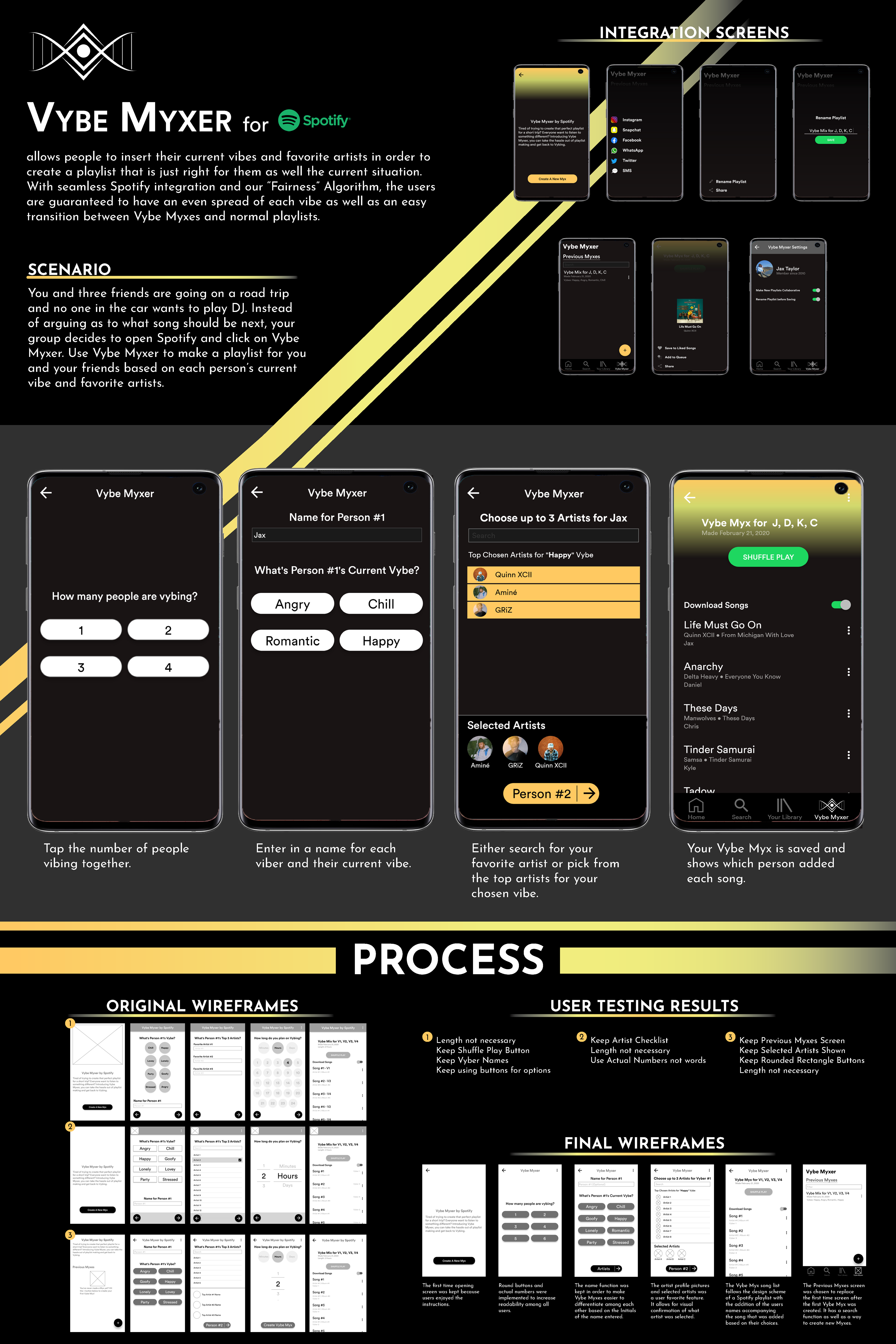

Project Description
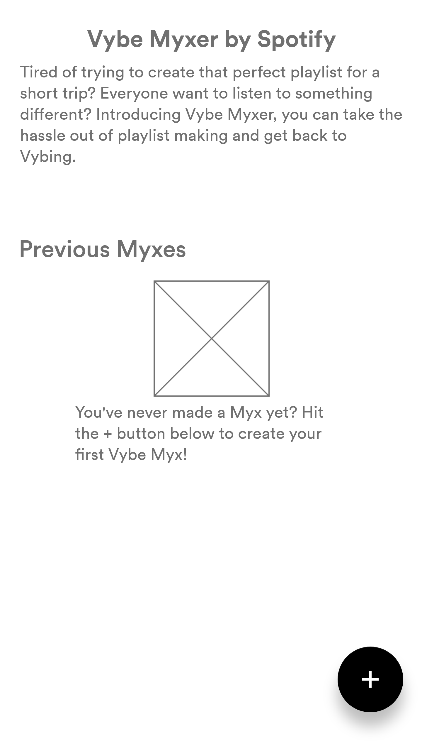
Vybe Myxer is a Spotify extension that allows people to insert their current vibes and artists to create a playlist that is just right for them and the current situation. The extension is programmed directly into Spotify so an additional log-in is unnecessary. With seamless integration and our “Fairness” Algorithm, Vybe Myxer guarantees an even spread of each vibe and an easy transition between Vybe Myxes and normal playlists.
Process
Wireframes
The opening screen will fade in with a small explanation of the extension. The following screens allow users to select the number of listeners/Vybers, insert their favorite artist, and their current Vybe and name. After that, the playlist will produce a balanced playlist of each listener's Vybe to create a playlist that everyone will want to listen to. This path is the general process for all of the wireframes.
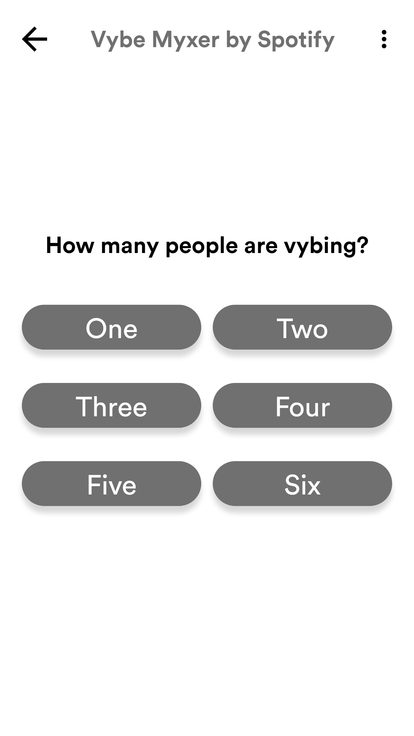
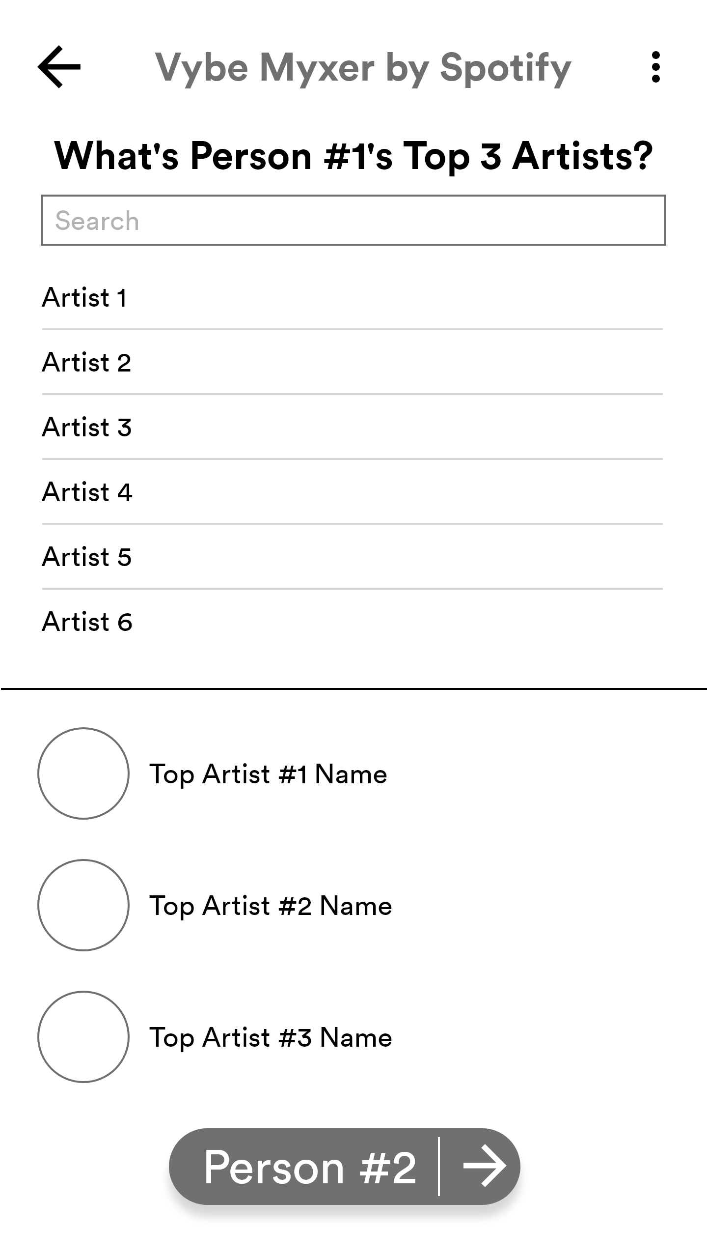
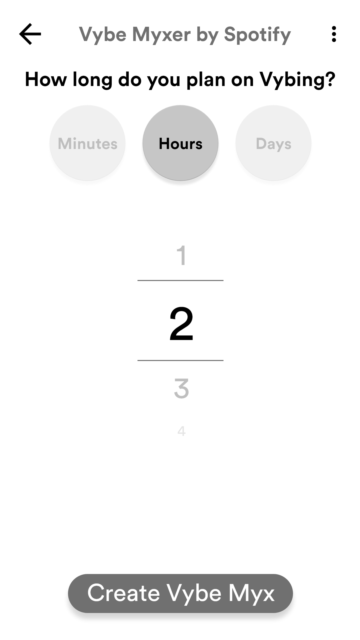
Wireframe 1: Round and Type
The first attempt at wireframes focused on a rounded design that would allow for easy tapping of options and assets. Since Spotify is a tap-heavy application, it would work well with the current IP's design. The opening screen would have the logo of Vybe Mixer fade in with a small explanation of the extension.
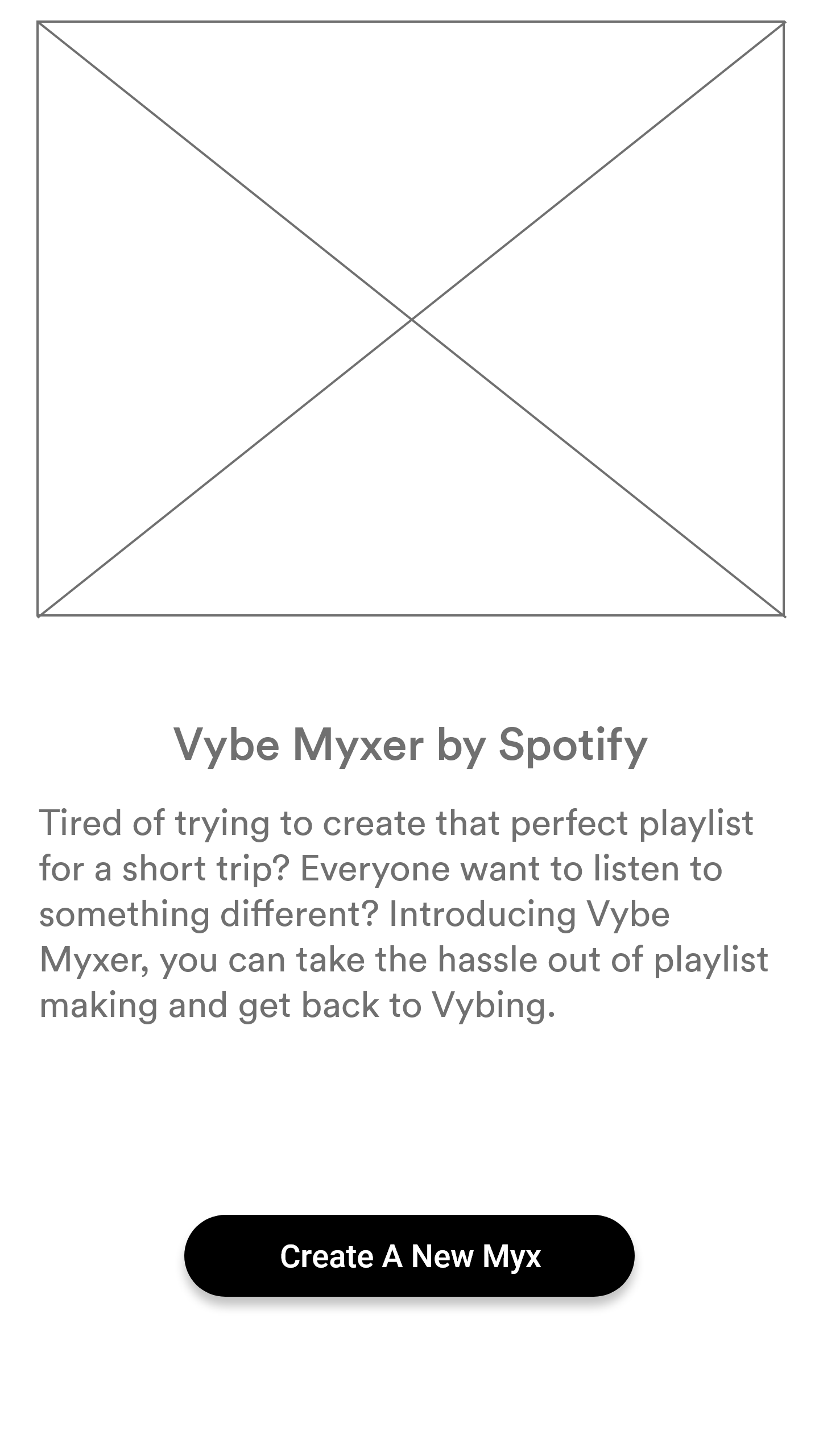
Opening Screen
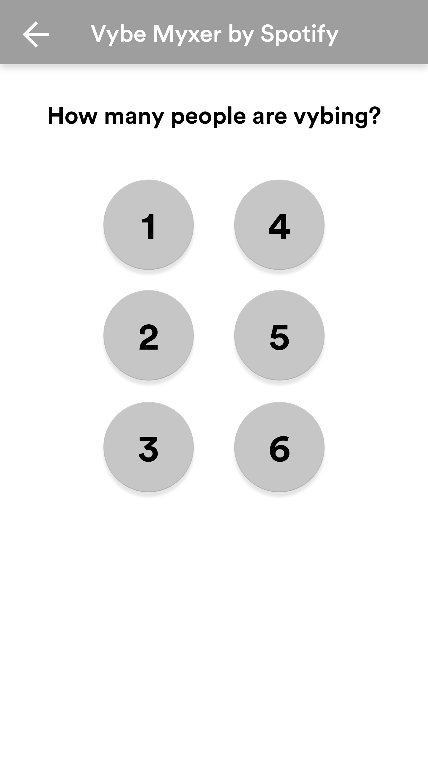
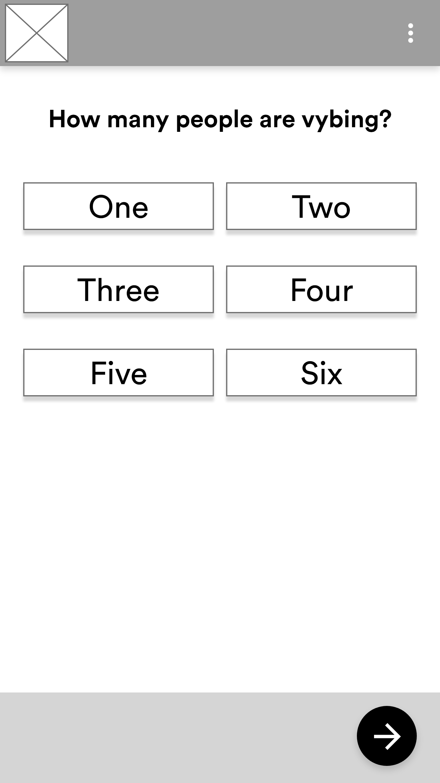
Number of Listeners
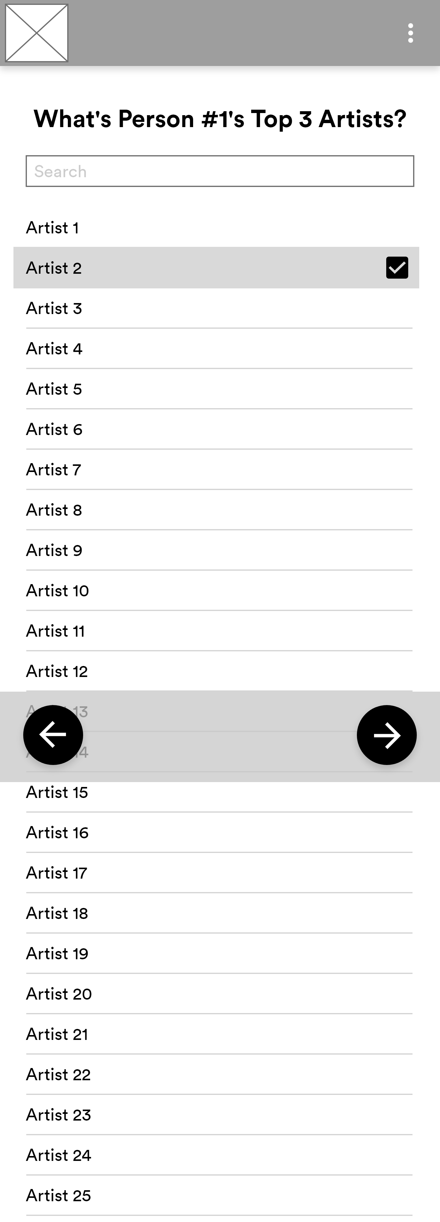
Top Artists

Vybes
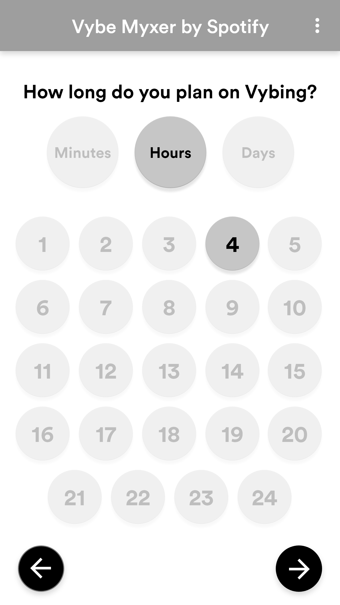
Time Selection
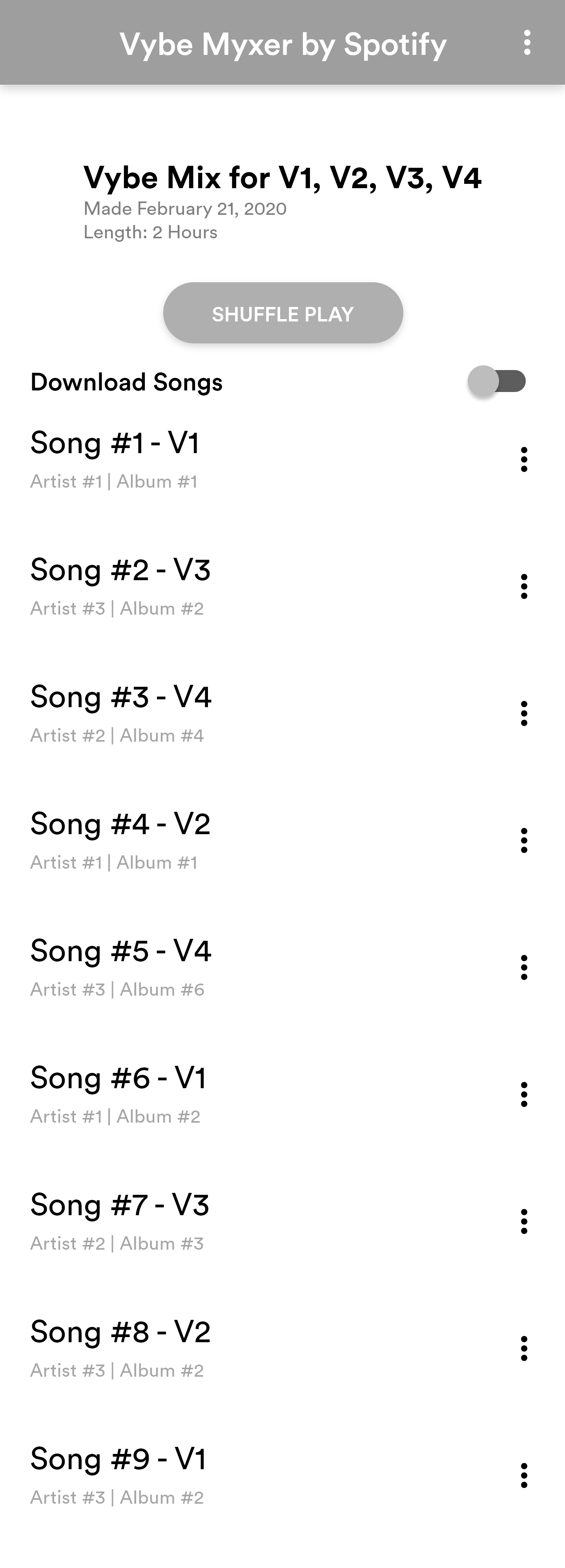
Final Playlist
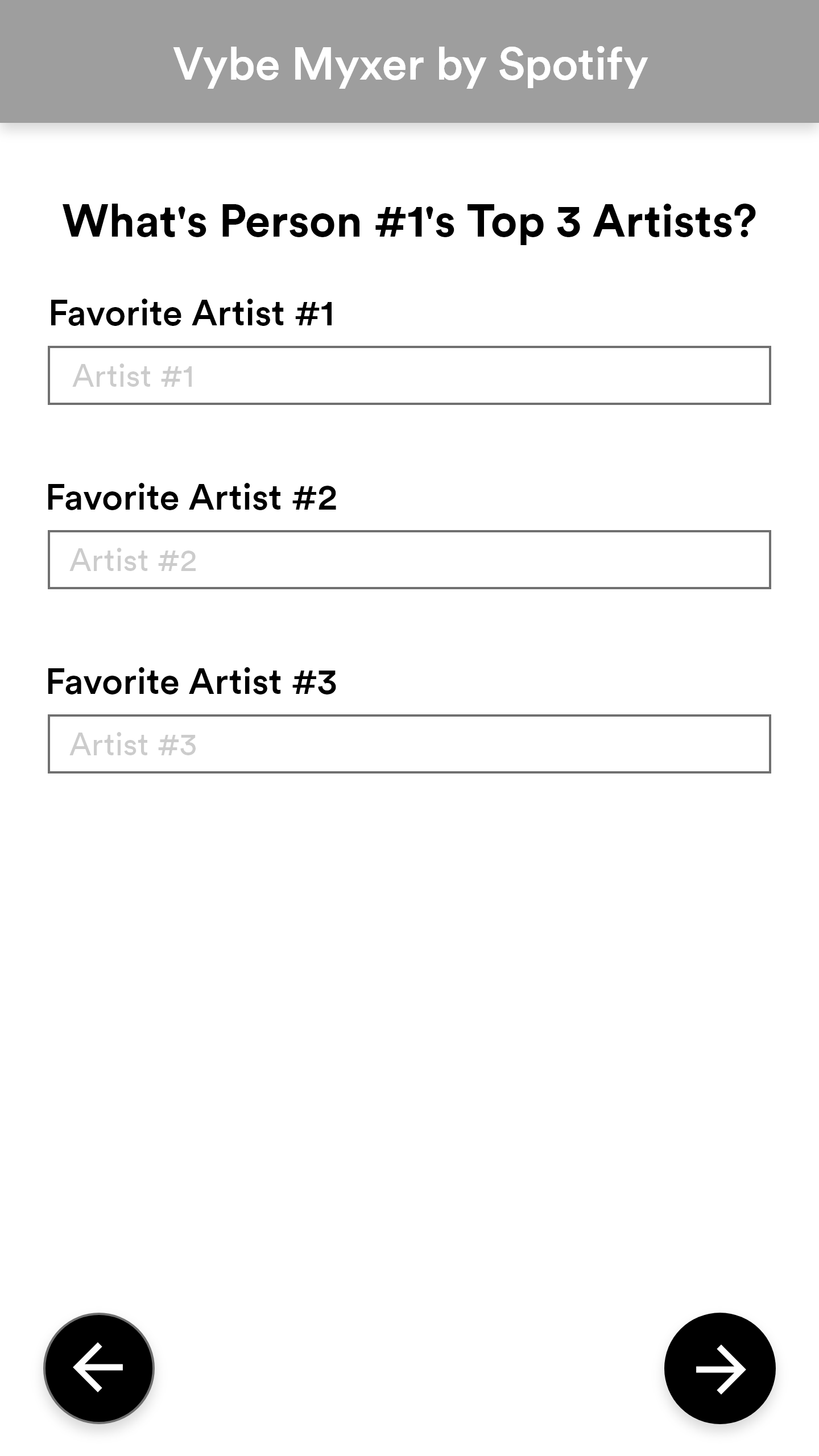
Wireframe 2: Box, Select, and Scroll
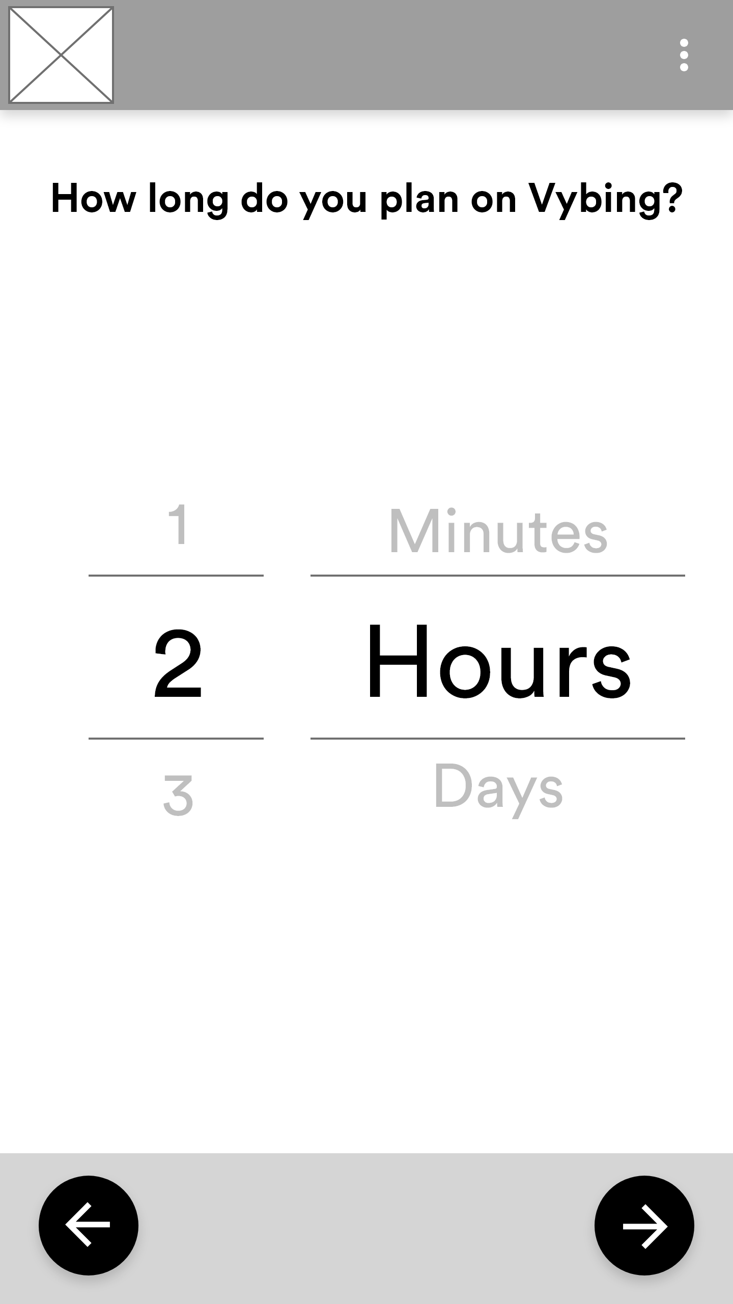
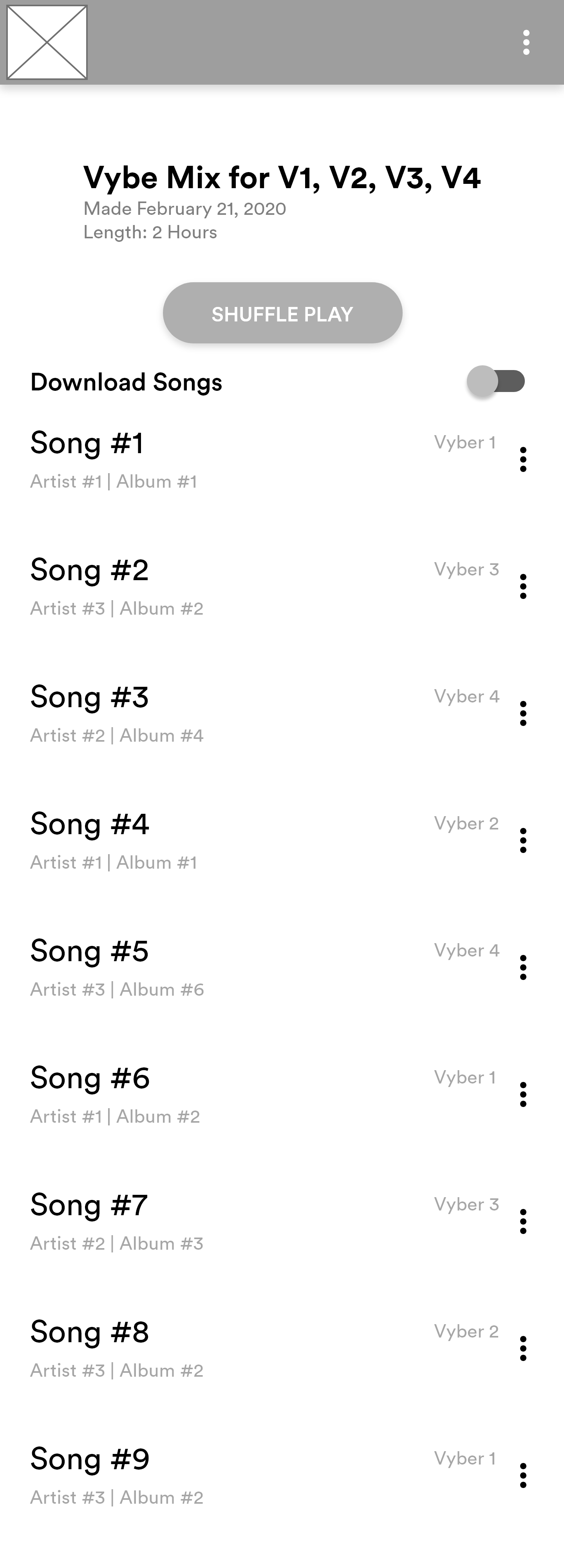
The second wireframe idea was based on a more boxed look. This design removed the cumbersome drop-down menus of the artist selections. The way to select time was shifted to more of a general iOS design, opting for the scroll rather than a static selection of time to choose between. The user could choose between lengths of time as well. The playlist screen also shows the person whose vibe the song caters to at the end of the container of the song rather than directly connecting to the song itself.

Opening Screen
Number of Listeners
Top Artists
Vybes
Time Selection
Final Playlist
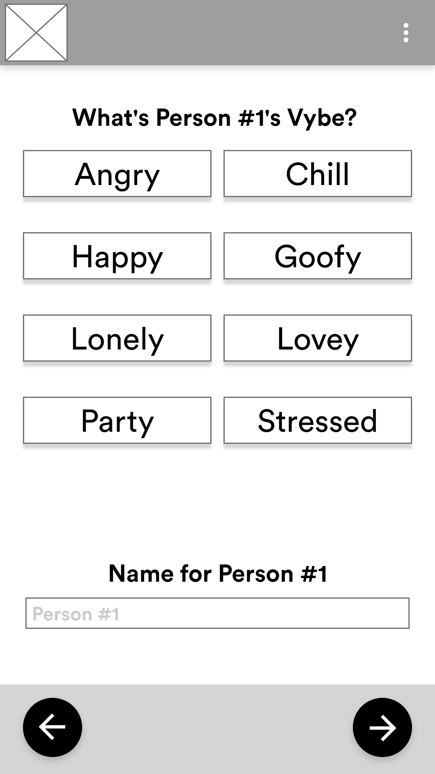
Wireframe 3: Round, Type, Scroll, and Preview
The third wireframe attempt focused on combining the best of both worlds of the first two attempts. The earlier designs were missing a place to remind the user what part of the application they were in. So I moved it to the top. The scroll and rounded section of the time was a test to see which was the most useful between the two designs. Finally, the Vyber's name to whom a song caters was brought below the other relevant song information.
Preliminary Wireframe 3: Opening Screen
Preliminary Wireframe 3: Number of Listeners

Preliminary Wireframe 3: Vybes
Preliminary Wireframe 3: Top Artists
Preliminary Wireframe 3: Time Selection

Preliminary Wireframe 3: Final Playlist
User Testing
The user testing was focused on allowing people to go through the app with many restrictions. Then after going through it once, we went back page by page to figure out what was working for each design and what wasn't. This allowed me to take the best parts of each design and formulate a way to combine them. Along with the findings, I also compiled a group of testers in two different age groups with different backgrounds. The people are color-coded to correspond to the participant shown in the key in the upper right-hand corner.
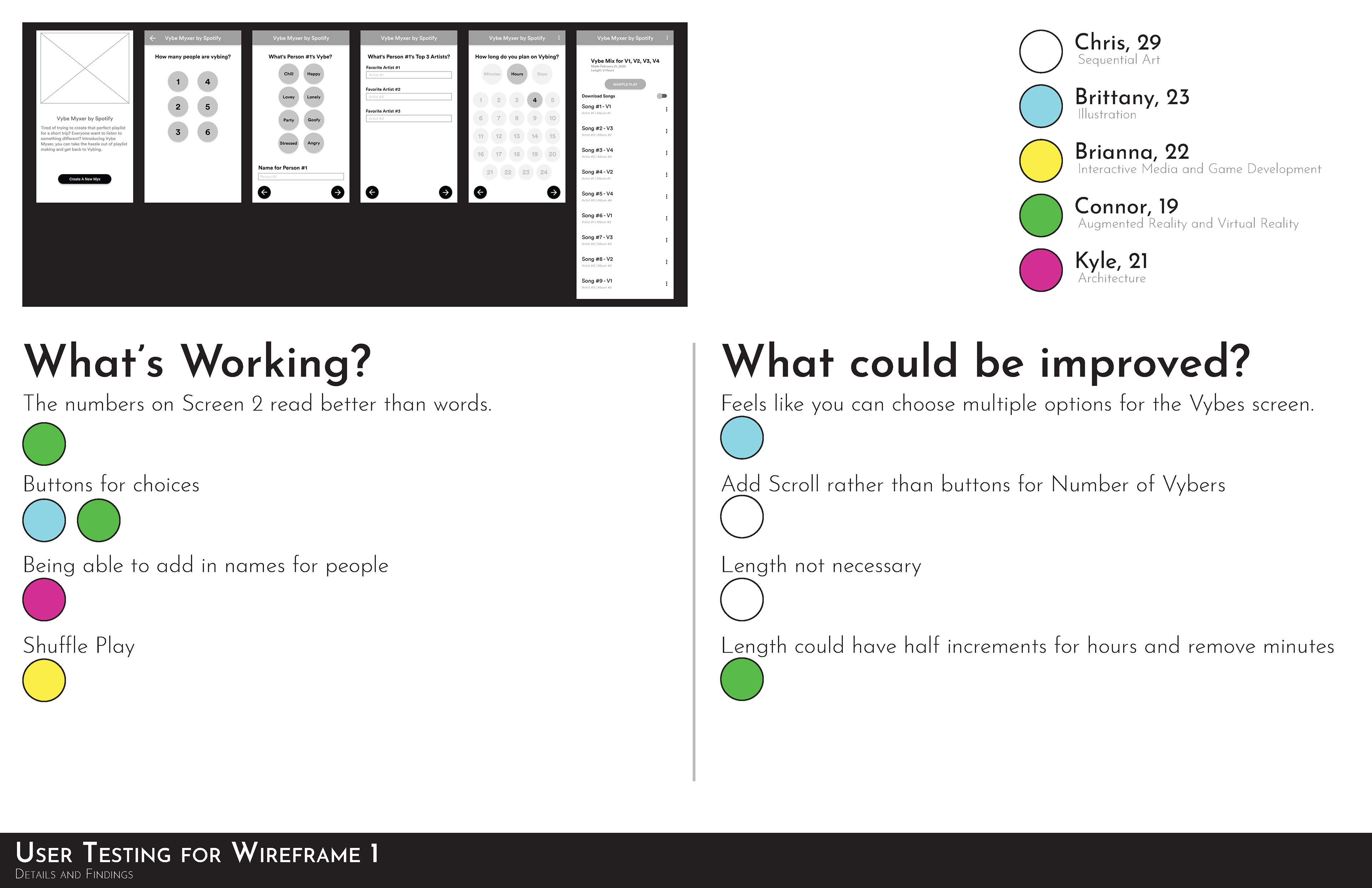
Wireframe Testing for Design 1

Wireframe Testing for Design 2
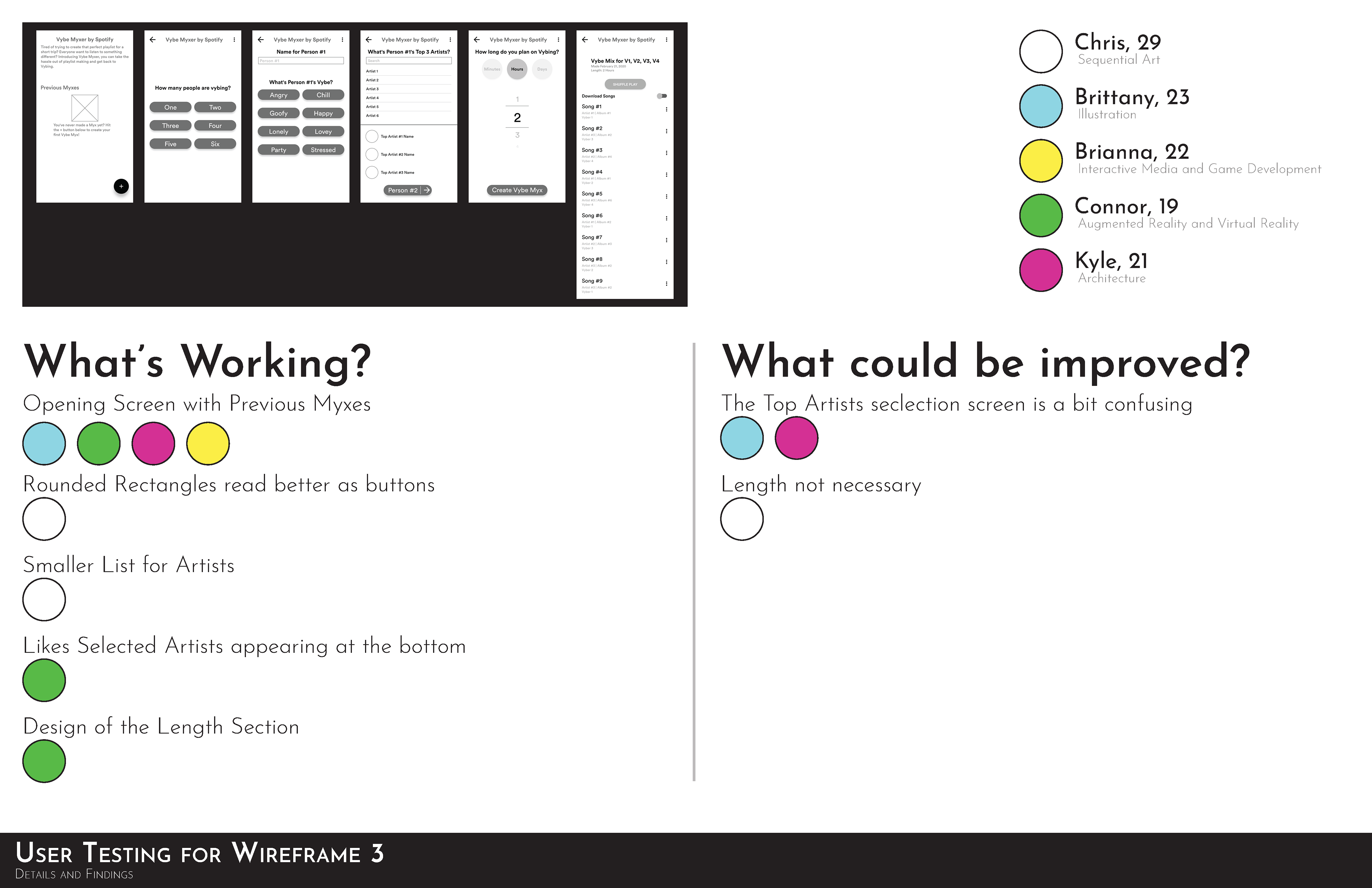
Wireframe Testing for Design 3
User Statements
Along with the testing and taking note of the pros and cons of the designs, I decided to take note of the statements made by the participants as well. When people are testing, they will speak out loud about things they find intriguing, confusing, or helpful. I took note of those exclamations and unconscious responses. From there I was able to make some important changes to the designs.
User Suggestions
After the testing of the mockups, I gave the participants a chance to offer up their suggestions. These suggestions are important for quality-of-life changes or design changes that bring it closer to the base application.

User Statements and Suggestions
Final Wireframes
After user testing, I went back to the drawing board. I didn't have to wipe the entire design into the trash, but shifting was necessary. One of the designs had something that I needed. So it was a test of breaking down the design and combining them into a comprehensive design. Along with the design, I broke down the reasoning behind the changes.
Drawing from my findings, I solidified the idea of having an introduction to Vybe Myxer. That way people knew the purpose of the extension and how to start using it. Focusing on a more tap-heavy functionality, the design had a design that fit well with the current application's theme.
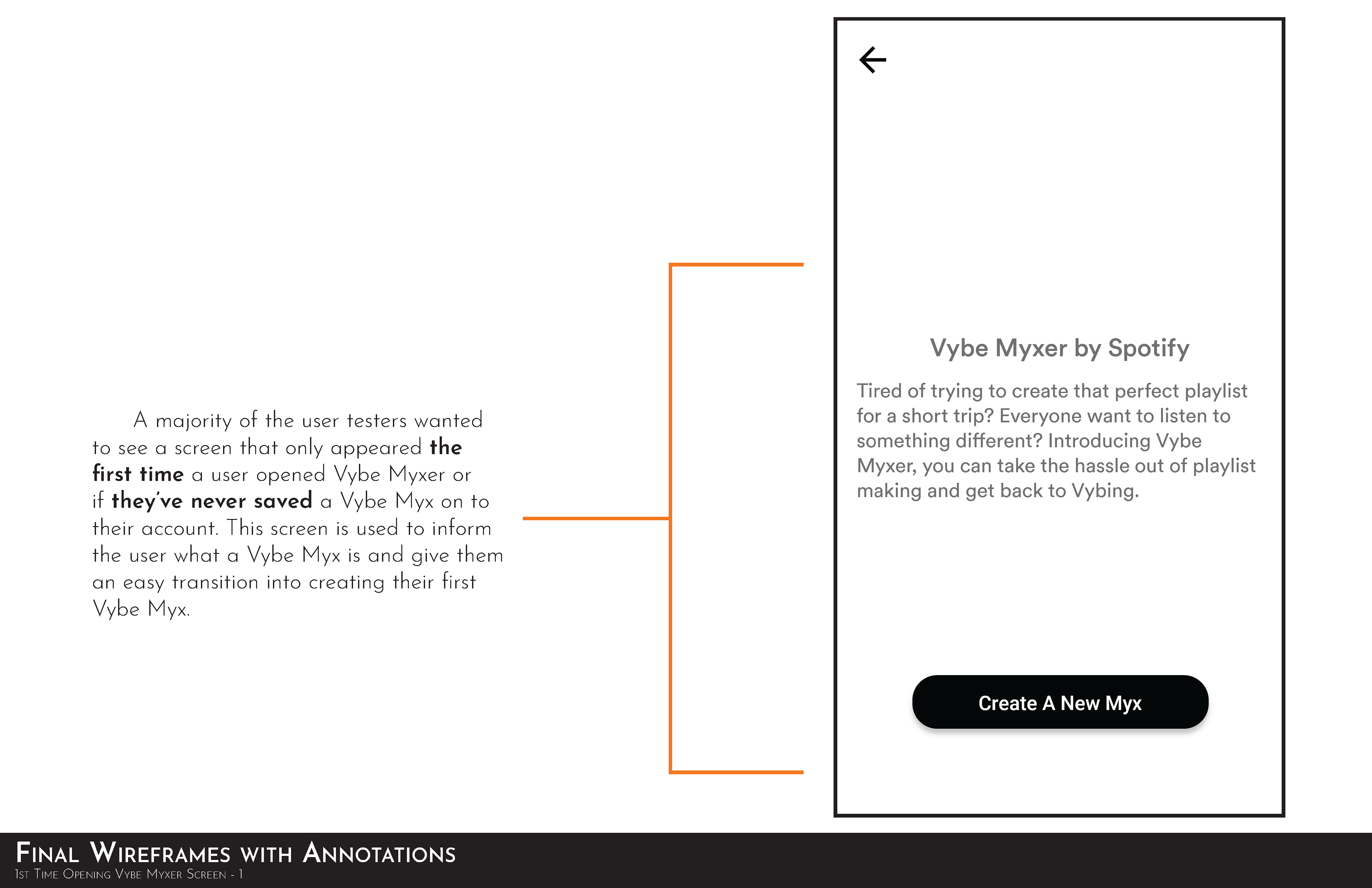
Final Wireframe: Opening Screen w/ Explanation
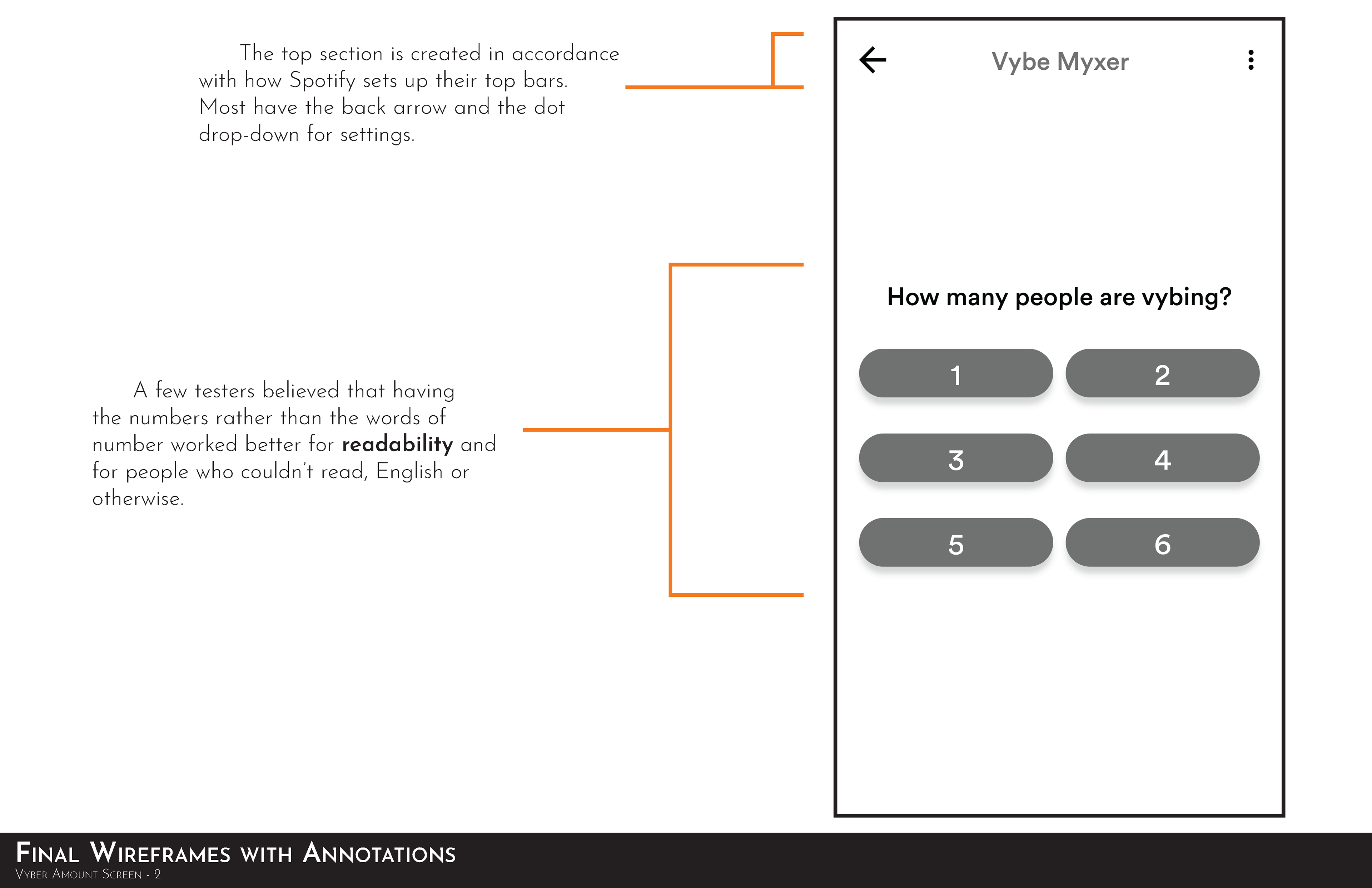
Final Wireframe: Number of Listeners w/ Explanation
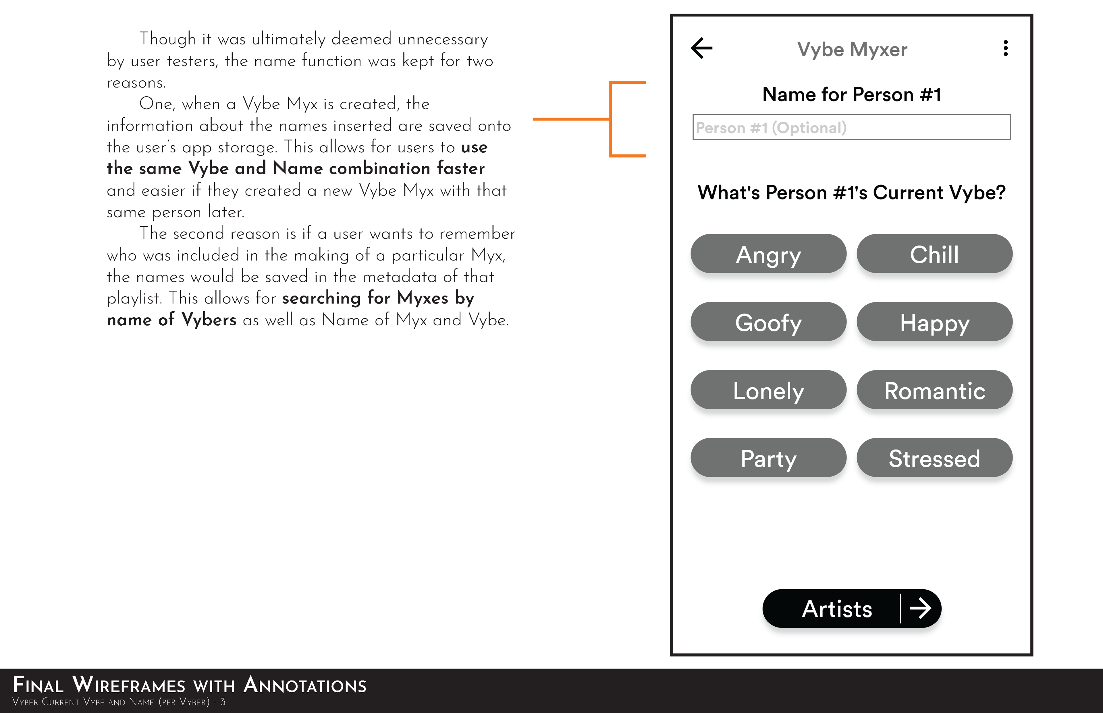
Final Wireframe: Vyber Profile w/ Explanation
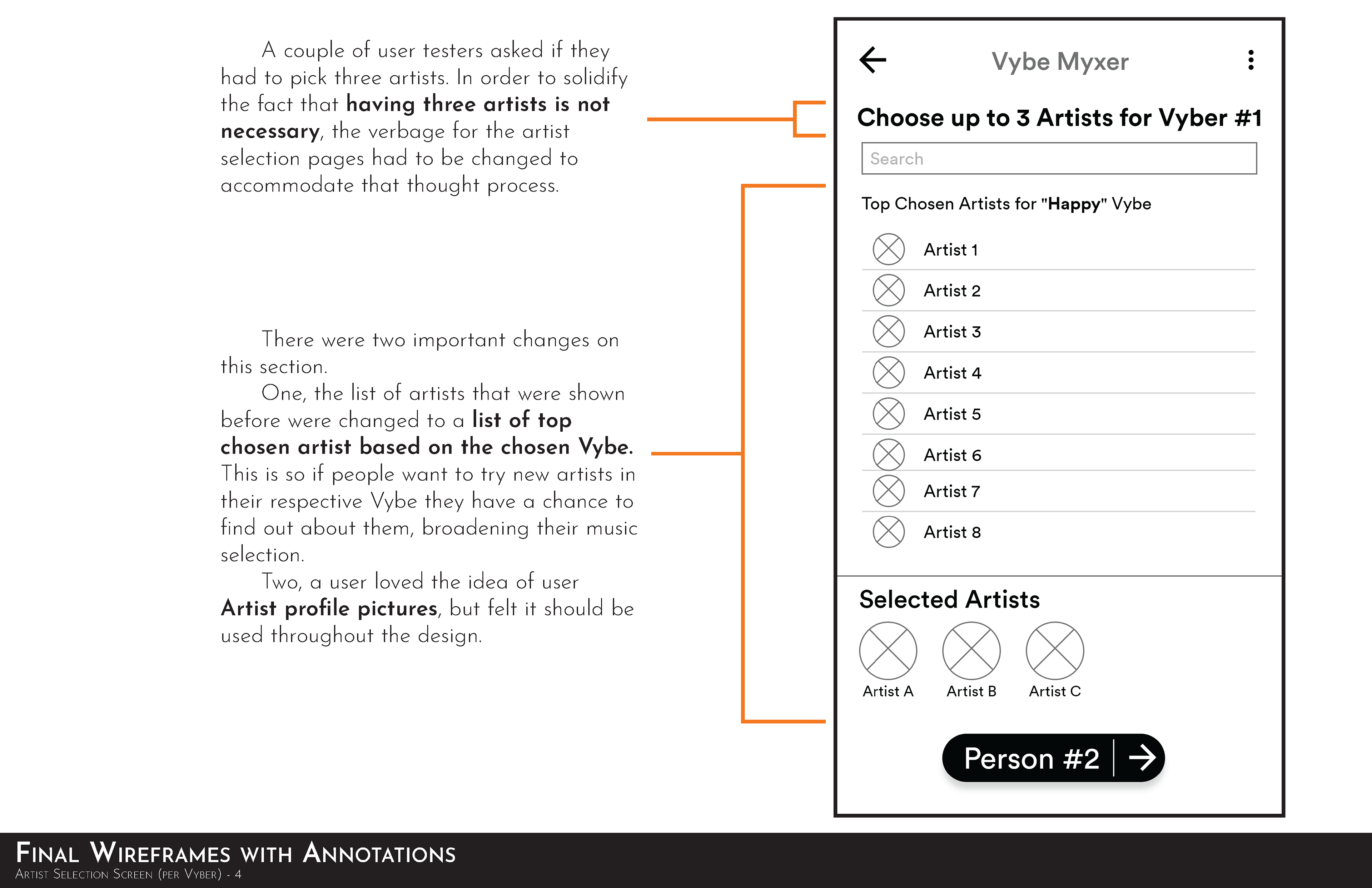
Final Wireframe: Artist Selection w/ Explanation
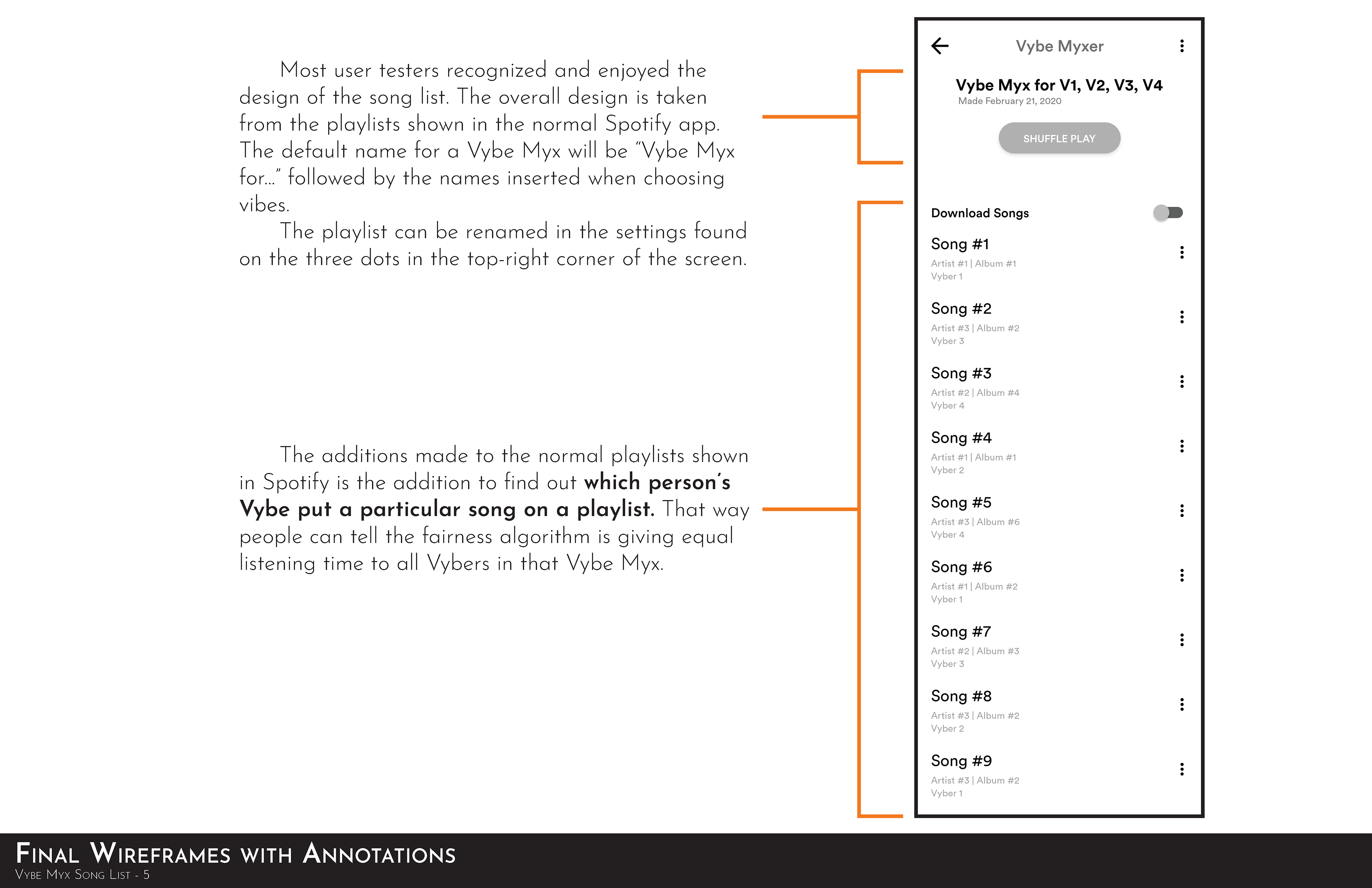
Final Wireframe: Vybe Playlist w/ Explanation
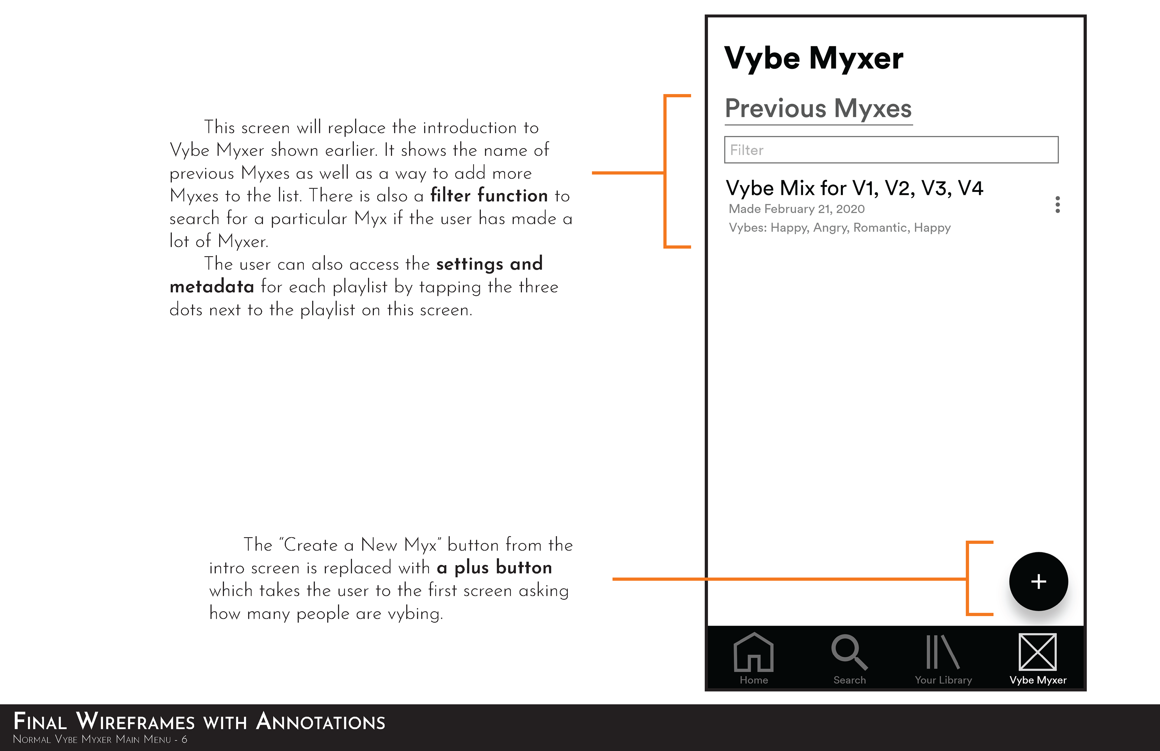
Final Wireframe: Previous Mixes w/ Explanation
Styleguide
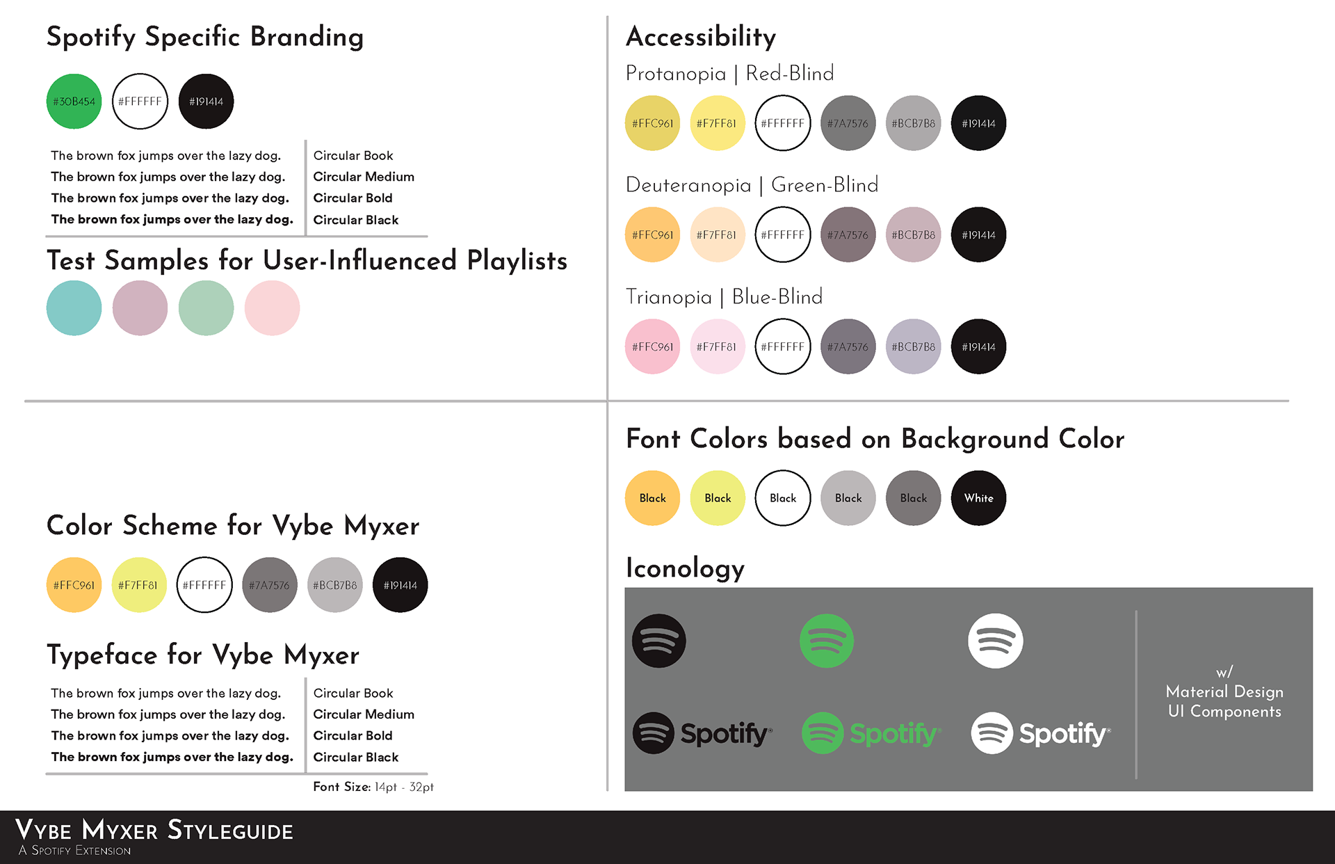
The style guide was the most challenging part of the design process for Vybe Myxer. Since I was working within the confines of Spotify, I would have to study how Spotify portrayed its playlists. That includes placement of buttons, designs of icons, and color language used. Though it required a solid amount of research, I was able to create a design that fit well in Spotify's existing design.
In the style guide, I included Spotify's branding for people to share and use. For the playlists, I went through and sampled my own playlists. Using gradients that are removed from the user-influenced playlists that already exist, I could make a color scheme that stood out from the general achromatic theme of the Spotify app.
Final Prototype
For the final prototype, I wanted to show how I envisioned how the application would look in-app. So using the color scheme from Spotify, I was able to translate my design choices realistically. The themes made to stand out from the achromatic base of Spotify worked wonders. The contrast is apparent in what is in focus or selected. And the design of the final screen showing the Myx is spot-on with how other playlists are portrayed. It stands out as being unique without being out of place.
The different interactions between the screens are focused on mimicking the smooth screen push of the original Spotify application. Between finding different timings and how overlays were used, I found myself learning more about what felt right in regard to micro-interactions for the user. Every slight change should be effective and intoxicating: the slide-up for overlays, the slide-down when tapping away from an overlay, and tapping any button to transition the style. All of it was and still is important. And that may be one of the biggest takeaways.
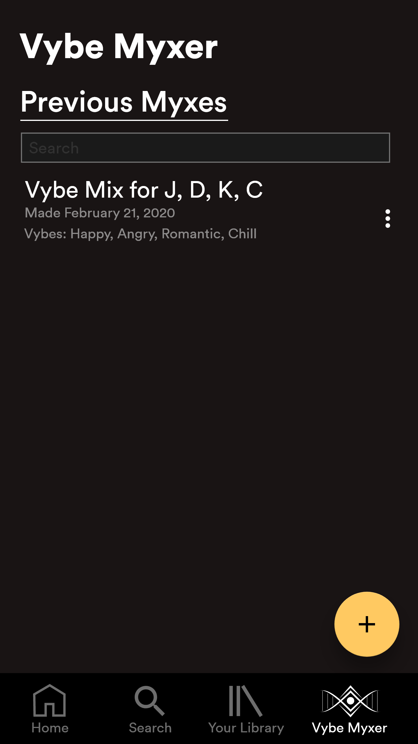
Final Design: Vybe Myxer Main
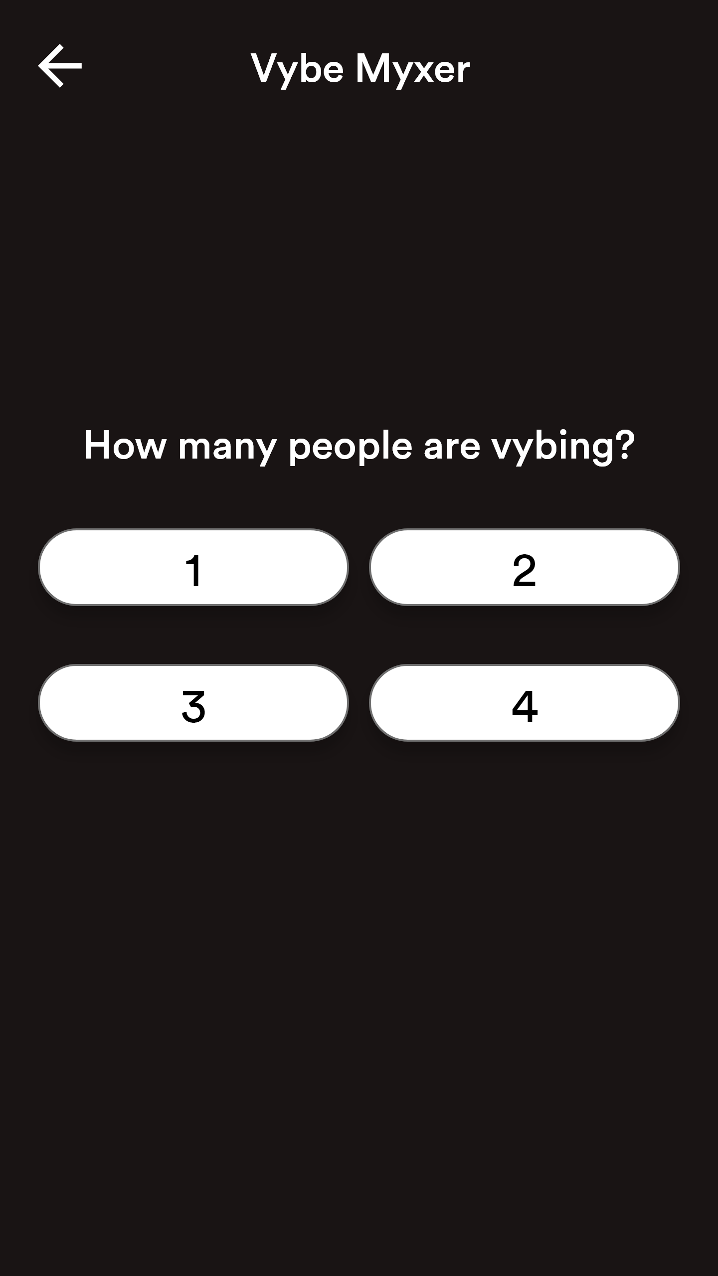
Final Design: Number of Vybers
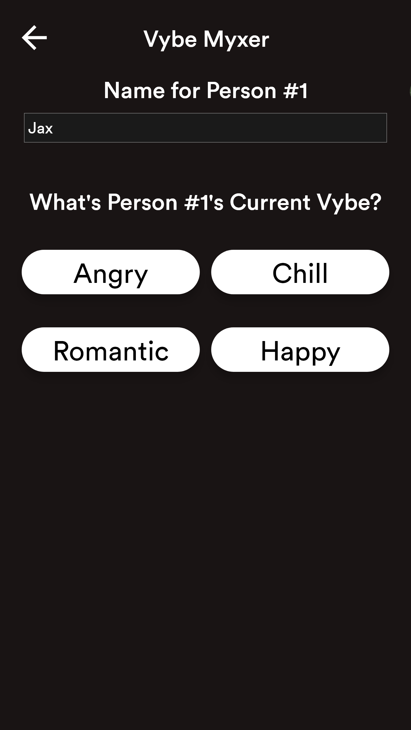
Final Design: Vyber Profile
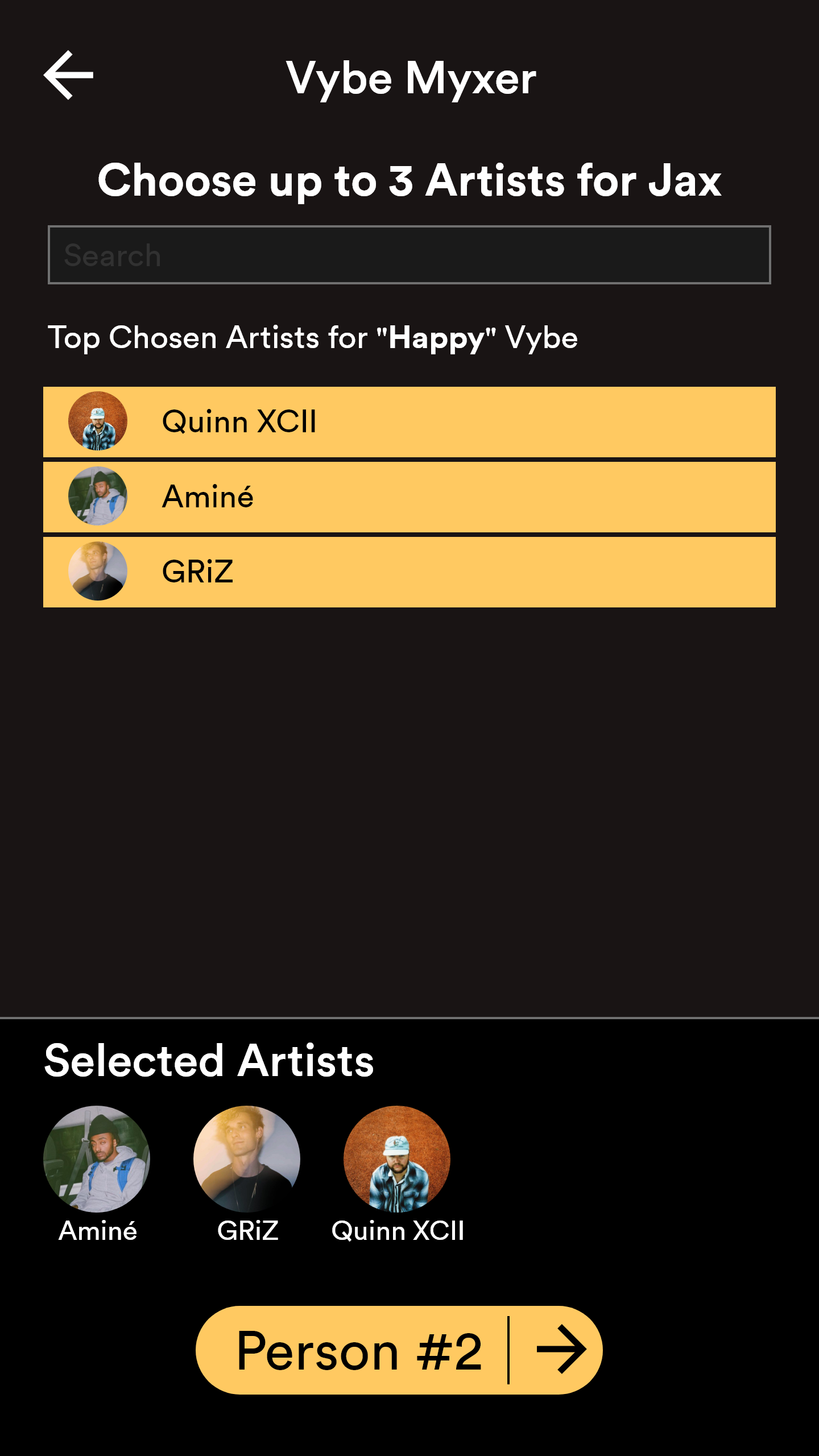
Final Design: Artist Selection
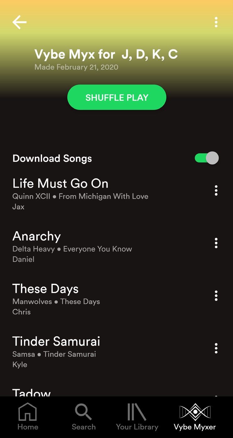
Final Design: Vybe Myx
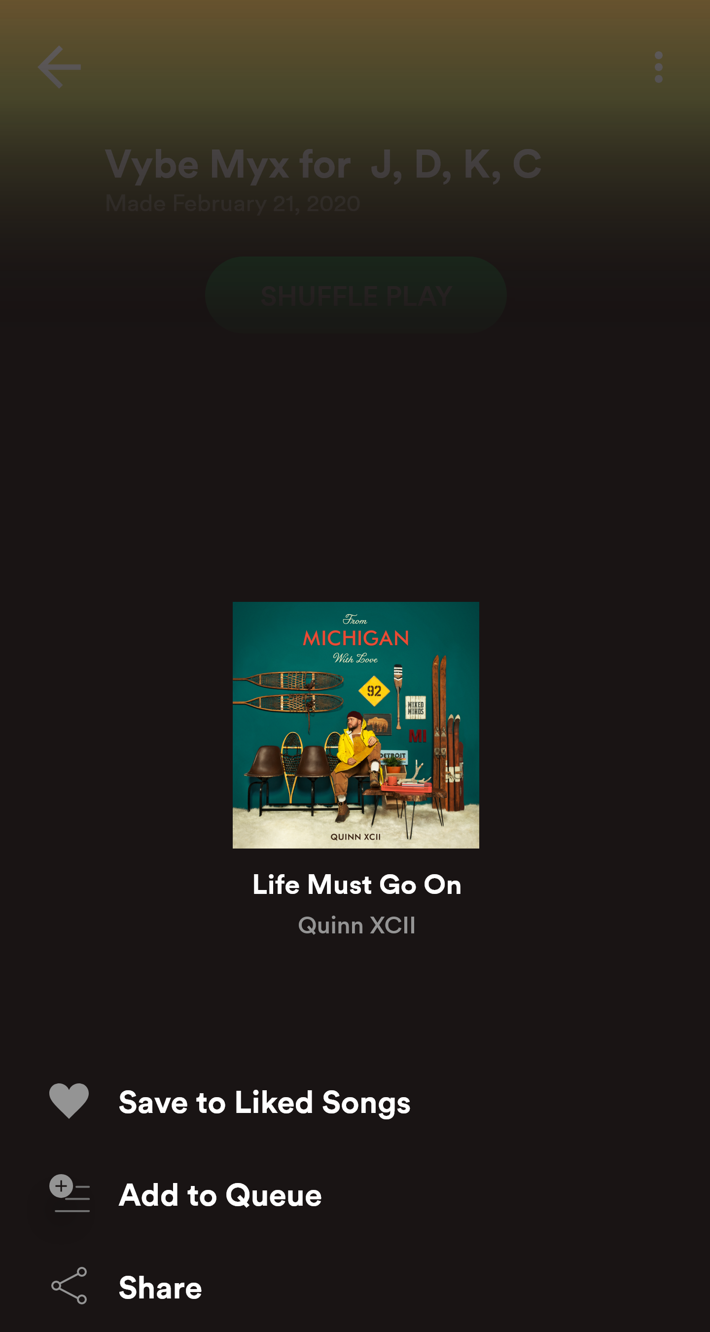
Final Design: Song Options
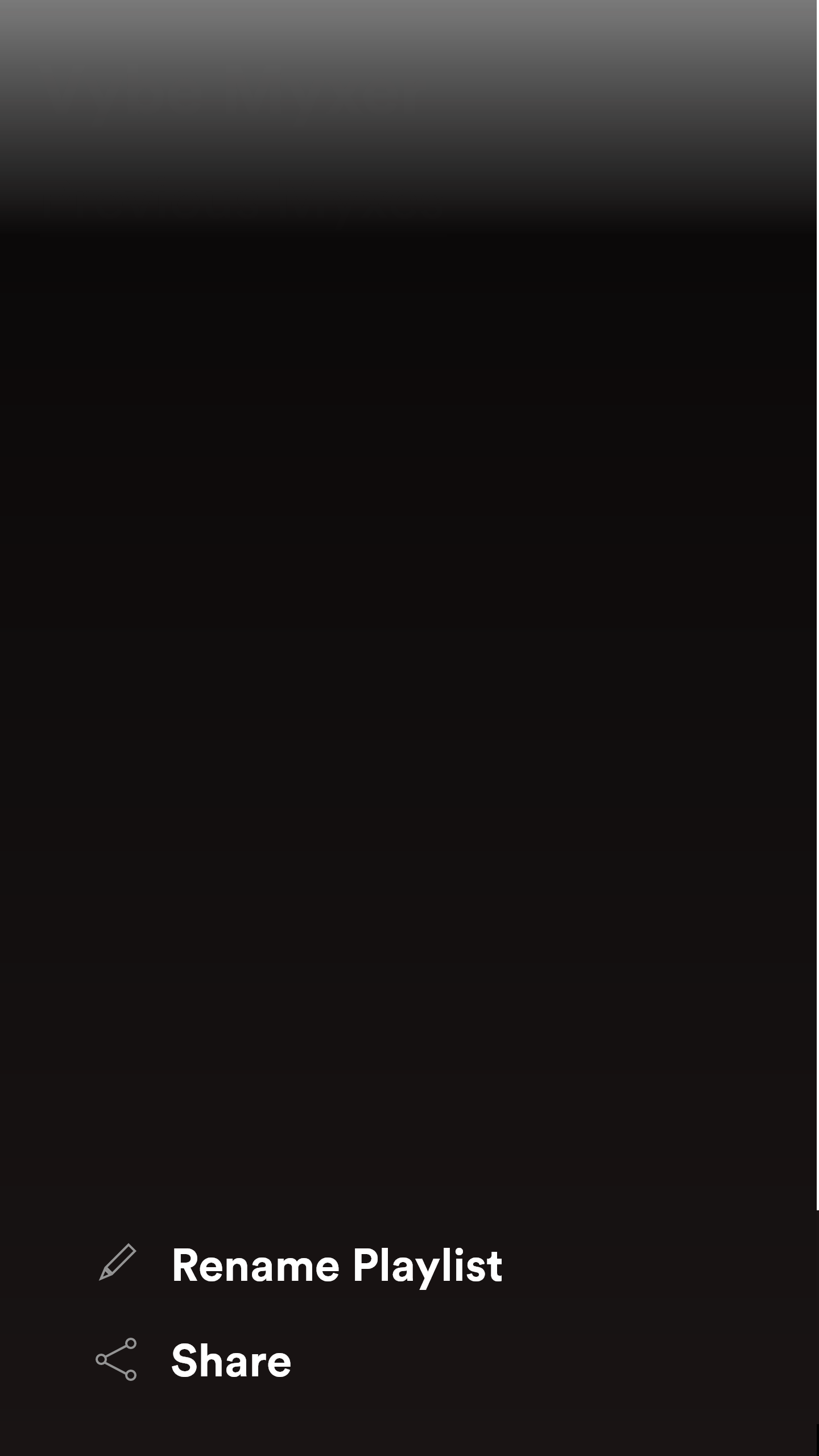
Final Design: Playlist Options
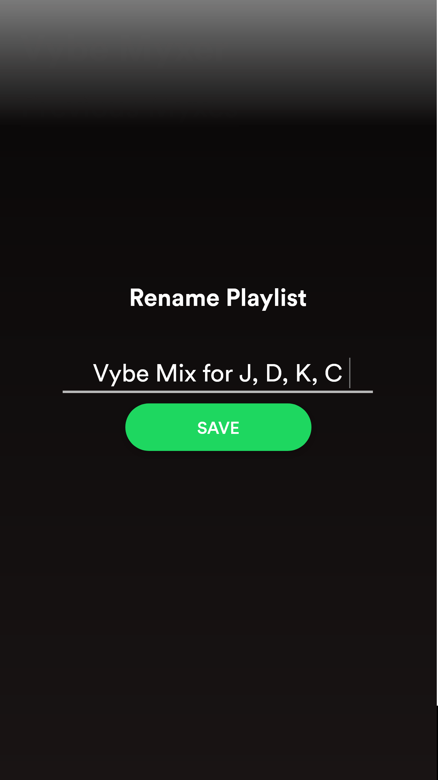
Final Design: Rename Playlist
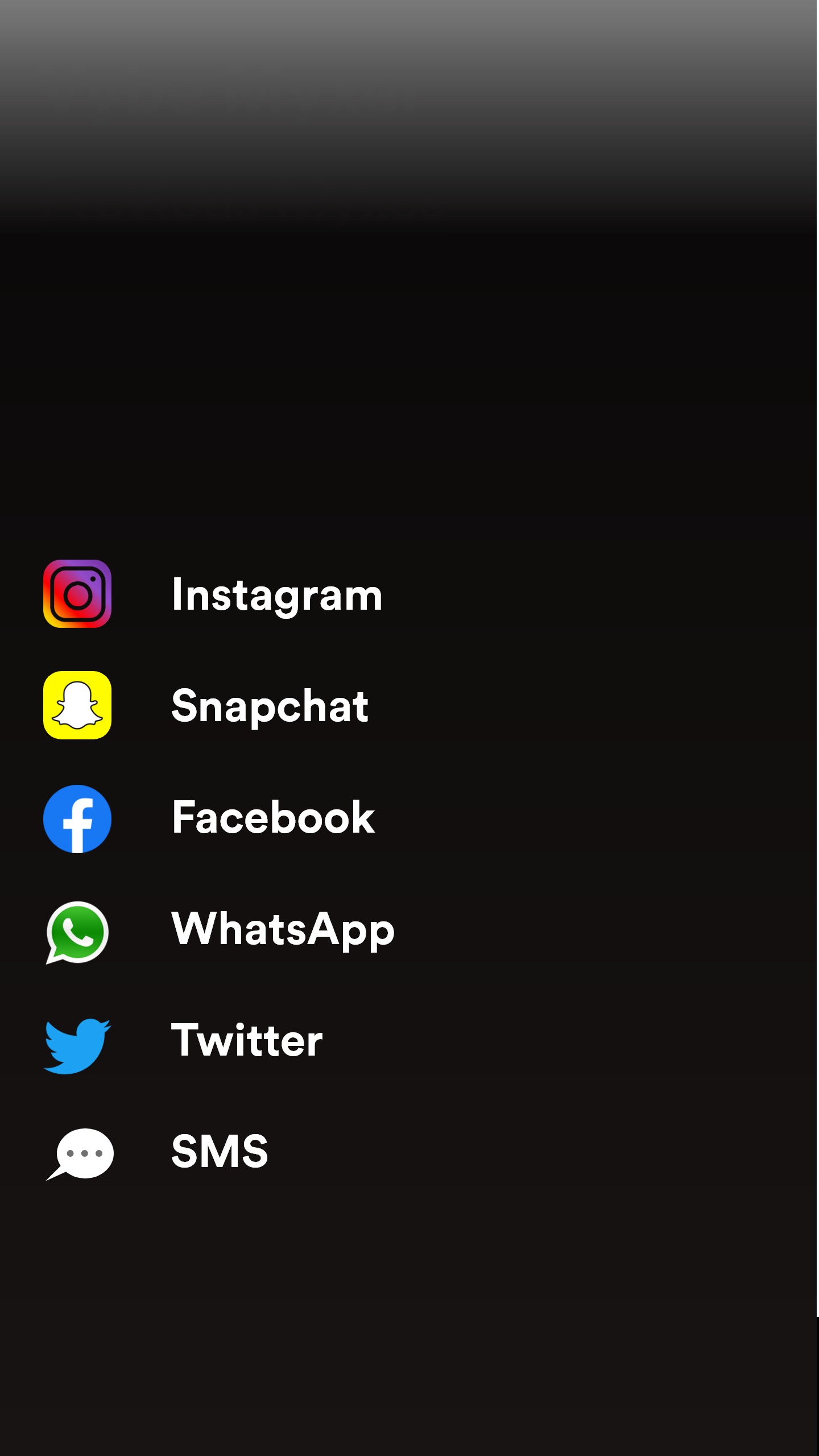
Final Design: Share on Social Media
Post Mortem
I learned so much from Vybe Myxer. Not only was it my first application to make in XD, but it was the biggest research task that I've ever taken upon myself. There were many moving parts that I wasn't aware of initially. Before this project, I was a game designer. I took up this idea out of personal curiosity. I gained so much respect for not just UI Designers, but even more so for UX Designers.
Working between the artistic designs and the user experience was unbearable at times. But even though it was difficult, I found a certain joy and draw to UI/UX. The time spent doing testing and changing designs were times when my mind was content. I was proud to do it. I would be remiss to not state that Vybe Myxer put me on the path of becoming a UI/UX Designer. After the Final Designs, there is also a poster to explain the design process of Vybe Myxer.