Tamed E-Sports Ticker is an application to bring all of the hassle of following professional and amateur e-sports teams on their roads to glory more manageable. This is the one-stop shop for all news, fantasy, and scores that any fan could ask for. Tame your unruly website list into an easy-to-follow and access app from your phone!
Project Overview
Though still in the works, I have been going through each step of the research and creative process in order to make sure it is user-friendly as well as free of unnecessary information. The majority of tickers and news outlets that exist for e-sports are for specific games. There is no outlet that encompasses all major games played on a world stage. And that is where Tamed enters the scene. Creating a solution for a group of people who are content with searching and having multiple outlets in order to get the information they need.
Research
Survey
The heart of any user interface design is the need to research if there is a need for the project in the first place. I began my research with a survey. This survey is to gauge how people interact with e-sports in general. Though there is a large audience of people who watch e-sports leagues, I needed to know what information is important for users.
Do they need to know when matches are? Do they watch games live or after the fact? Are fantasy leagues important enough to include or not?
All of these questions can shift a design to make the application easier to traverse and remove extraneous information that isn't useful for the wider audience. Being able to confirm what information is vital allows me to move forward with designs that were wireframed before the research was finished. This allows me to alter wireframes rather than starting on designs later in the process.
You are also welcome to assist in my research since I'm always gathering information until the designs are finalized. You're welcome to help with the research because you are important as a potential user as well!
Interviews
To make sure that there is a market for the application, I decided to do interviews as well as a survey. The interviews do serve a different purpose than the surveys though. The interviews not only allowed me to find my target audience but also gave me a chance to dig deeper into what potential users may want from the app. I needed to find what would be useful that I didn't have in the design and what was useless in the current design.
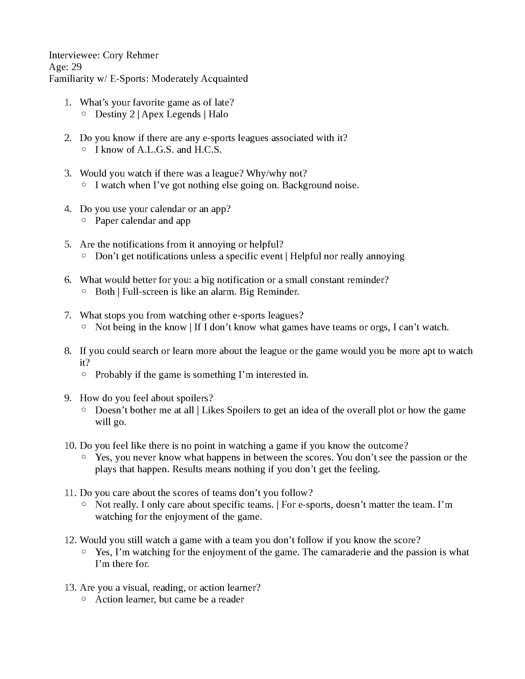
Interview: Cory R. - Page 1

Interview: Cory R. - Page 2
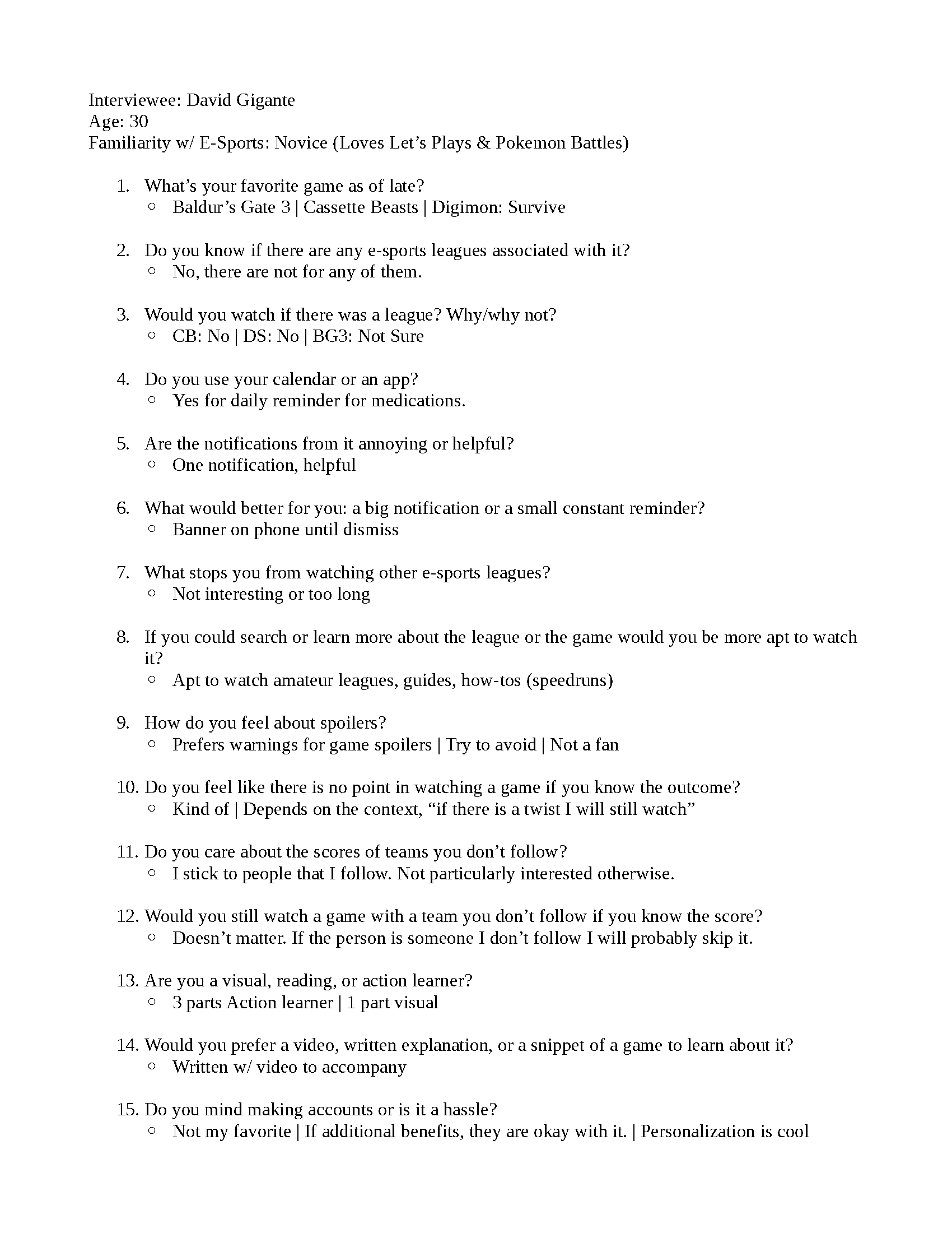
Interview: David G. - Page 1

Interview: David G. - Page 2
Flowcharts
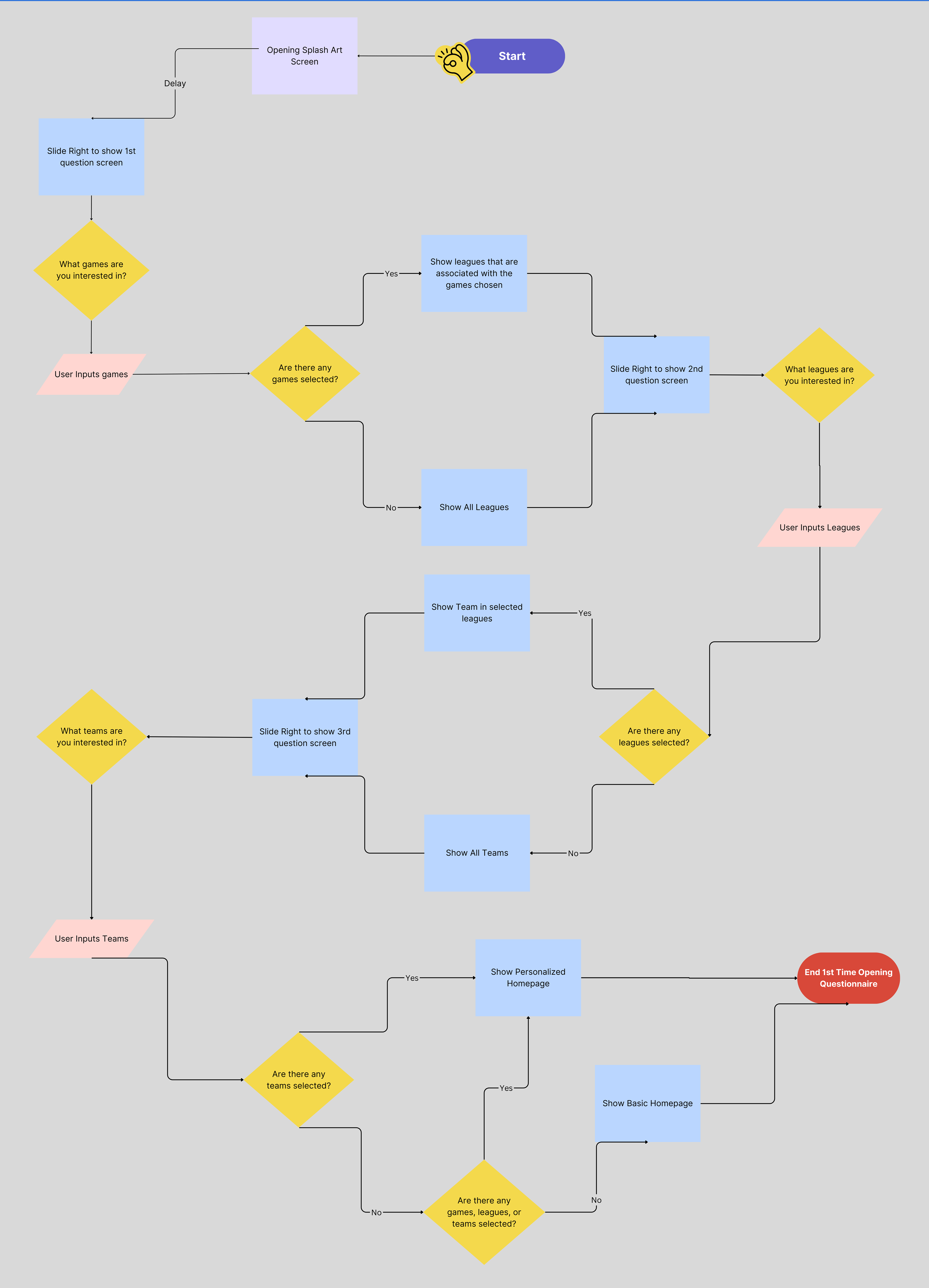
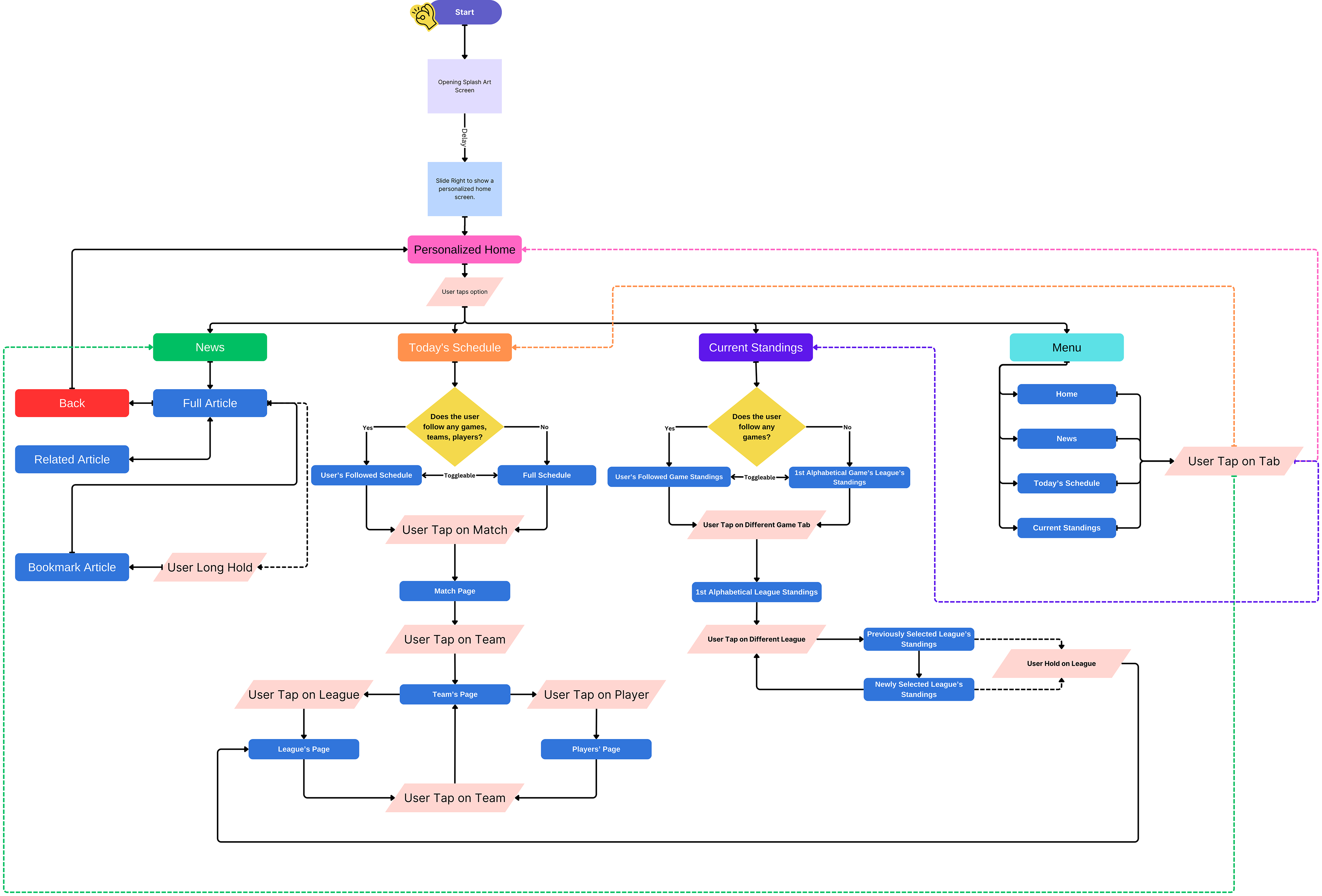
After the interviews, the flowcharts became a bit more simple. A lot of the additional aspects in the articles and additional sections of the app were removed. Not because they wouldn't be useful, but because they would clutter up the application which made navigating it more difficult. The big sections of the application boiled down to Home, News, Standings, Player/Team Information, Schedule, and Settings. The most complicated sections are the settings and user personalization.

Wireframes
The wireframes bypassed the general grayscale empty designs that they normally are. The idea of the app was well-established before the design came about. This allowed me to input specific information to guide my design as well. Since the app is primarily for scheduling and stats, it was imperative that I introduced information into the design. The information allows me to test how easy it is to follow and read without becoming tiresome for the reader.


Additional Wireframe Screens

Favorite Selection Wireframe
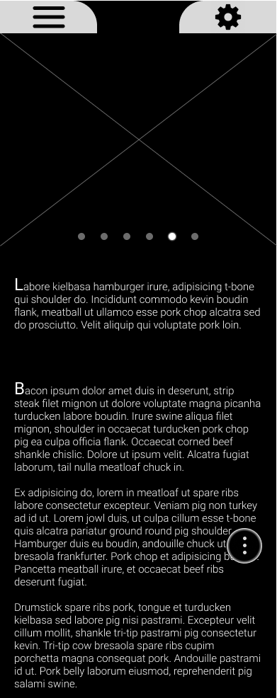
News Wireframe

Schedule Wireframe

Standings Wireframe
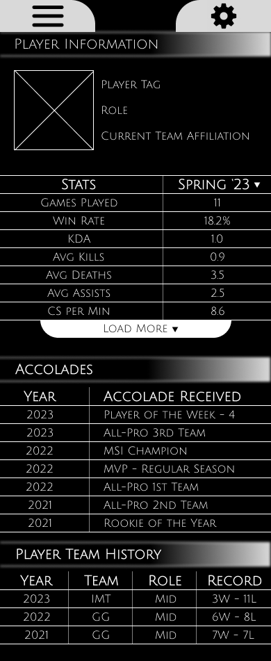
Player Info Wireframe
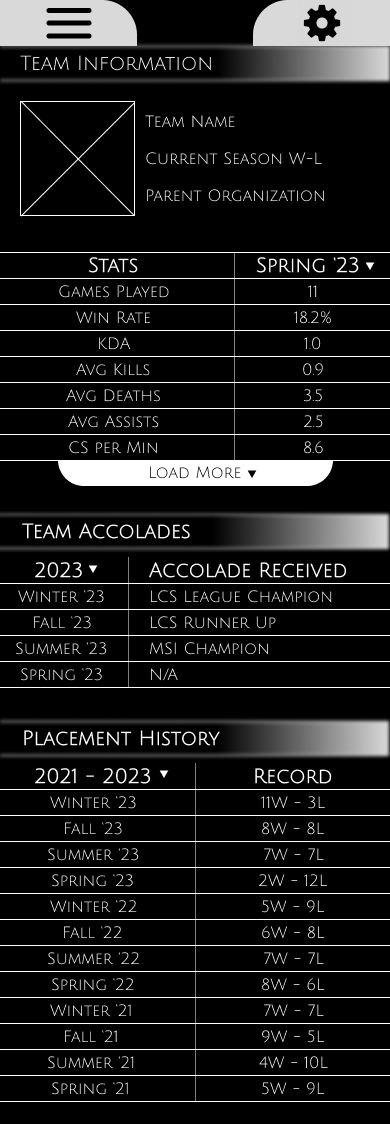
Team Info Wireframe

Settings Wireframe
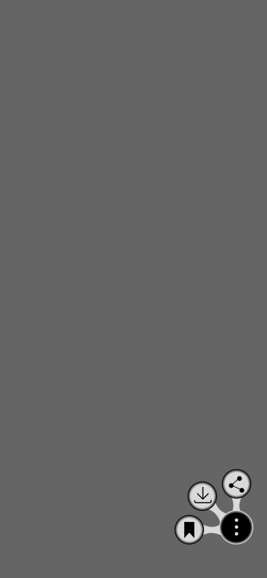
News | Additional Actions

Drawer Menu Wireframe
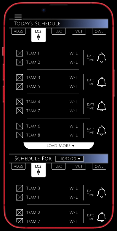
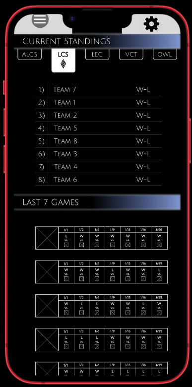
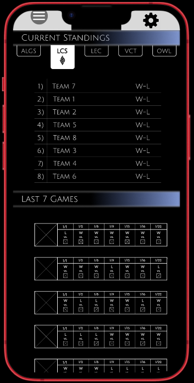
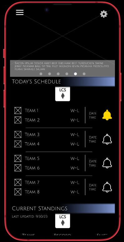
Lo-Fi Mockups
The changes from wireframe to lo-fi were consolidating the designs. I needed to find a way to make all the information more digestible. Being shown tens of numbers is an easy way to overwhelm the user. But in addition to that, the wireframe designs lacked a uniformity that would tie the different screens together. So after wasting time working to let every user choice work through the prototype, I scrapped the idea and focused on one pathway for users to experience Tamed E-Sports Ticker.
In addition to the color, I also used the Lo-fi mockups to try to add in behaviors. The first animation that used user input was the notification bell. Testing what I could learn and utilize was important after coming back to working on Tamed. The use of placeholders to flesh out the rest of the design was something else that is shown in the Lo-Fi mockups. Everything was coming together one step at a time.
Additional Lo-Fi Mockups



Hi-Fidelity Mockups
After working with the base wireframes, I found the design becoming too convoluted without the ability to show the animations that I wanted to convey. So I took the ideas shown in the wireframes and built upon them and my Figma knowledge. What exactly I learned will be shown later in the development breakdown.
The main changes between the wireframes and the mockups were the inclusion of color, photos, animations, and the inclusion of Figma components. The complexity and number of pages I needed significantly decreased when I started using Figma variant components.
I was able to combine pages and nest components within each other. That allowed me to get a more complex base application without adding more pages along with it. Some of the more complex components I learned to create were carousels, drop-down menus, small animations, toggles, and nested drop-downs as well.
Still Hi-Fi Mockups

Favorite Selection
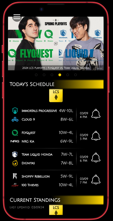
Homepage
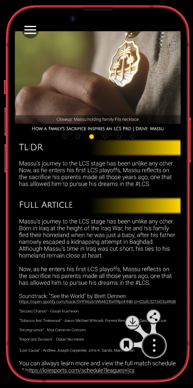
News: Massu
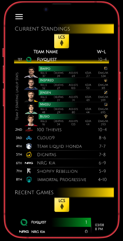
Current Standings | Recent Games
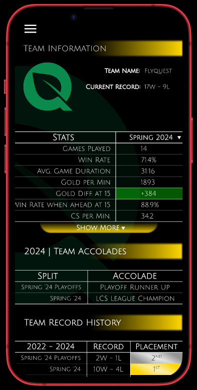
Team Information
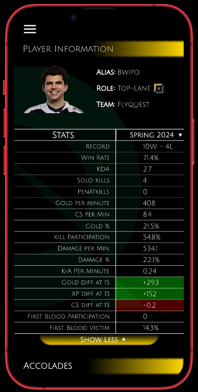
Player Information
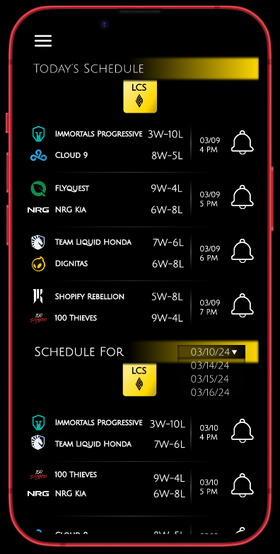
Schedule
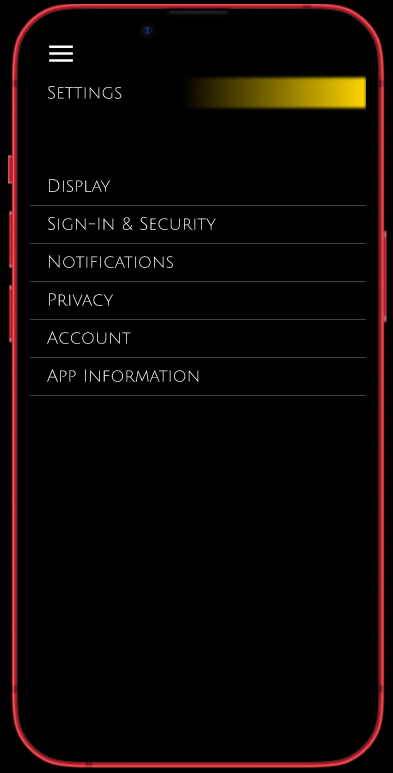
Settings
Post-Mortem
The biggest takeaway from this project was the need to keep the passion for design. This application took a year for me to take from ideation to mockups. The initial app seemed simple to start, but I realized how much I had bitten off. So between my everyday life of working, hobbies, and social obligations, I lost track of the timeframe for the project. But with that failure under my belt, I was able to refocus and stay the course. I proved to myself that no matter what is happening in life, I always make time for what I want. And what I want is to make applications and games.
With my understanding of Figma, I was able to stop brute-forcing wireframing and prototyping. Taking the time to learn and gain a deeper understanding of why professionals believe and work with Figma was eye-opening. Components are so useful for showing how much depth a design can have with a little bit of user input. Adding animation and behaviors to mockups breathes life into a design. So in addition to finding my passion for design again, I was able to learn how powerful Figma is.
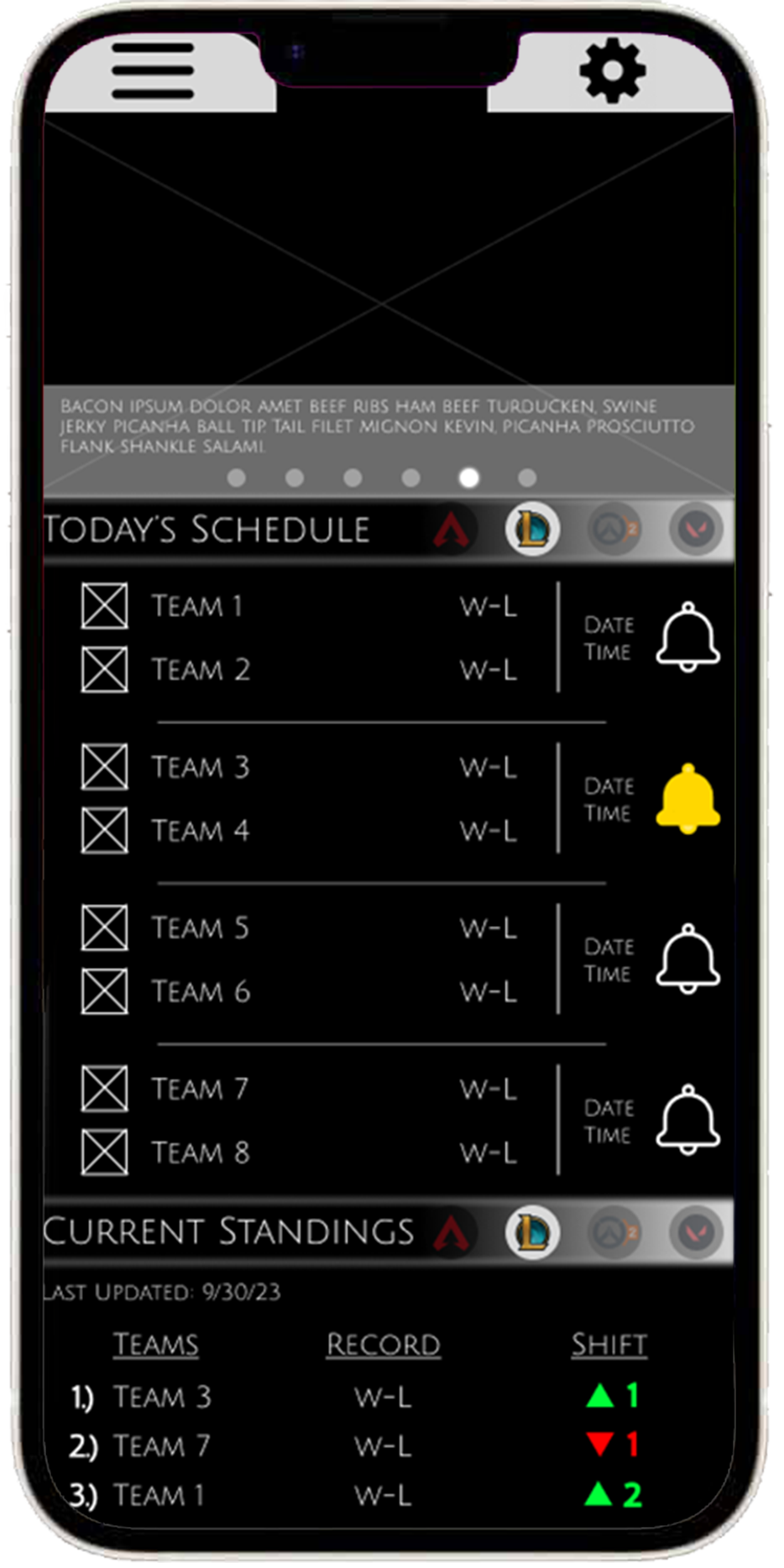
Wireframe

Lo-Fi Mockup


