
Project Description
My redesign of the iconic Mass Effects inventory was more than a stylistic change. Games have changed extensively since the release of the first Mass Effect. Though innovative and interesting at the time, players today are more focused on ease of use rather than stylistic differences.
So I took a more user-friendly approach to an inventory system. But in order to get from where Mass Effect left the inventory system to my ideal system, I needed research, modern competitive analysis, and a whole new design.

Research
User Interface Misses
The general information that the player needs exists in the UI. But that's not all an interface should do. Players shouldn't dread going into menus to do something that will happen thousands of times over the course of a playthrough. After playing the game and using the interface, I created a list of fixes to accomplish with my new design.
• Color Scheme
• Confusing Icons
• Awful Comparison User Interface
• Useless Detail Screens
• Haphazard Layout of Inventory
• Large Section for little Information
Competitive Research
Monster Hunter: World
Monster Hunter has always done a fantastic job condensing vital information and making it palatable. Monster Hunter: World was no exception. These are some of the aspects I wanted to employ in the Mass Effect inventory redesign.
Takeaways
• Small inventory
• Equipment shown based on a chosen section
• Status and stats are shown with equipment
• Awful comparison user interface
• Robust sorting criteria
• Tutorial and tip screen
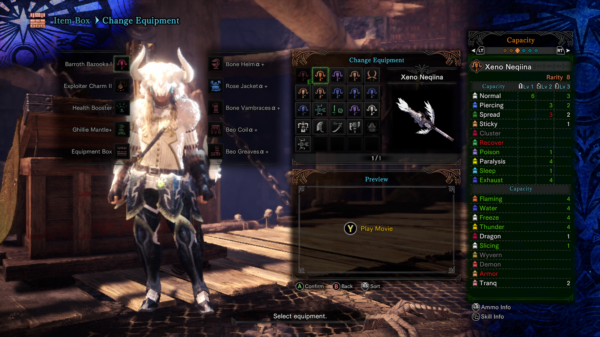
Monster Hunter: World - Change Primary Equipment + Capacity
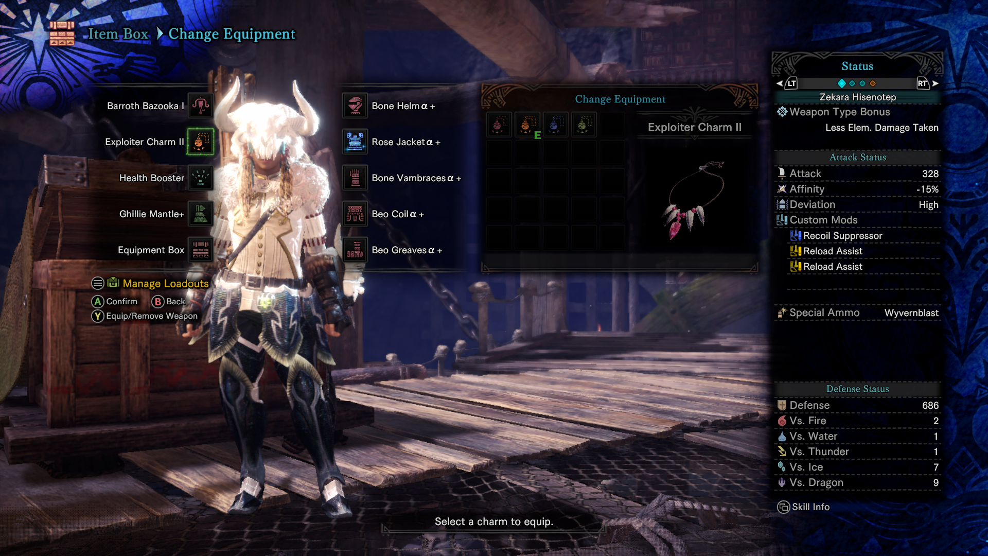
Monster Hunter: World - Change Necklace + Status
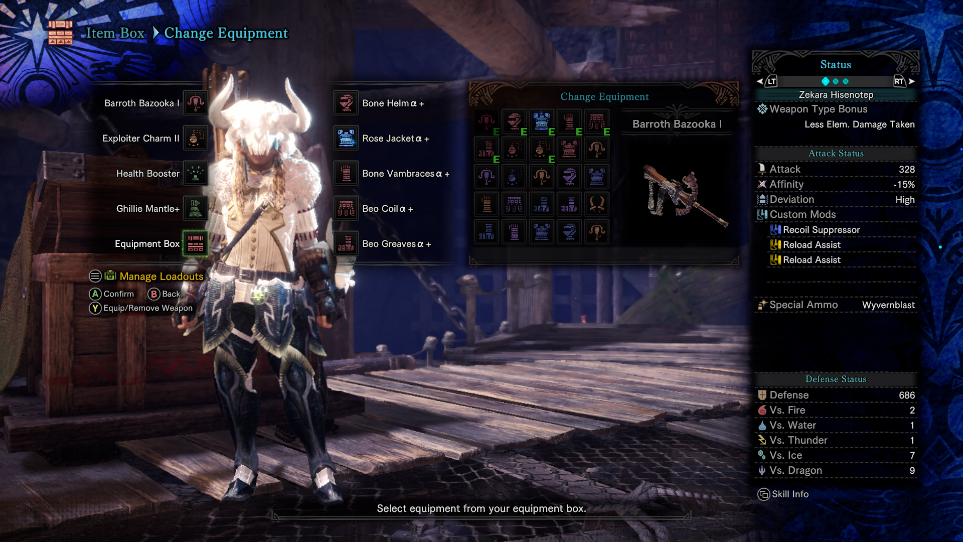
Monster Hunter: World - Equipment Box + Status
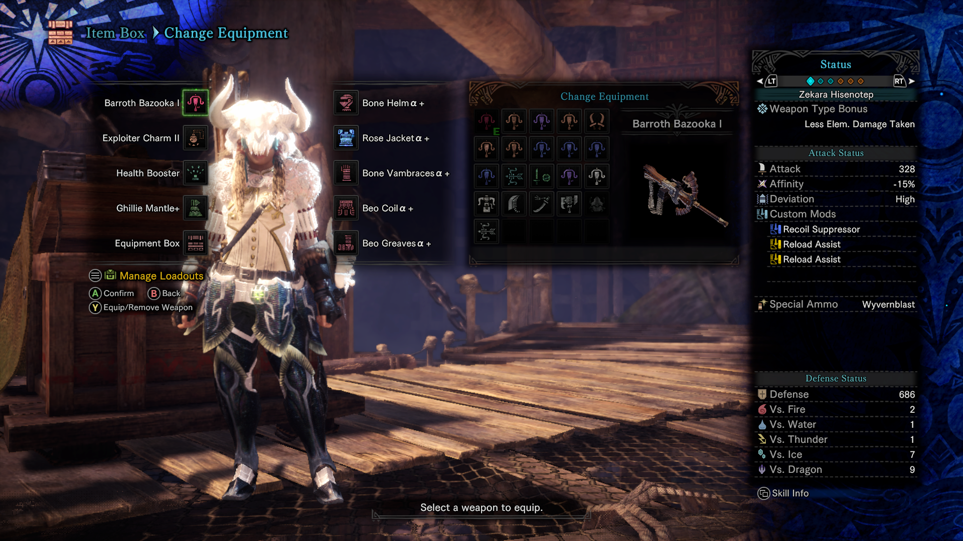
Monster Hunter: World - Change Primary Equipment + Status
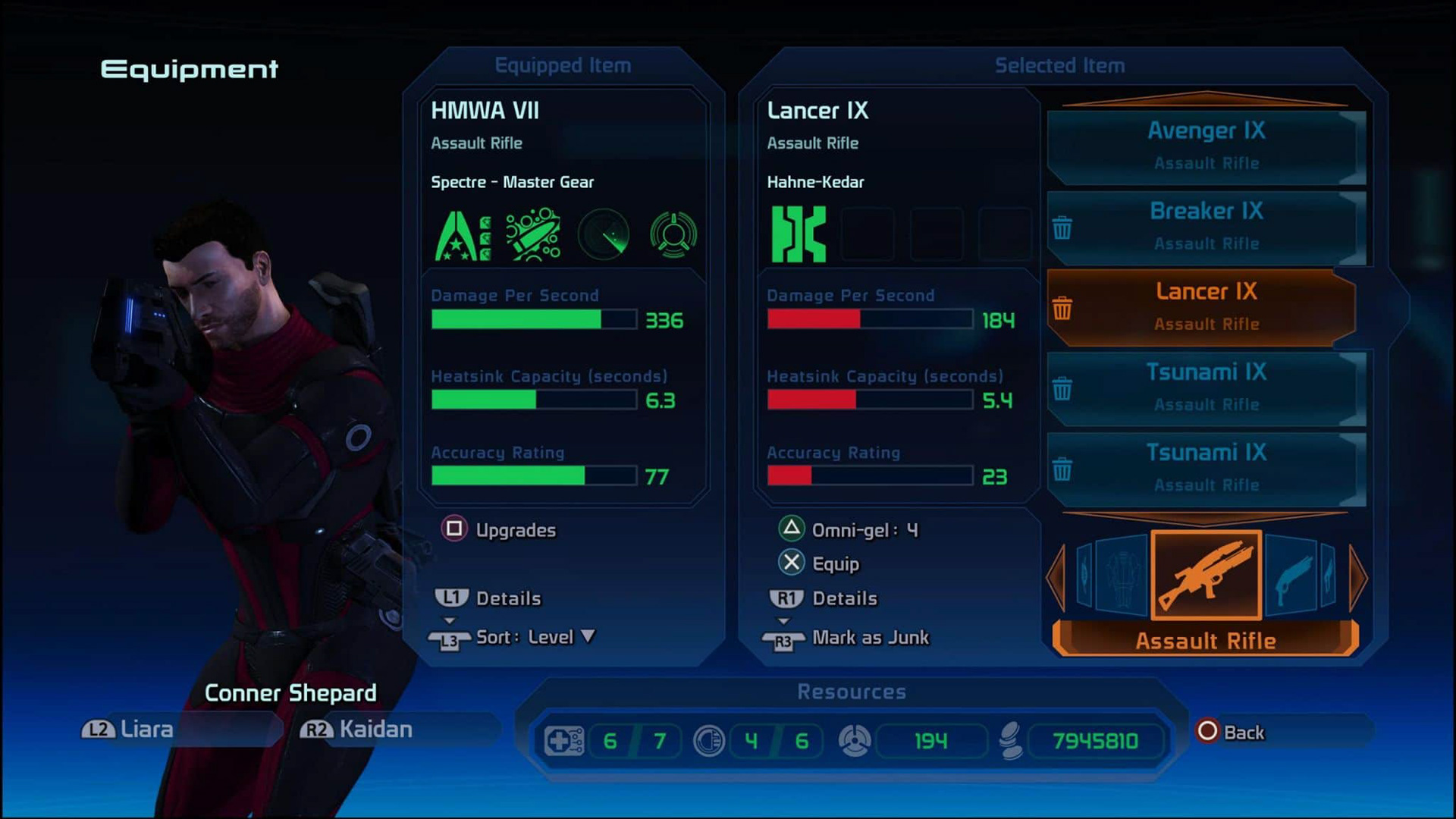
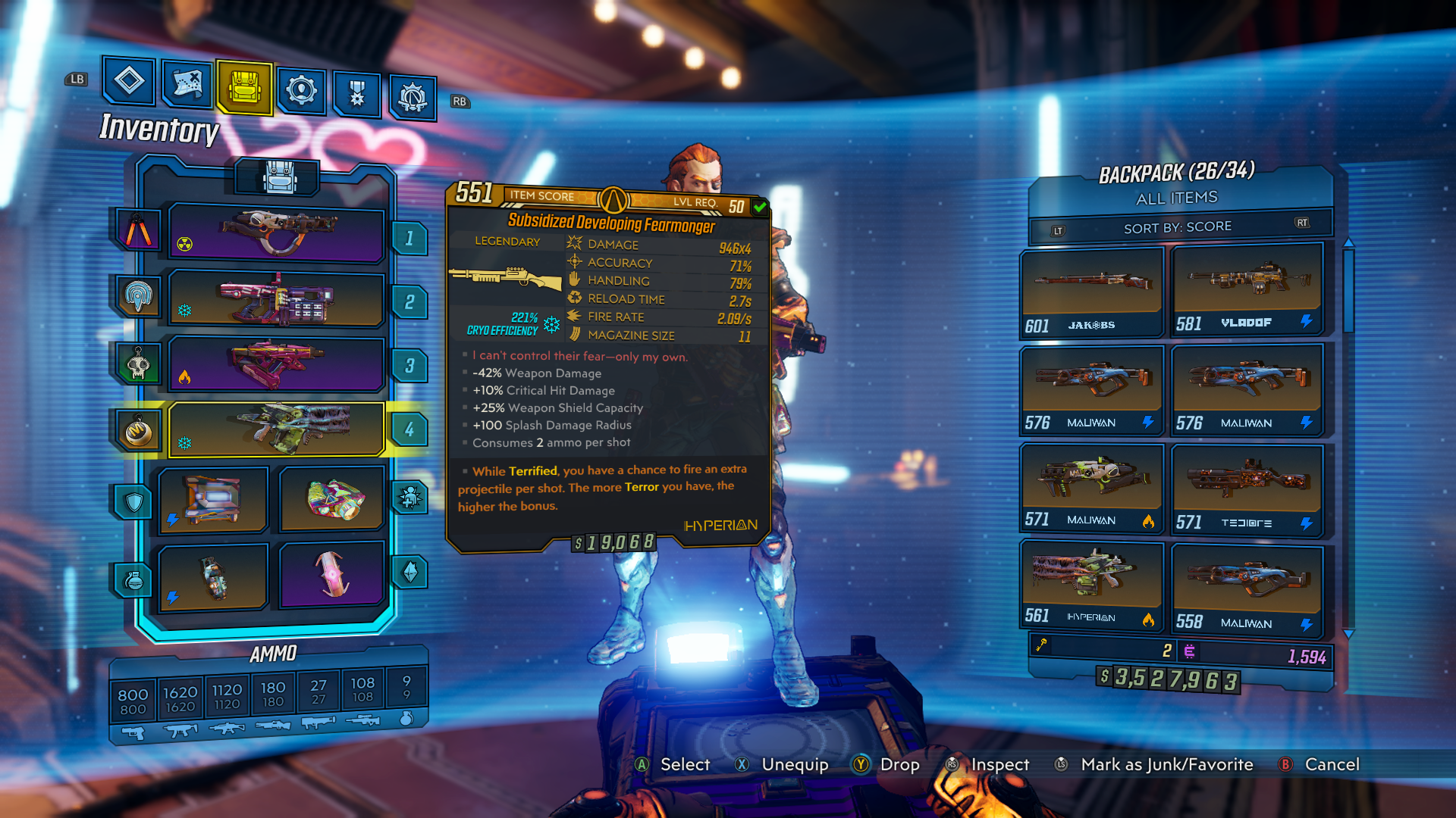
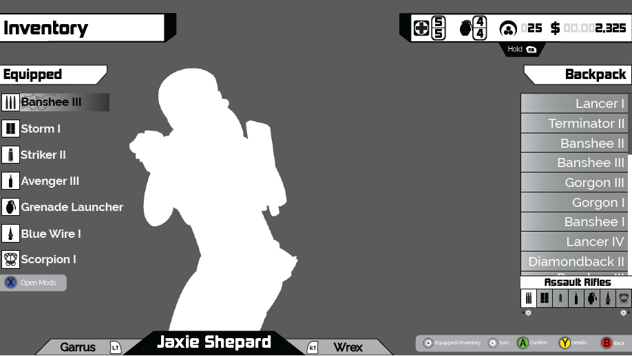
Borderlands 3
Borderlands often takes its sci-fi designs and utilizes a diegetic UI to make the menus fit the theme. Borderlands follows suit and enhances the inventory system of the previous games.
Takeaways
• Equipped/Inventory on different halves
• Player showcasing weapon
• Hovering gives more details
• Formatted money
• Detailed sort methods
• Concise weapon details
• Button inputs next to applicable sections
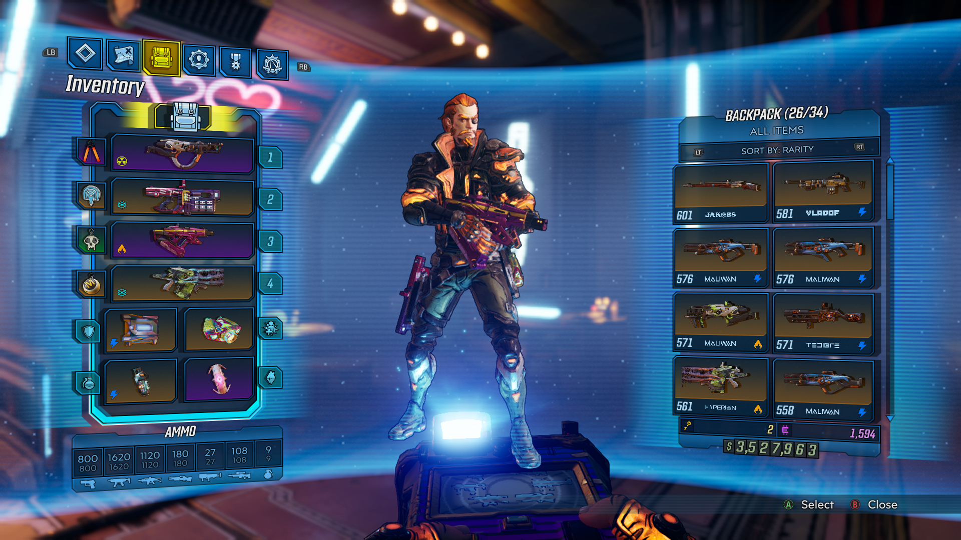
Borderlands 3 - Full Inventory + Rarity Search
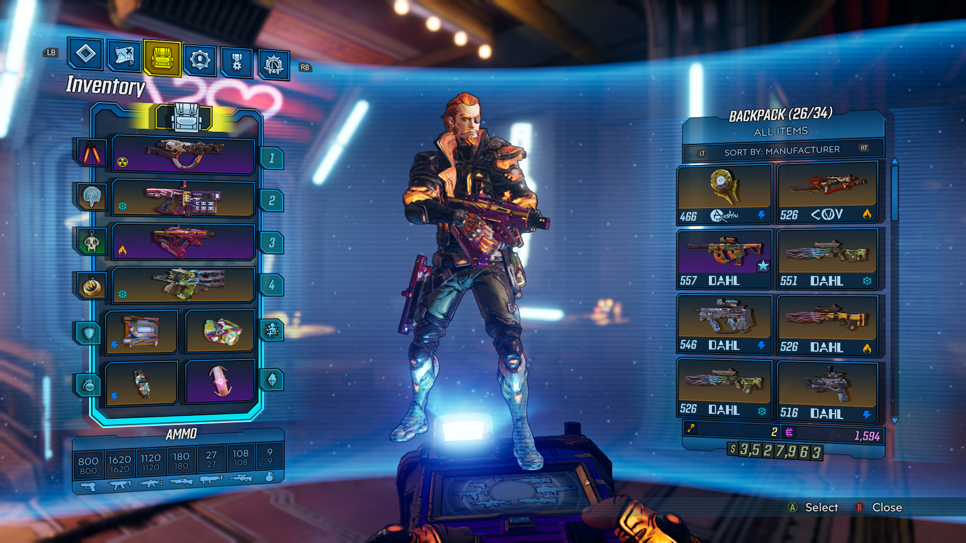
Borderlands 3 - Full Inventory + Manufacturer Search
Borderlands 3 - Weapon Stats + Score Search

Borderlands 3 - Inactive + Score Search
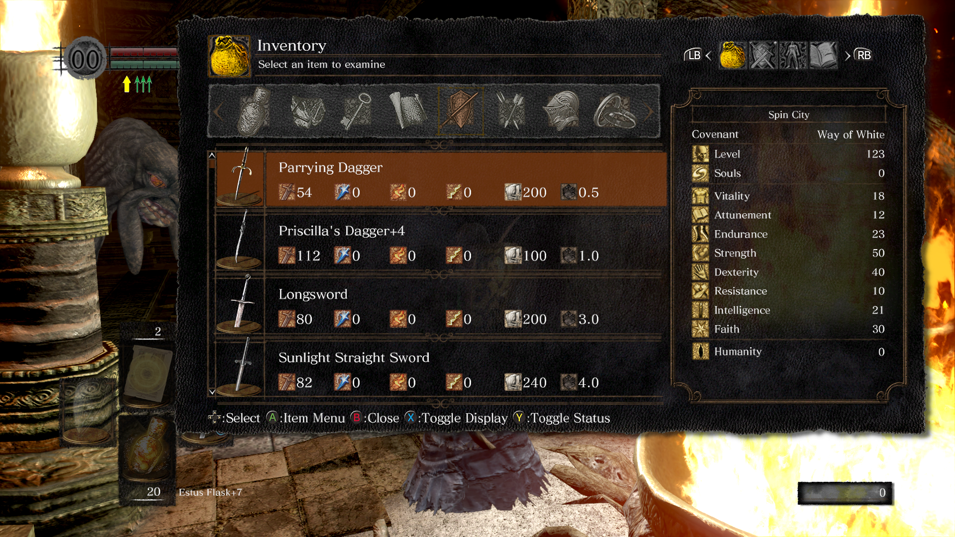
Dark Souls: Remastered
The Dark Souls UI leans heavily on recognizable icons and iconography. The belief in "if it isn't broke, don't fix it" works well, and proven ideas can be refitted for a variety of situations.
Takeaways
• Easily Recognizable Icons
• Differentiating Colors to show changes
• Usable Equipment is shown in all white
• Various defense types are shown next to the armor
• Inventory Sections are shown by icon
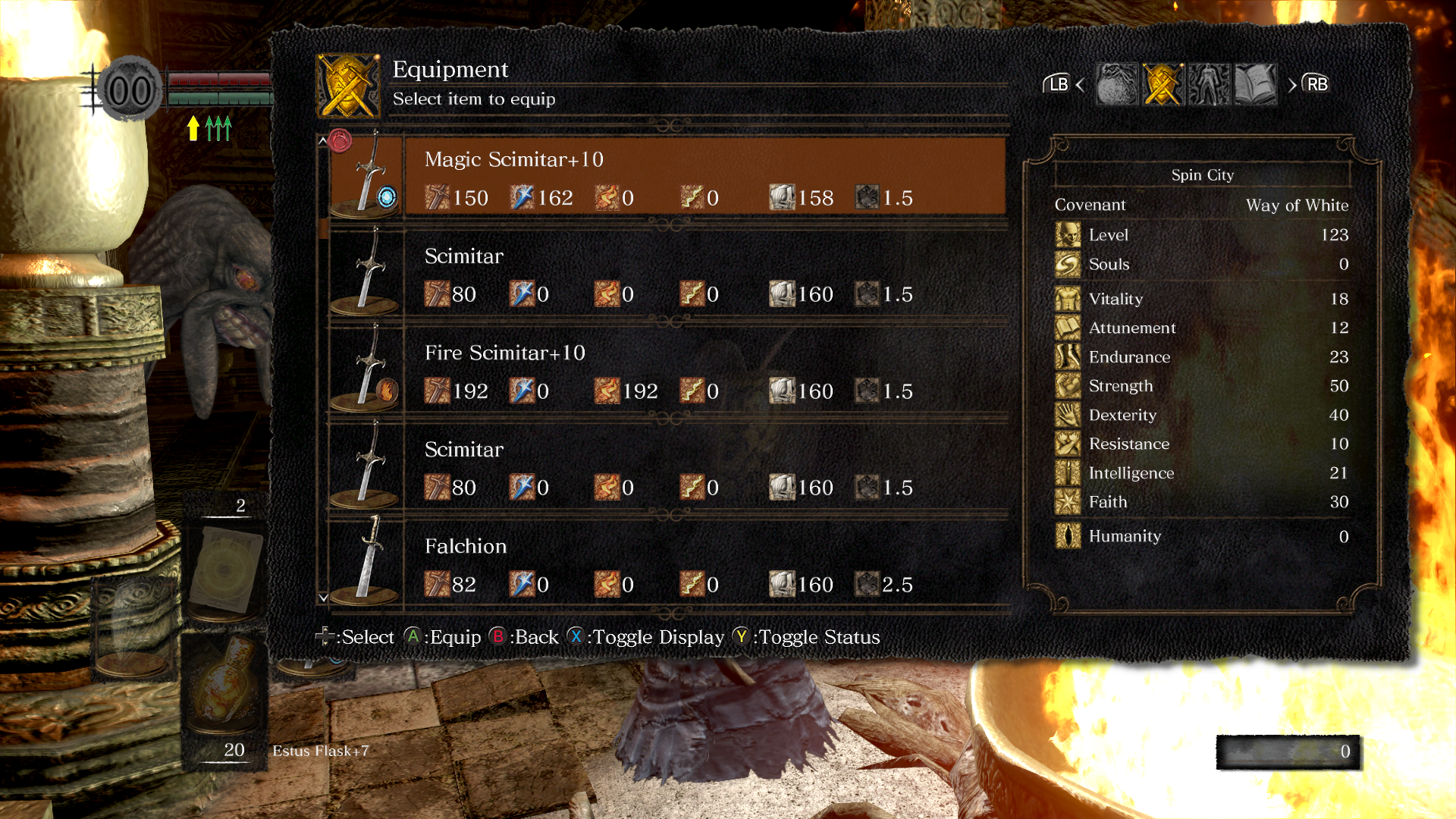
Dark Souls: Remastered - Equip Primary Weapon + Character Stats
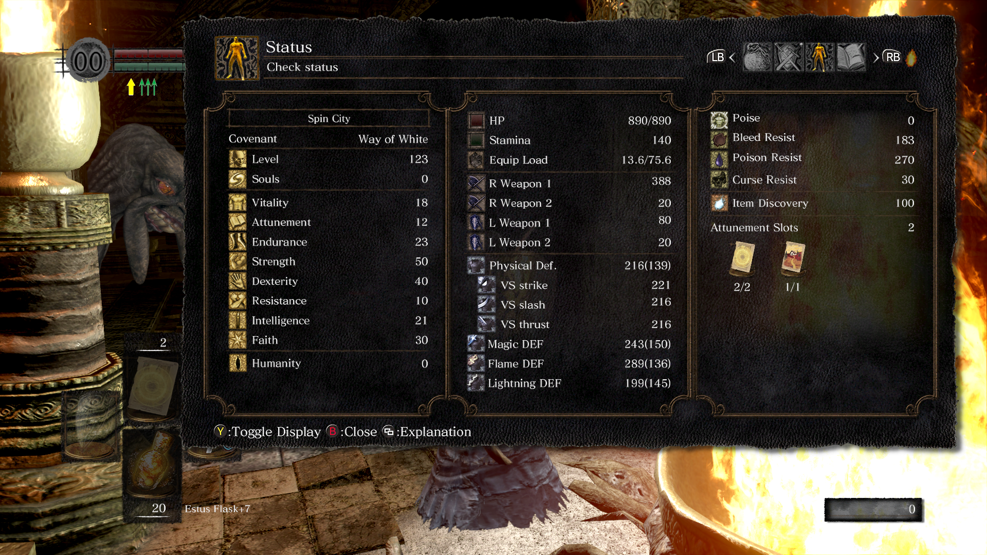
Dark Souls: Remastered - Full Character Stats
Dark Souls: Remastered - Weapon Inventory + Character Stats
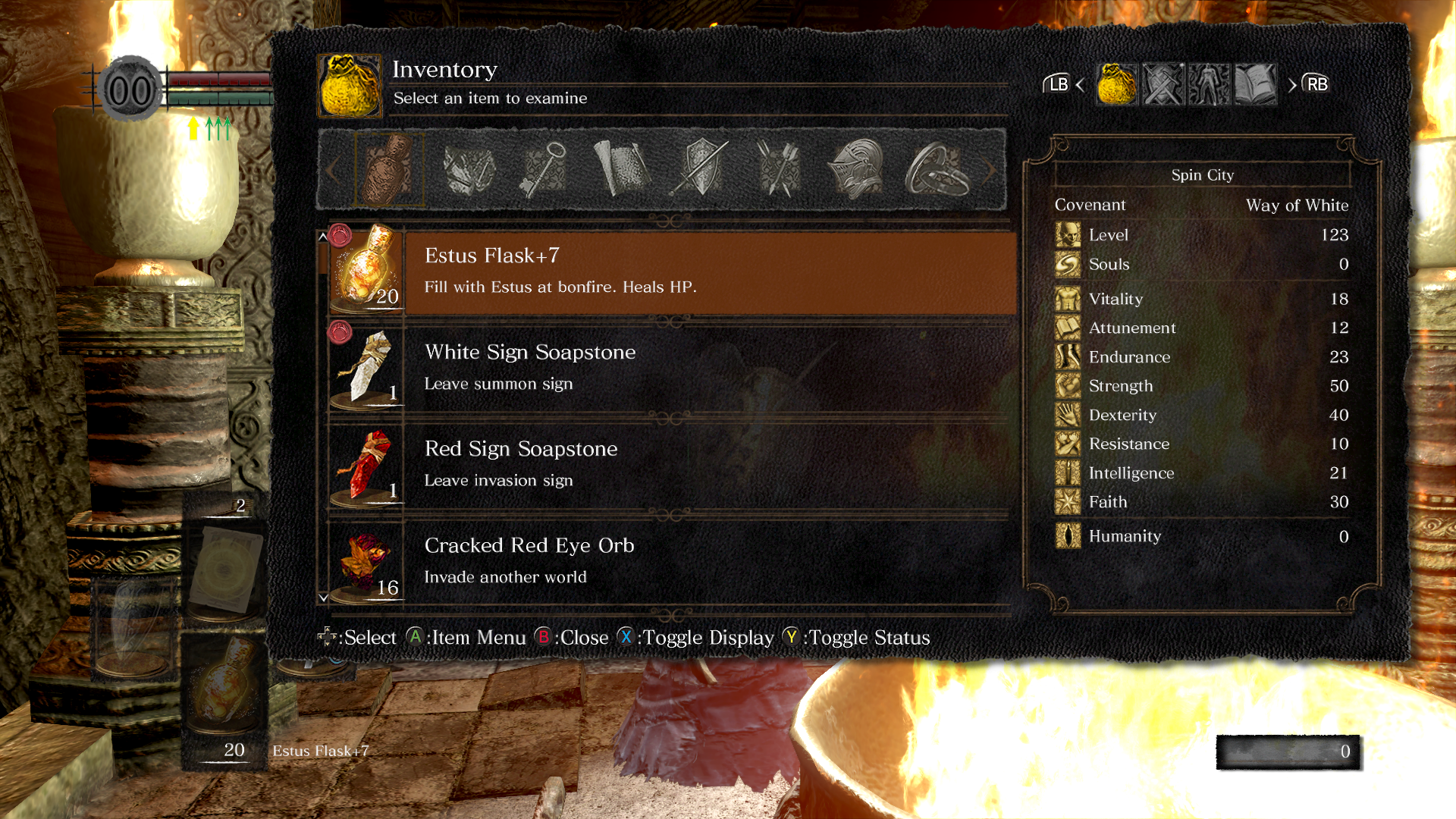
Dark Souls: Remastered - Item Inventory + Character Stats
Fallout: New Vegas
Another heavy hitter in the diegetic UI is Fallout: New Vegas. Lauded the best in the Fallout series, the player in the series is always accompanied by a Pip-Boy. This Pip-Boy is the UI for equipment, health, and quests.
Takeaways
• Separated Sections for Items and Equipment
• Image of Weapon and Stats on hover
• The control scheme is the same anywhere in the menu
• Usable Items Effects Explained
• Strong Aesthetic Menus
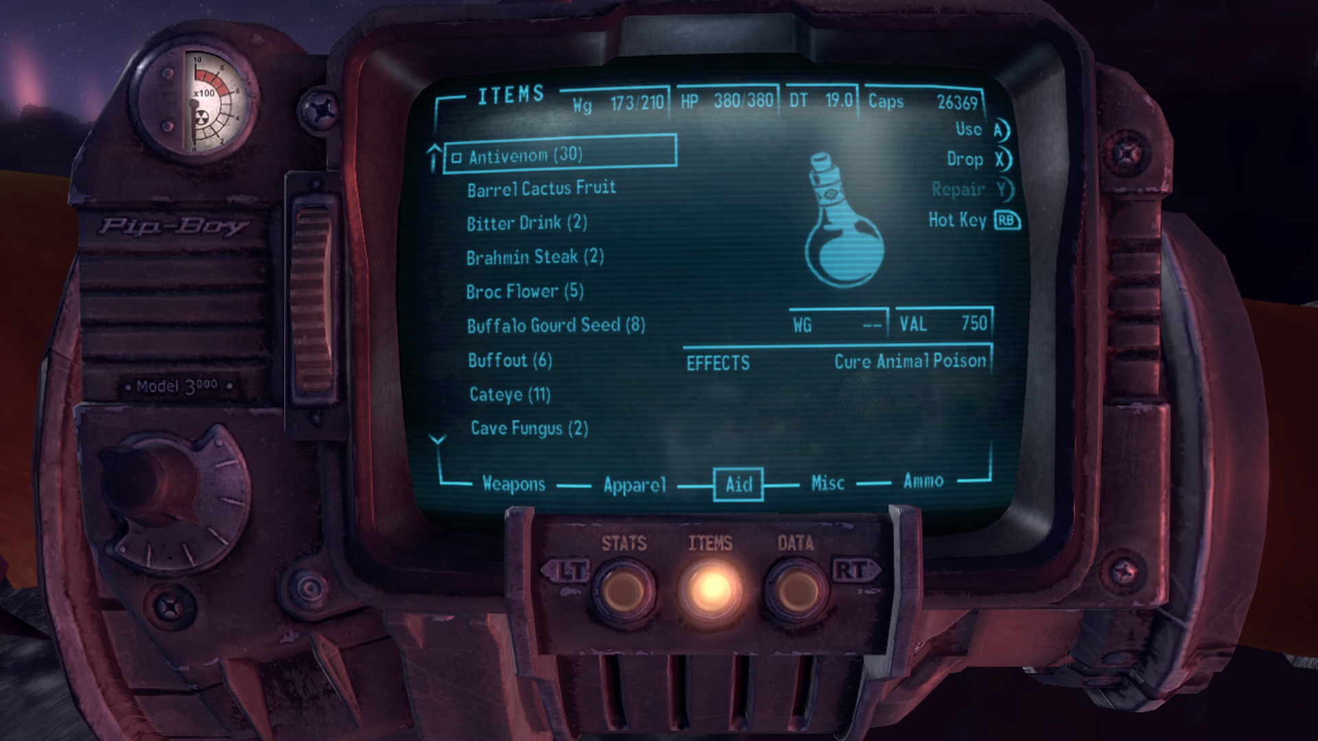
Fallout: New Vegas - Aid Inventory + Character Vitals
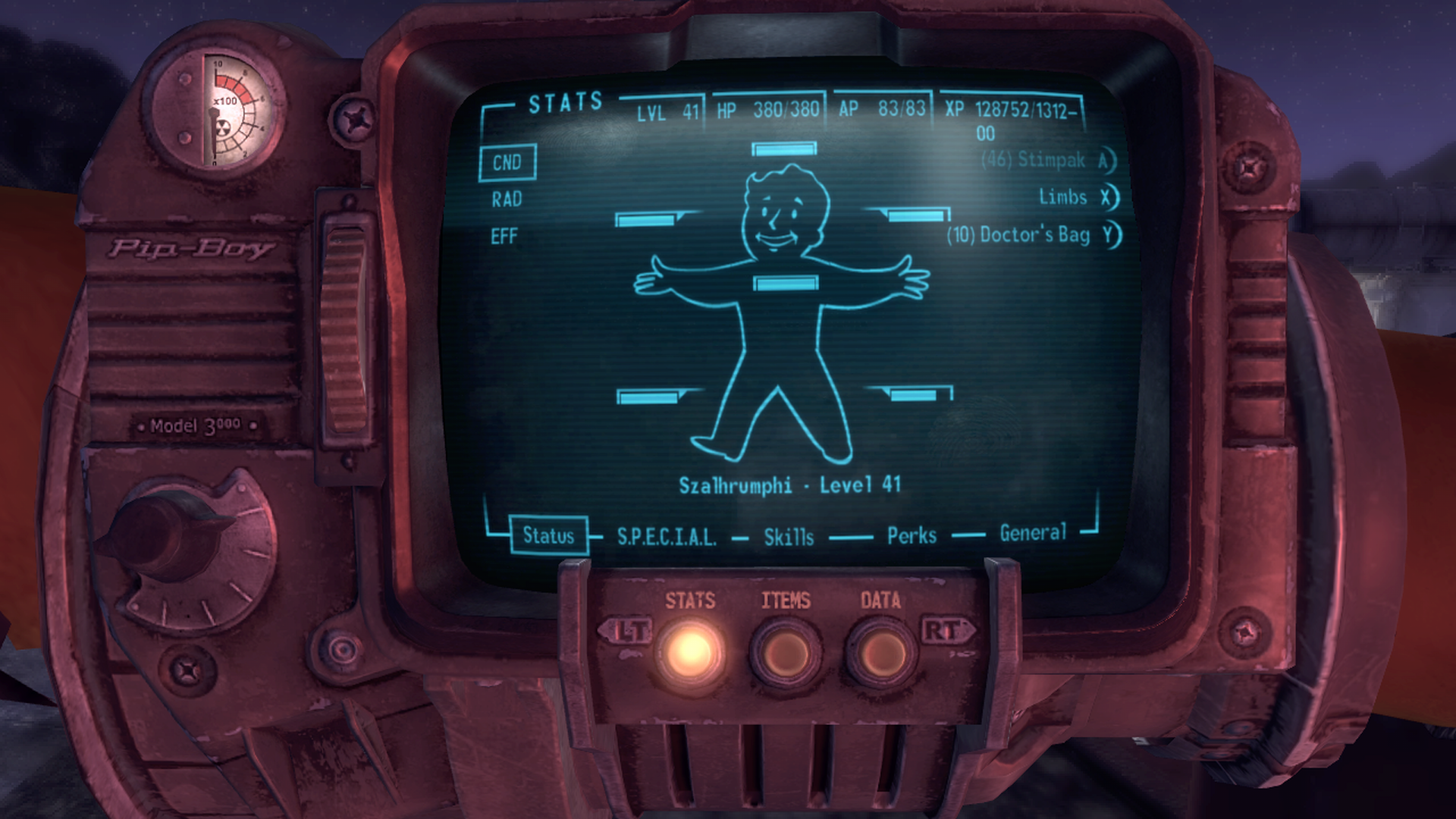
Fallout: New Vegas - Limb and General Health

Fallout: New Vegas - Character Stats + Character Vitals/Exp

Fallout: New Vegas - Weapon Inventory + Character Vitals
Early Designs
Mid-Fidelity Wireframes
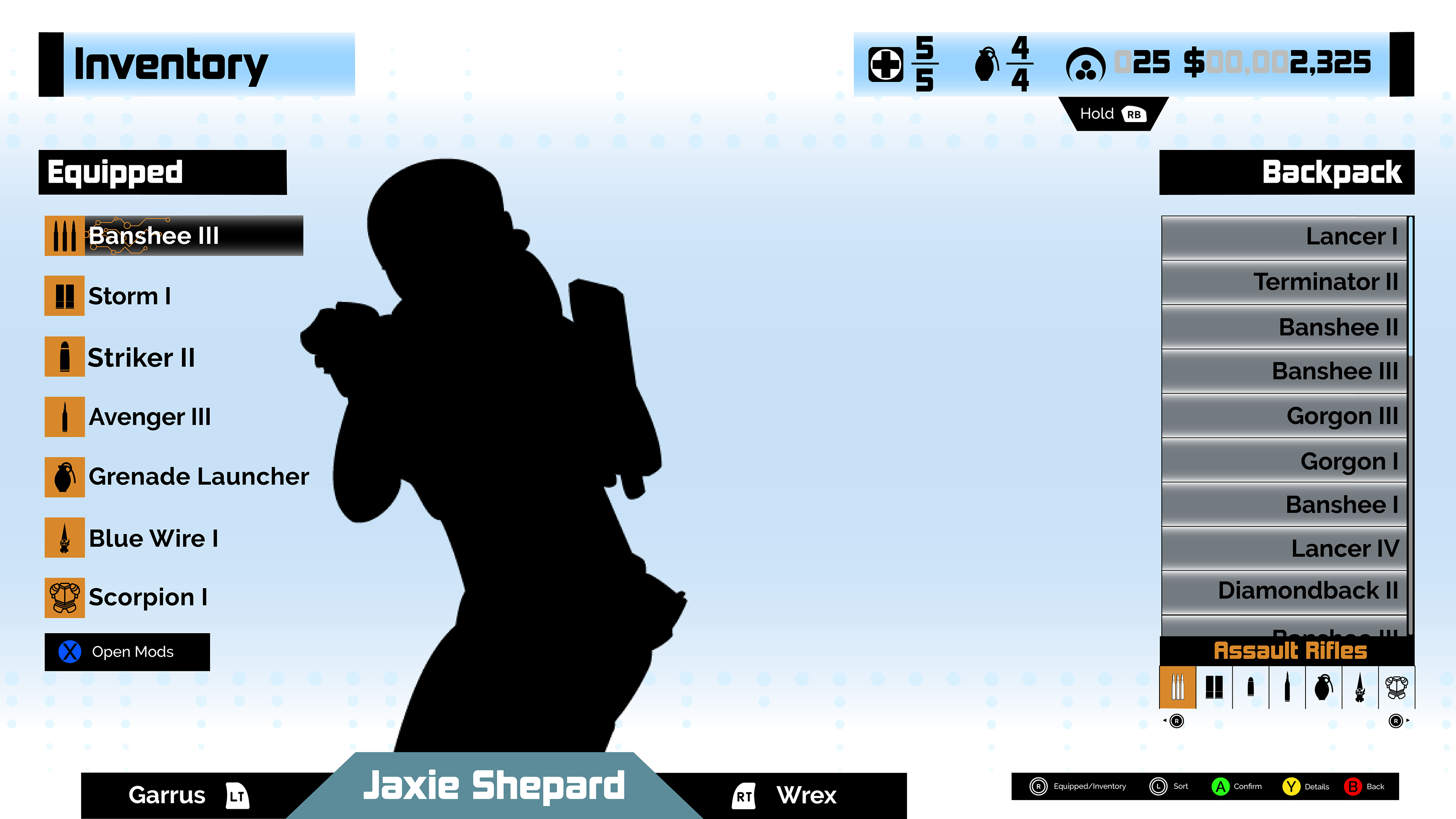
The preliminary designs allowed me to settle on my placement of vital information for the player was visible and easy to locate. Taking a few ideas from the competitive analysis, I shifted the original design closer to modern standards. I also wanted to make sure that the information presented was easily accessible.
• Inventory on both sides of the screen allows for weapon stats and the character model.
• Inventory is clearly labeled for equipped and backpack.
• Each weapon/armor is broken up by the type of weapon/armor.
• The control scheme for using the inventory is also plainly posted.
• The finite resources are shown with upper limits in the upper right corner.
Styleguide
The style guide was essential for the entirety of the redesign. And that is because I wanted to keep the original idea of Mass Effect, but also expand on some ideas that weren't implemented in the original design.
• Text Hierarchy
• Color Palette
• Iconography
One aspect that was left lacking was the use of text in the original design. The hierarchy of text in the original design is lacking in definition. There are places where the text blends with other sections of text because they look similar. So by introducing another font, it adds a layer of difference in important and general information.
Another lacking aspect was the color palette employed by the original Mass Effect. The contrasting red, blue, green, and orange works in the short term. But the player will be looking at it hundreds of times throughout a playthrough. The accessibility of those colors doesn't work well because most colors have the same saturation.
The last focus I wanted to recreate was the iconography. It is difficult for players to figure out symbols they are not used to. The different icons for health, grenades, weapon types, and weapon modifications are odd and not instantly recognizable. So removing the unfamiliar aspect allowed me to focus solely on having recognizable icons that could be understood at a glance.

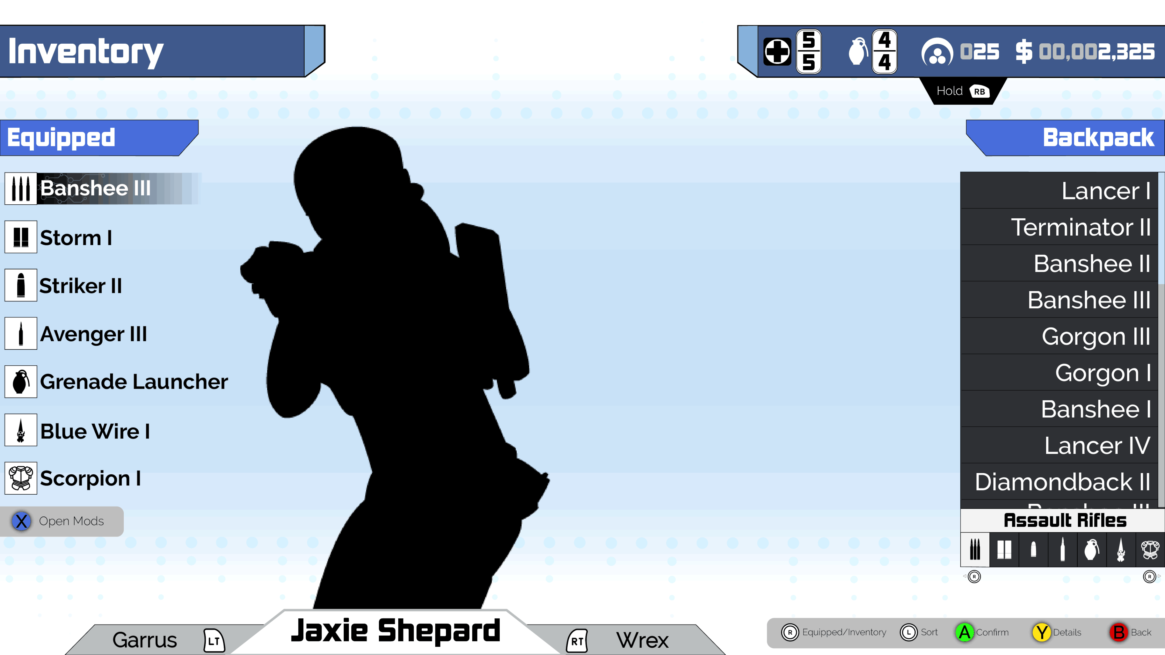
Final Designs
With the final designs, I finally saw my knowledge and tenacity come to fruition. The contrast was strong enough to stand out for what was highlighted. For an added thematic touch, I also set up a color shift of the design based on the route that the player was following. if the user was going the paragon route, it would look like the screens to the right. But there is also a darker version that centers on more blacks and maroons if the user was going the renegade route.
But the redesign solved the problems we set out to fix. The color scheme was updated to be more accessible for a wider range of people including those with ranges of color-blindness. The iconography was overhauled to be easier to understand. The detail screens were removed instead of adding minor information with useful stats. The inventory is easier to maneuver as well. But the biggest takeaway was throwing the large section reserved for the name of the weapon for more breathing room in the design.
Final Design: Primary Assault - Hover

Final Design: Backpack Assault - Comparison
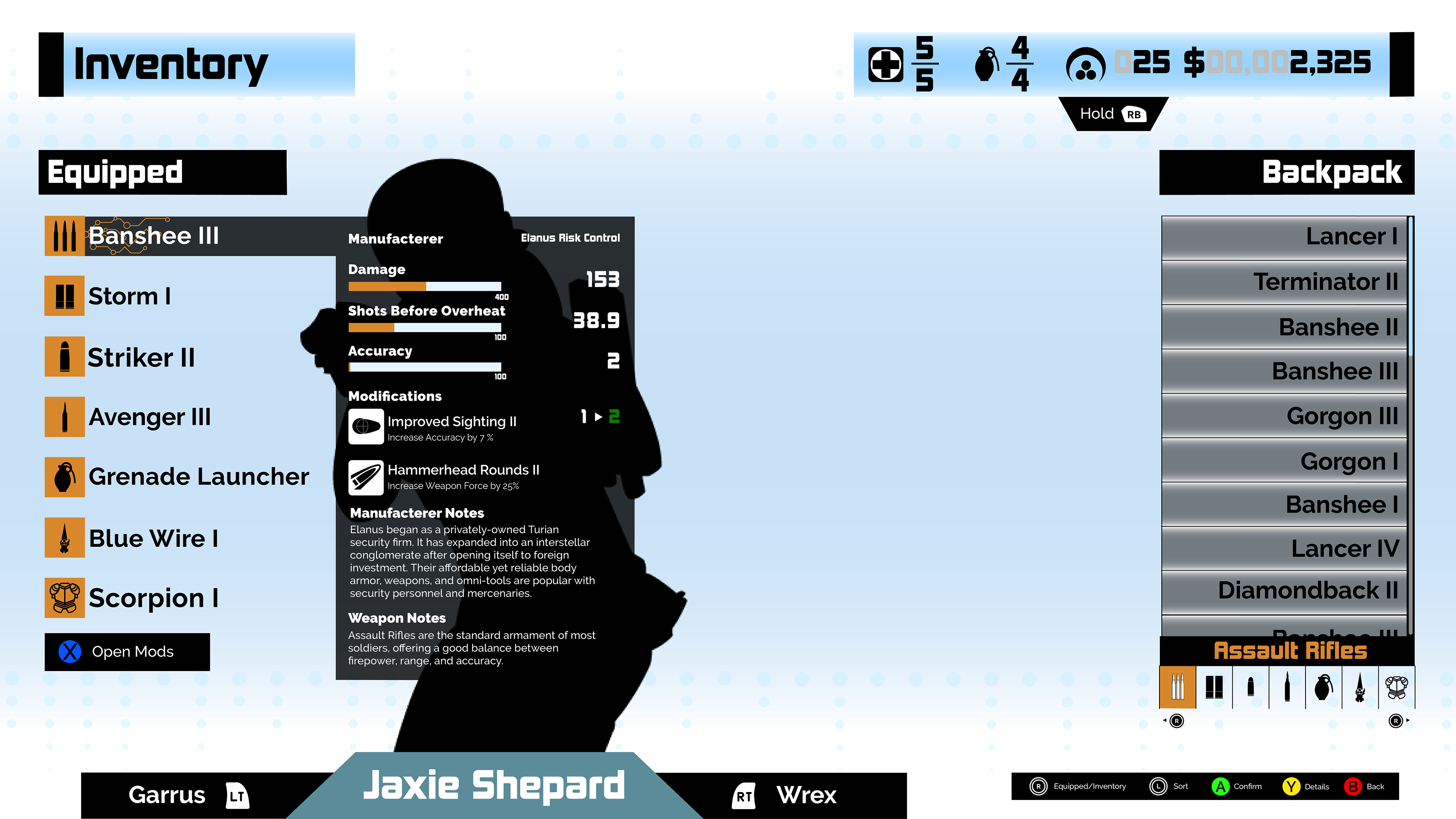
Final Design: Primary Assault - More Info

Final Design: Backpack Assualt - More Info
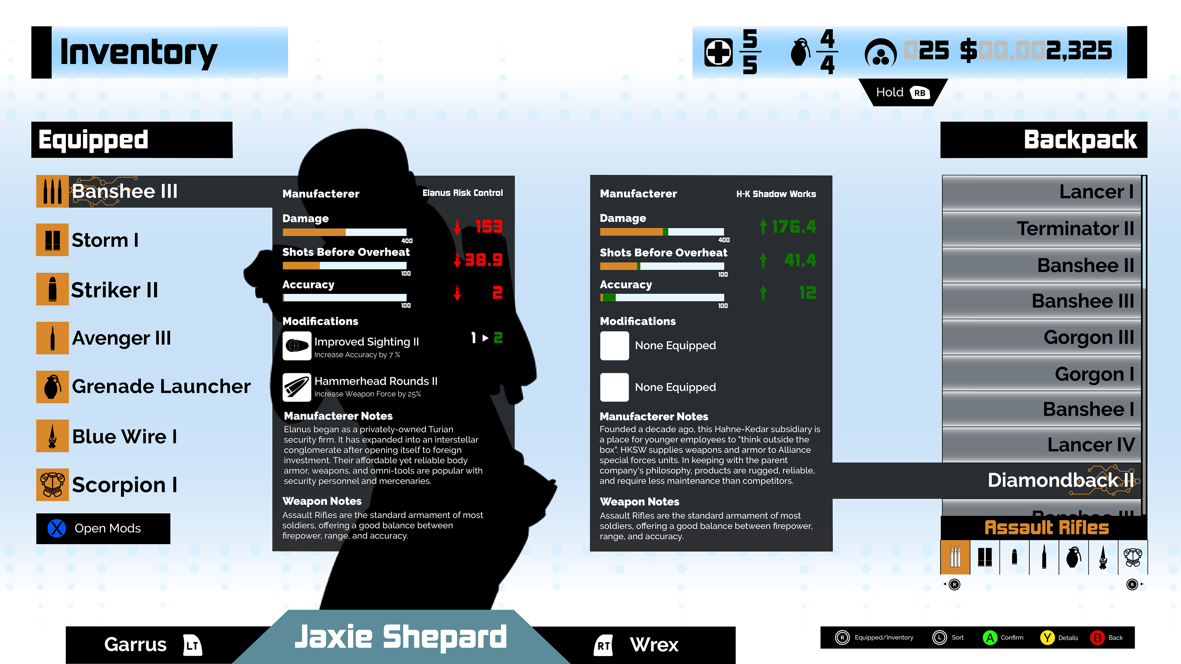
Final Design: Weapon Comparison
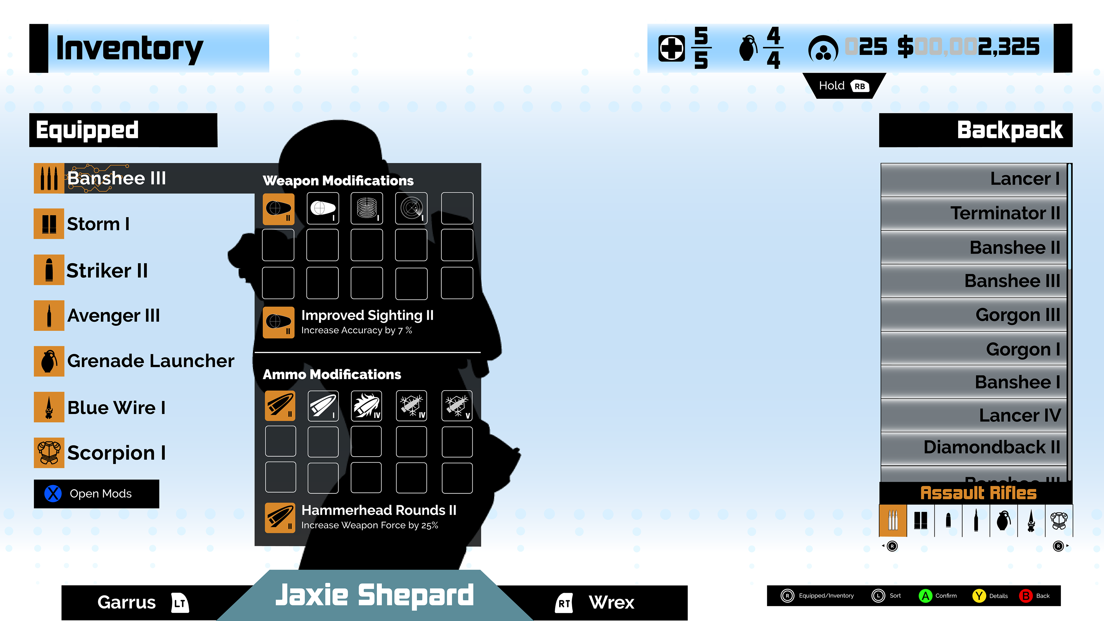
Final Design: Weapon Modification

Final Design: Renegade | Primary Assault - Hover
Post Mortem
This project was the first time for me to shift an existing design into something modern and fresh. The realization that games have come a long way in regards to accessibility made me ecstatic. As a community, we have focused on allowing more people the ability to play more games. Learning what was acceptable for good UI in the mid-2000s and being able to see what needed to be changed was a confidence booster. It was a sign that showed that I was able to perceive the good, the bad, and the ugly when it came to interfaces. That realization coupled with my newfound love of style guides and accessibility made the Mass Effect inventory redesign a worthwhile project.