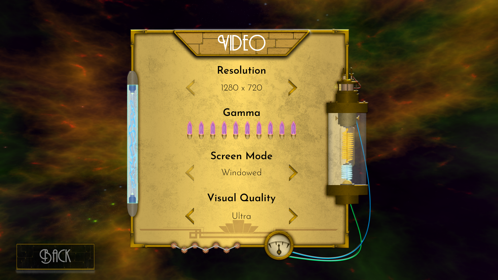
Horizon Bebop is the project that comes from an infatuation with space westerns like Cowboy Bebop and a passion for rhythm games that has long since been removed from the forefront of gaming. A rhythm game that draws from steampunk designs coupled with the flamboyant, decadent style of Art Deco. When put together, the two extreme design styles meld into a world exploding with personality, flair, and grunge.
Horizon Bebop Logo
Project Description
Horizon Bebop is a rhythm game in which players attempt to evade capture by going on an adrenaline-fueled, heart-pumping speed chase throughout various interstellar highways while listening to their favorite songs. This space western police evader rhythm game encompasses the troubles of pushing a tankard to its limits and the pressure of not keeping calm amidst all of the chaos while driving.
Research
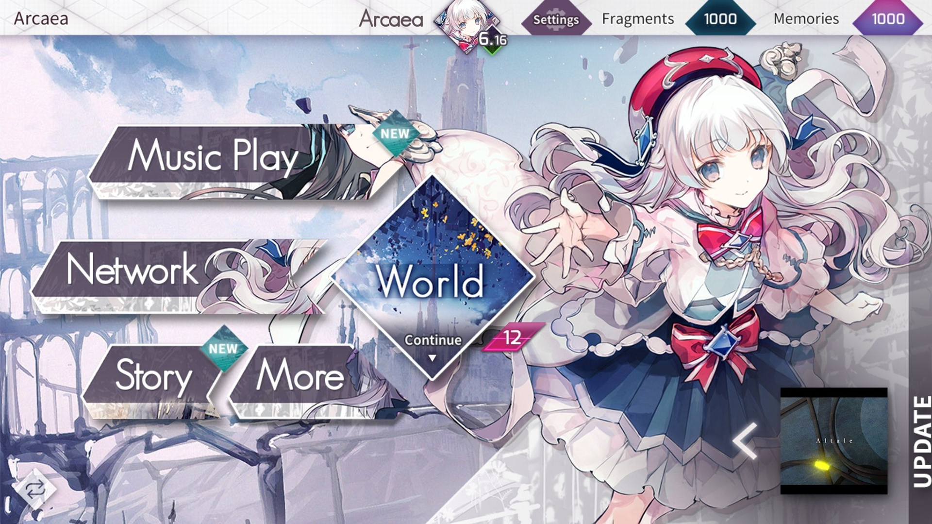
Arcaea Main Menu

Audio Surf 2 Main Menu
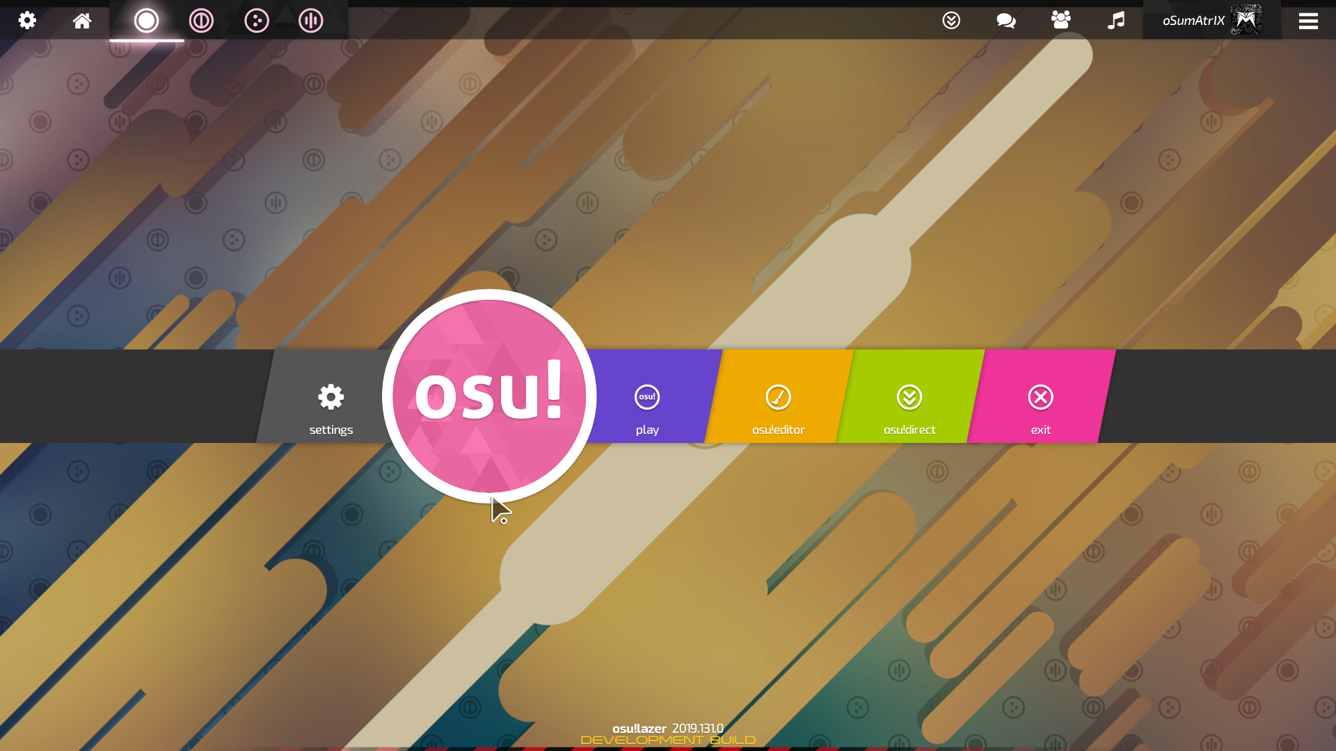
Osu! Main Menu
The research started as an umbrella. Starting with just rhythm games, there was a rabbit hole of clones and fan games that rose to the forefront depending on their popularity. But what I wanted to draw from was not just any rhythm game. I wanted to pull from games with very stylistic and deliberate designs to sell the world they were set in whether the style was cartoonish, pixel, or sleek. This allowed me to not only see successes but the shortcomings of certain designs as well.
Competitive Analysis Takeaways
Osu!: Great Space Economy + Accessible Menus
Arcaea: Sleek Design + thematically/mechanically cohesive
Audiosurf 2: Sci-Fi Design Balance + Information Balance
Technology and Tools

Adobe Illustrator

Adobe InDesign

Adobe XD

Lucid Charts
Adobe Illustrator
I used Adobe Illustrator for the bulk of the graphical elements. The use of vectors for buttons and icons made it easier to shift design quickly and efficiently. I also worked in Illustrator for the clean lines and geometric aspect that comes with using the pen tool in combination with various shapes and blends.
Adobe XD
Animations were new for me in XD. Adobe XD is great for wireframing and prototyping because it is quick to iterate on designs. However, working with different states made the animations challenging but rewarding. Learning and mastering how to utilize rotations and z-movement allowed me to bring the UI to life.
Adobe InDesign
In order to keep my process easy to follow and disseminate, I created a process book to show stages of development and research. InDesign was indispensable for the ability to create templates to stretch across large documents. And being able to shift them to be useful for presentations was a bonus as well.
Lucid Charts
Lucid Charts was a very useful tool for making the flowchart for the game itself. Being able to catalog what would be happening behind the scenes was a challenge. But it was worthwhile to see the full map of the project I was going to be pushing to engineers down the line. And anything I can do to make the pipeline easier to manage I will do.
Flow Charts
I have a habit of really taking time to plan out the different actions the users can take. By knowing all the actions you plan to implement. You can decide the amount of state changes, menus, and user interfaces that need to be created overall.
This keeps you on track for the entirety of the project. Having a definitive list made my job of creating the menus easier than ever.
Full Flow Chart for Horizon Bebop
Below is a closer look at the breakdown of the full flow chart.
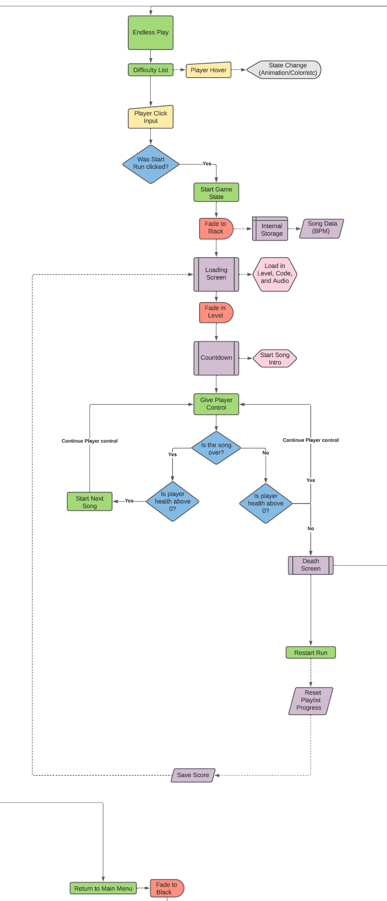
Endless Mode Flow Chart
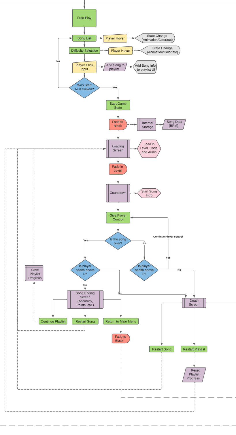
Free Play Flow Chart
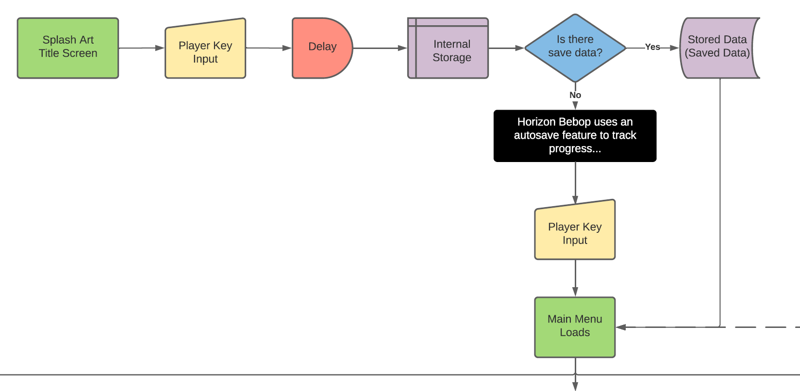
Title Screen Flow Chart
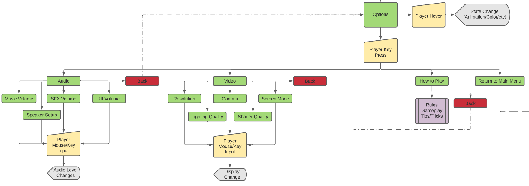
Settings Flow Chart

Campaign Flow Chart
If the flow charts were a bit much, fear not. Below is a breakdown of the Main Menu.
Main Menu Breakdown
Campaign
1.) Save Slot Selection
2.) Mission Selector
3.) Mission Brief/Video
4.) Mission Start
Endless Play
1.) Difficulty Selector
2.) Loading Screen w/ Run Information
3.) Run Start
Free Play
1.) Playlist Selection
2.) Loading Screen w/ Playlist and Current Song Information
3.) Run Start
Settings
1.) Audio
2.) Video
3.) How to Play
4.) Exit to Main Menu
Exit Game
Campaign
1.) Mission Length
2.) Score
3.) Lane/Note UI
4.) Item and Equipment UI
5.) Health and Anxiety UI
Endless Play
1.) Song Length
2.) Score
3.) Lane/Note UI
4.) Item and Equipment UI
5.) Health and Anxiety UI
Free Play
1.) Song Length
2.) Current Playlist Progress
3.) Score
4.) Lane/Note UI
5.) Item and Equipment UI
6.) Health and Anxiety UI
Sketching
Sketching allowed me to try to combine the idea of space westerns with the idea of Art Deco. I started with a base sci-fi idea and extrapolated upon it as I got deeper into my design process. This process stretched not just to the buttons and logo, but the menu itself. The creation of a niche type of "punk" led me to a lot of different angles that turned out to be dead ends. But that did not deter me from continuing the creative process to create something new that fit my exact style.

Preliminary Button Sketches
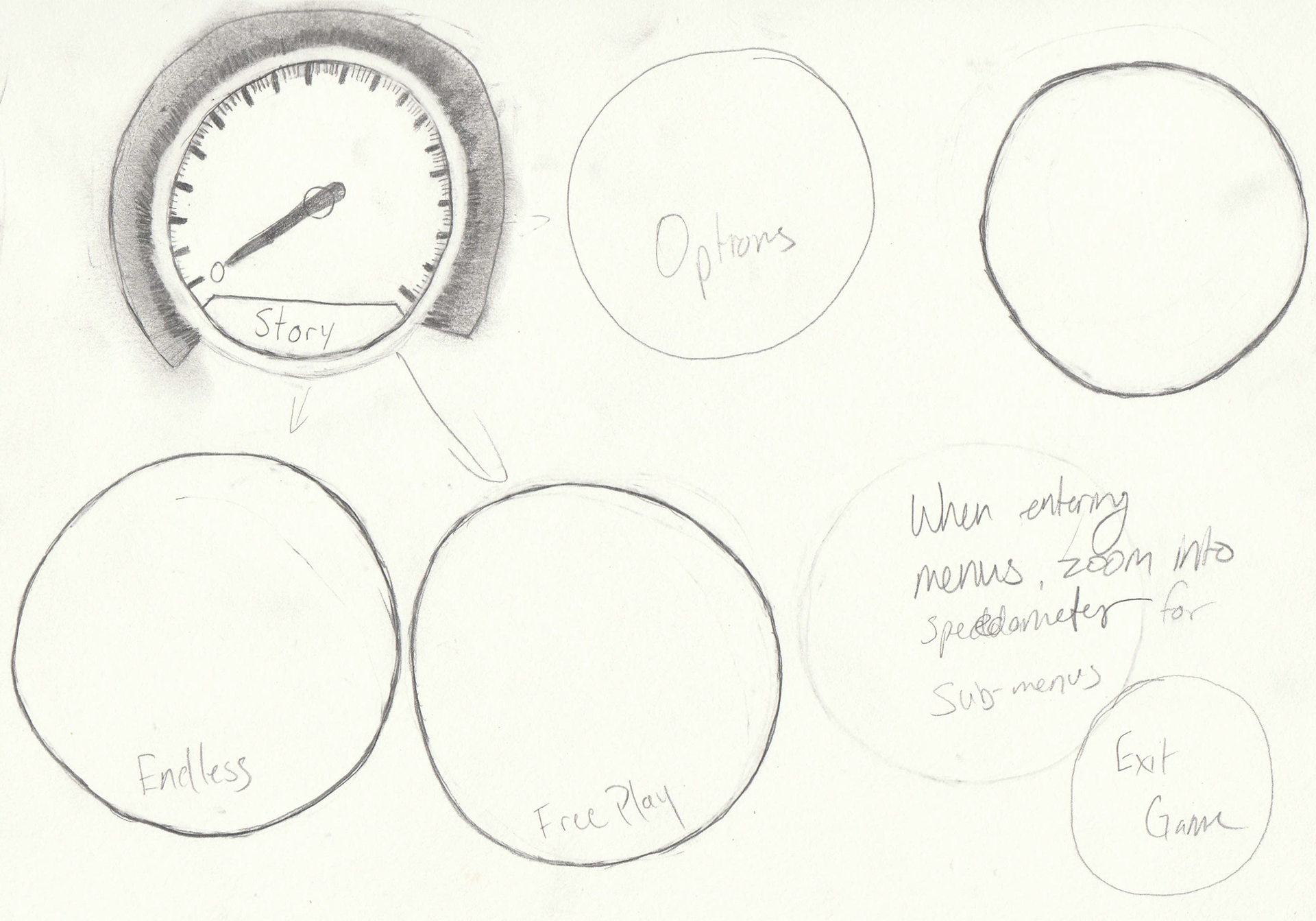
Preliminary Main Menu Sketch w/ Speedometer
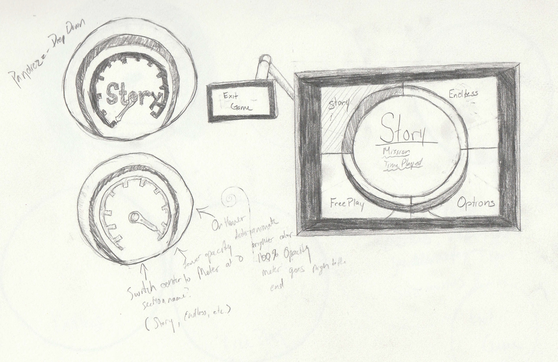
Preliminary Main Menu Sketch w/ Sci-Fi Screen
Wireframes
The base wireframes detail the simplicity that could come with a rhythm game. At its base, I found that rhythm games should allow the player to jump straight into the action without much delay. So I minimized the amount of menus. The game could quickly select songs based on a BPM that randomized a playlist for the player. This aspect was expanded upon with the inclusion of a Free Play mode.
The options menus were also designed to draw on either simplicity or simple symbols to push the design closer to the ideal style without compromising the ease of use for the player.
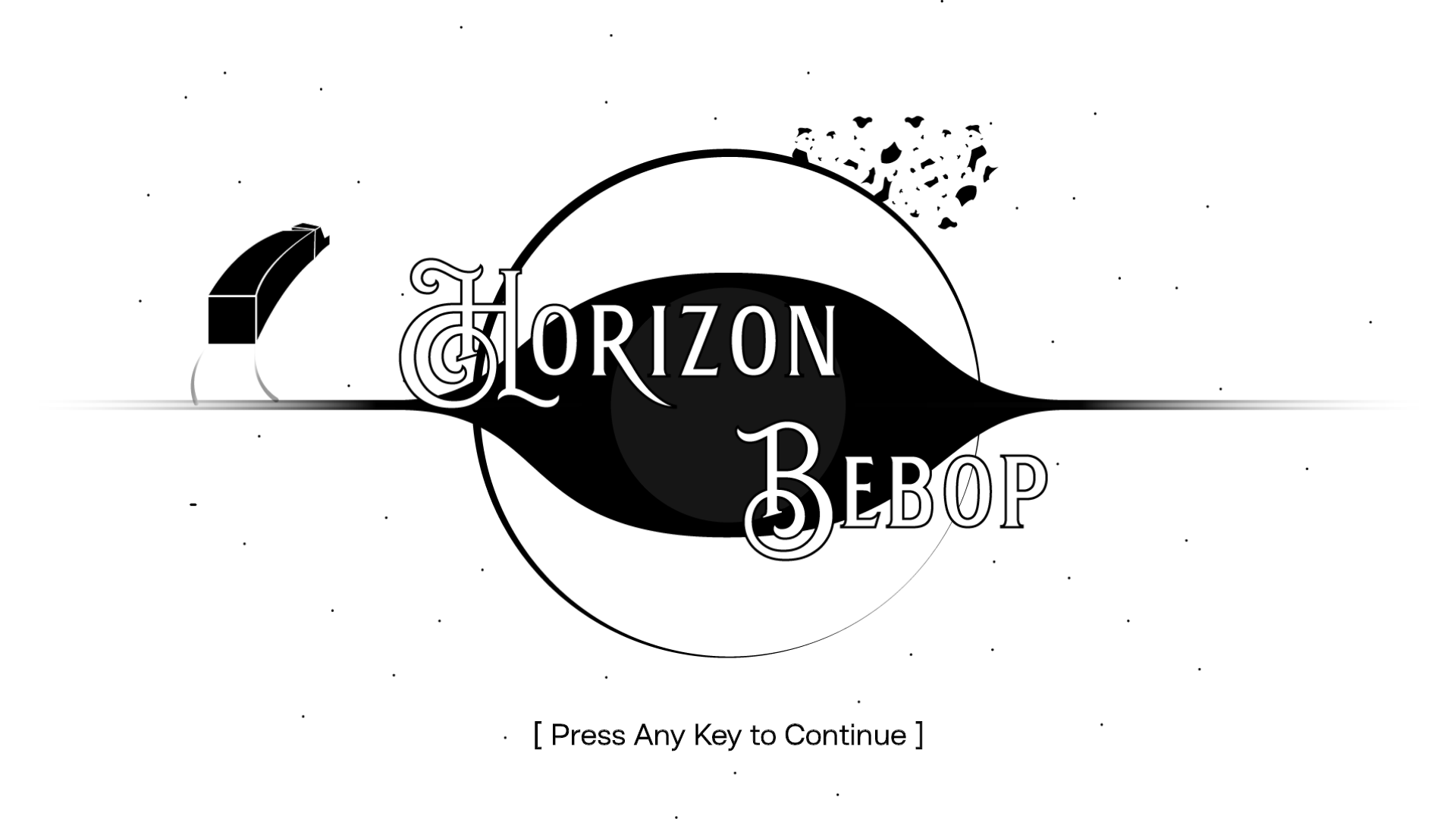
Wireframe - Splash Screen

Wireframe - Main Menu
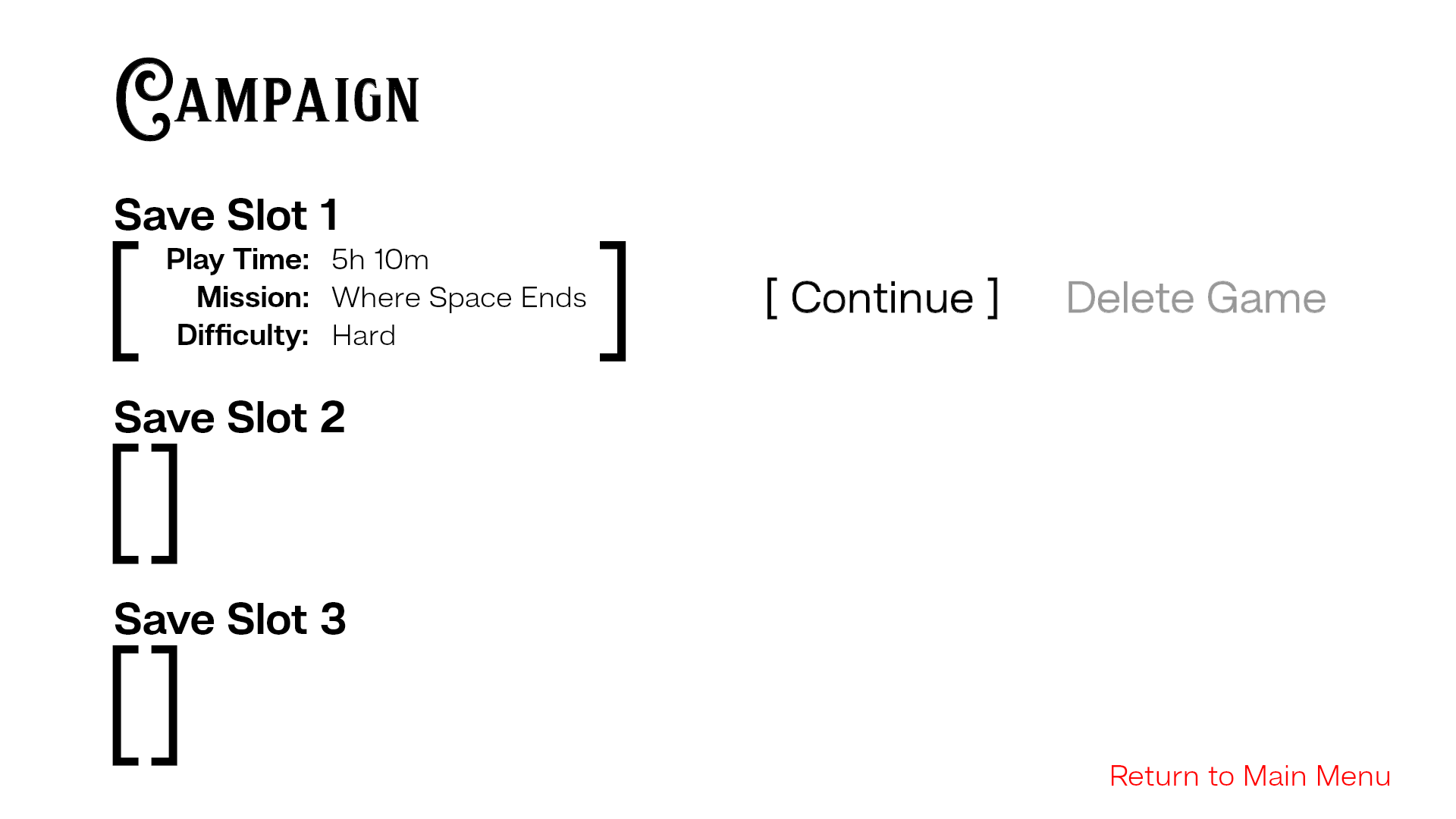
Wireframe - Campaign Menu Horizontal Bars
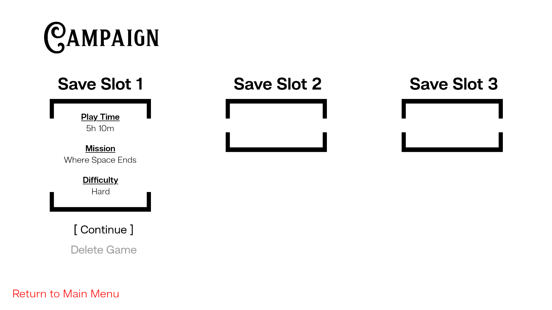
Wireframe - Campaign Menu Vertical Bars
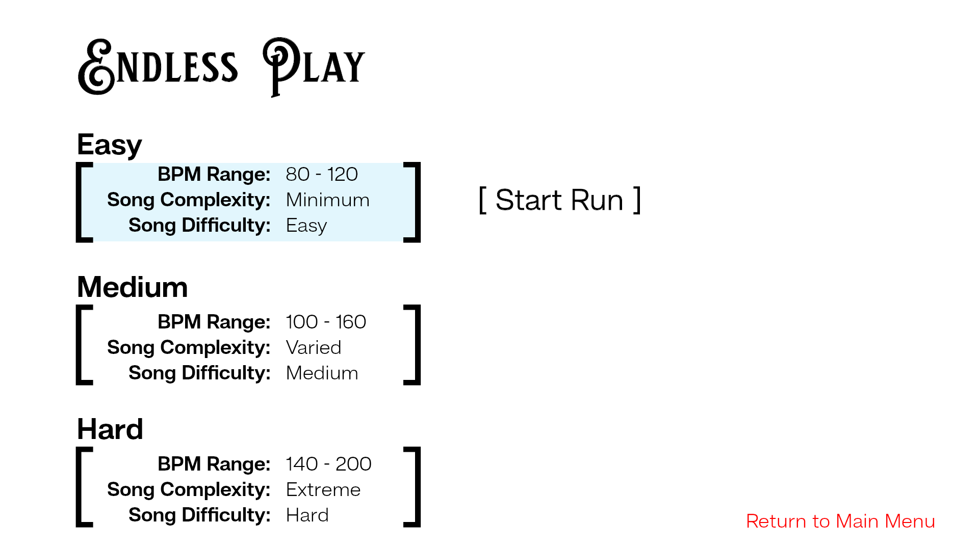
Wireframe - Endless Play Horizontal
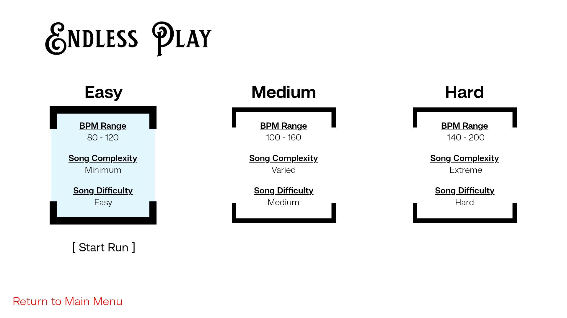
Wireframe - Endless Play Vertical
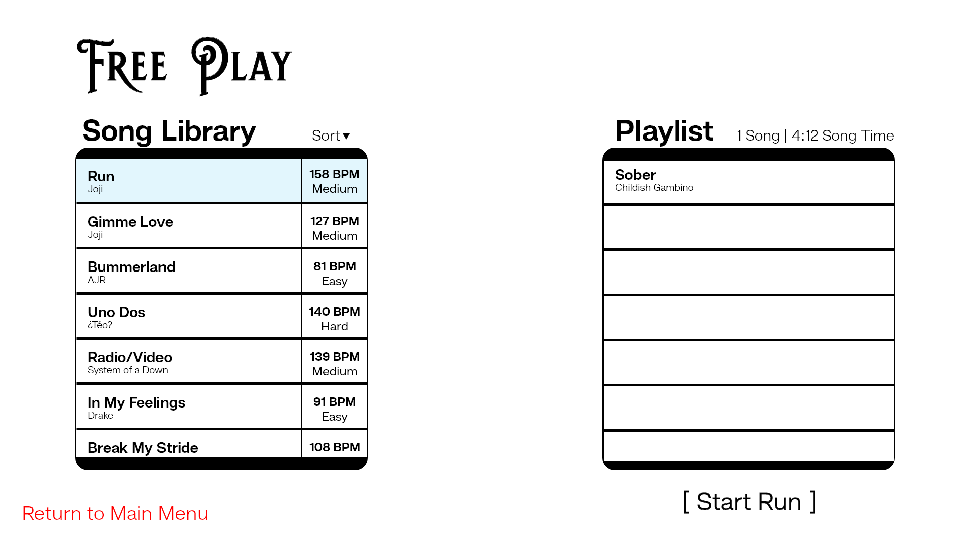
Wireframe - Free Play Song --> Playlist

Wireframe - Free Play Playlist --> Song
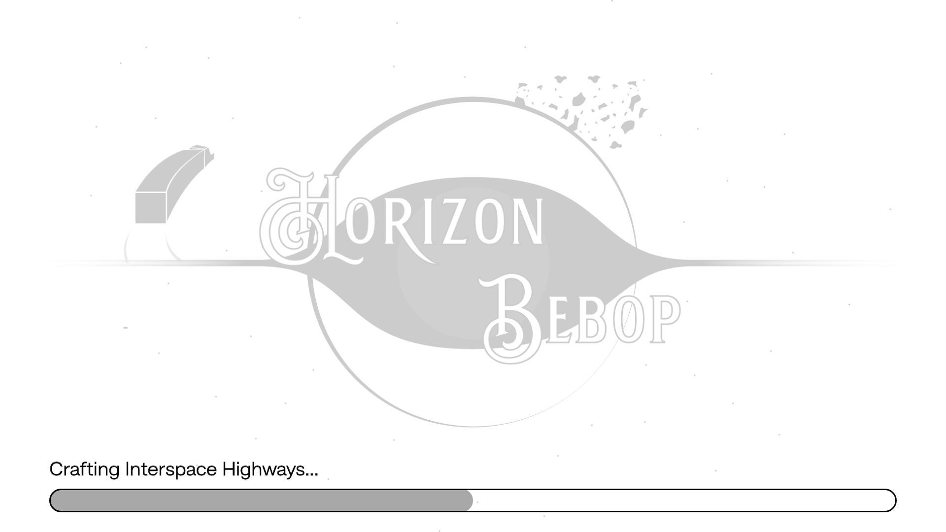
Wireframe - Loading Screen Bar
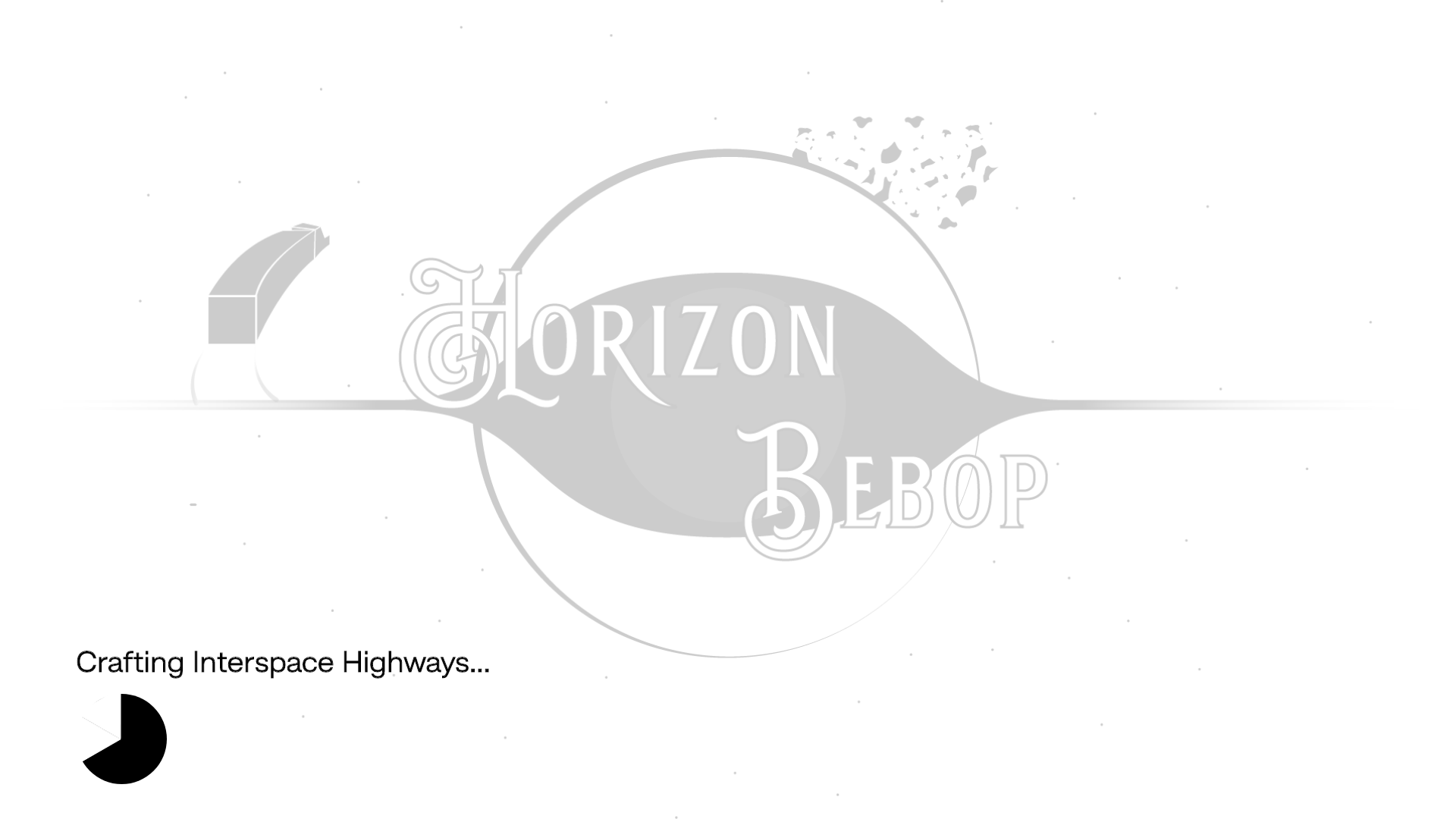
Wireframe - Loading Screen Pie

Wireframe - Options

Wireframe - Audio Bars

Wireframe - Audio Spheres
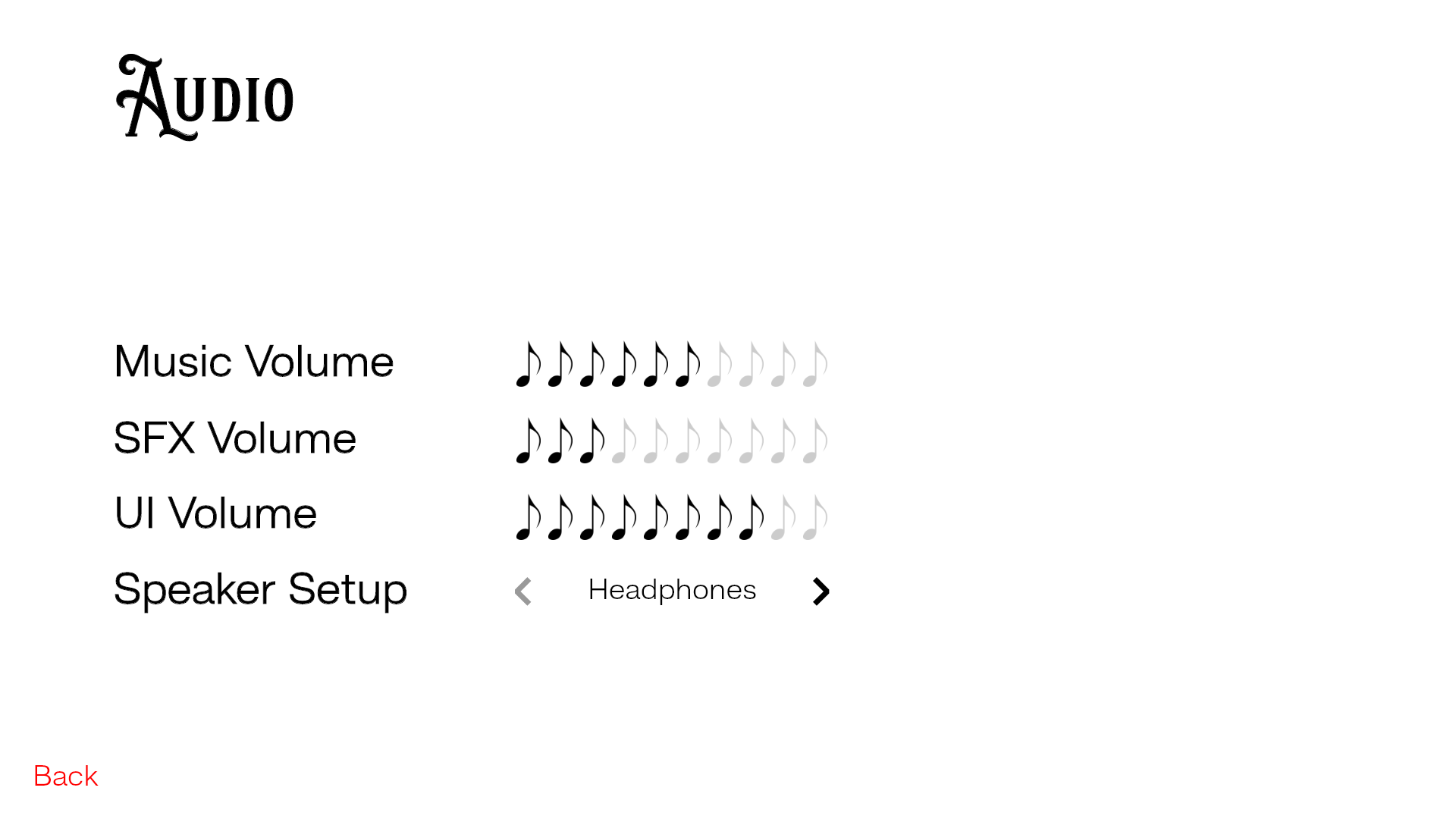
Wireframe - Audio Notes

Wireframe - Video Spheres
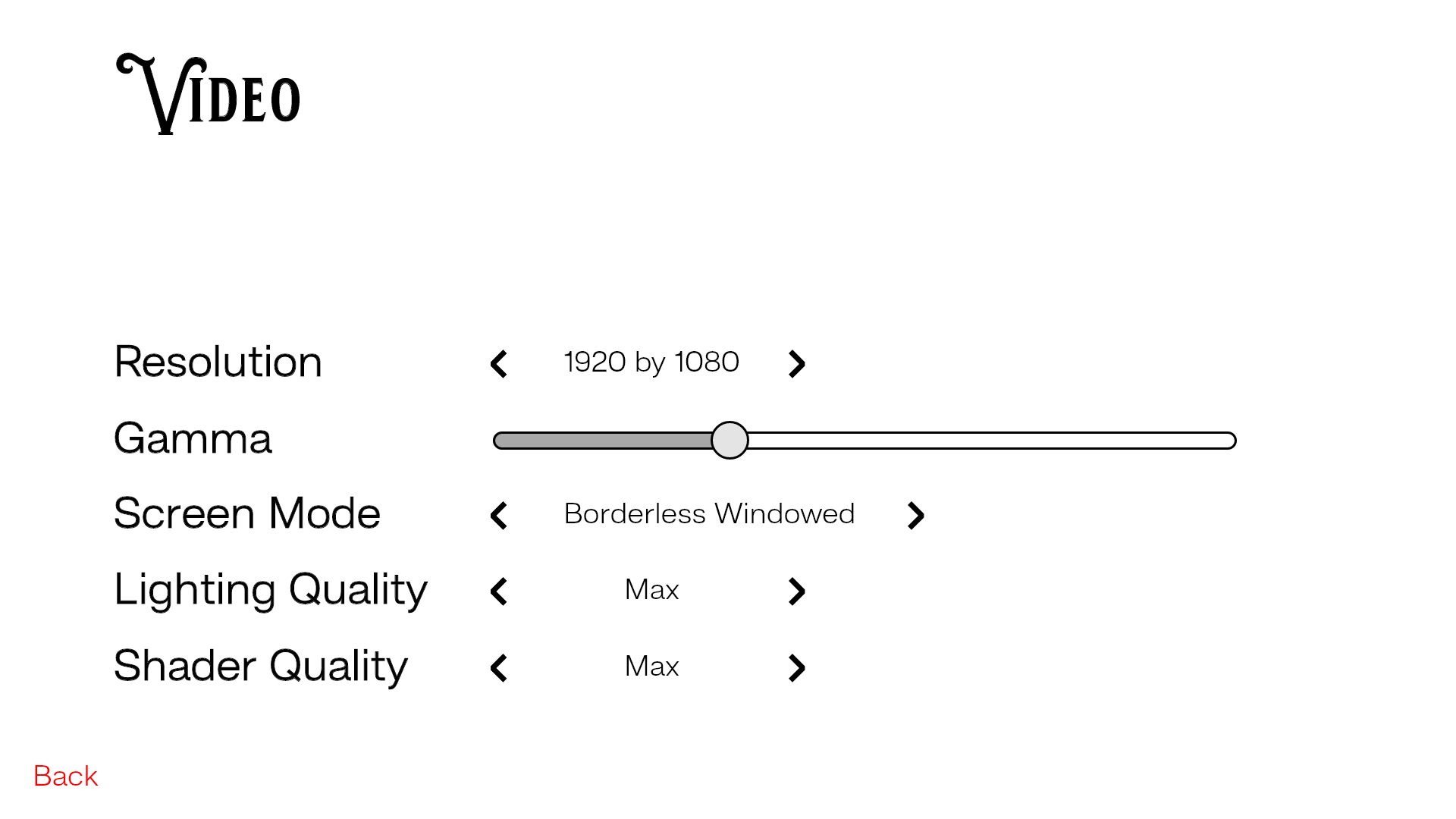
Wireframe - Video Vars

Wireframe - How To Play
Logo Iteration
To put a face to the game itself and spread interest in the game. I started formulating a logo Horizon Bebop. In the beginning iterations, I really played off the idea of the event horizon. The idea was too on the nose once the development of the design got to a certain point. So once the style was developed to lean more on the Deco-Punk niche that I created, the logo took a new turn.
The design for major aspects of the design focused on clockwork with highlights or distinct Art Deco shapes and styles as shown in the last two logos. At the end of the design process, the minute details and slight rusting and discoloration made the logo feel complete.

Wireframe - Horizon Bebop Logo
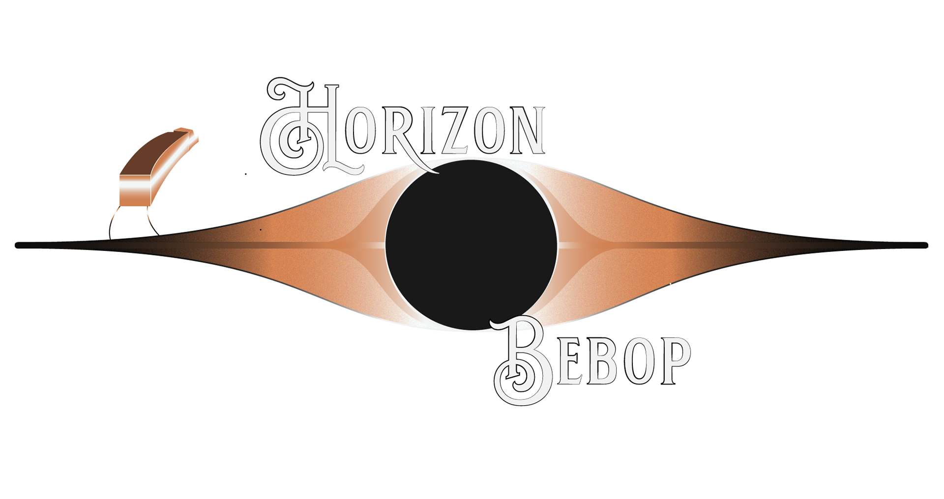
Bronze Era - Horizon Bebop Logo

Silver Era - Horizon Bebop Logo
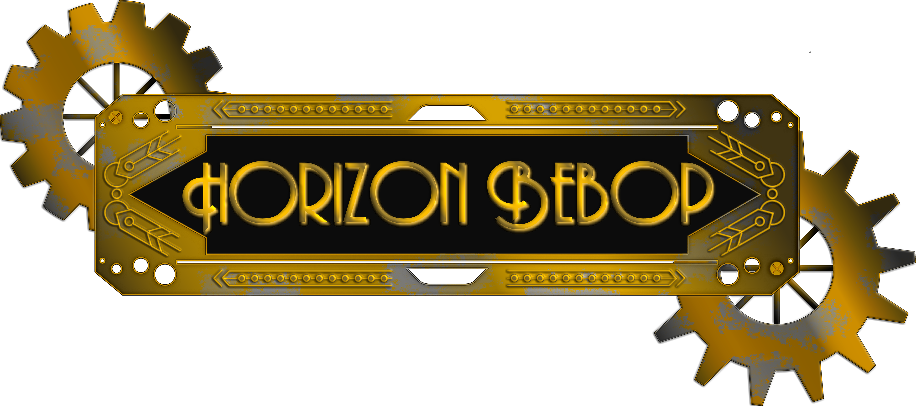
Golden Era - Horizon Bebop Logo
Menu Iteration
The designs have their own eras since they were all very distinct until the golden era. The bronze and electric eras are mid-fidelity mockups where the design wasn't pinned down and very turbulent. The Golden era is when everything came together to show the final themes of the design.
1st Iteration: The Bronze Era
The Bronze era shows the sci-fi idea that was the main focus of the interfaces at the beginning of the design process. I found that going strictly for designs that drew upon space phenomena was great, but not for this specific game. Horizon Bebop was not a game about space but about the distinction between sleek sci-fi designs and dusty, grungy space westerns.
And though the speedometer was set up for the main menu at the beginning of the design process, it worked its way into the in-game interface. But with the inclusion of designs from Osu! and cookie-cutter menus, this era did not last long.
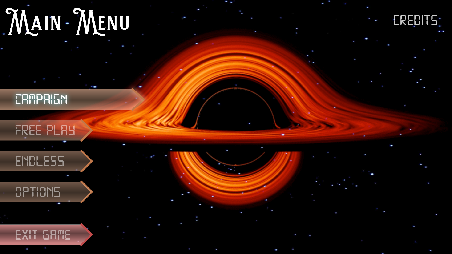
Bronze Era - Main Menu

Bronze Era - Free Play
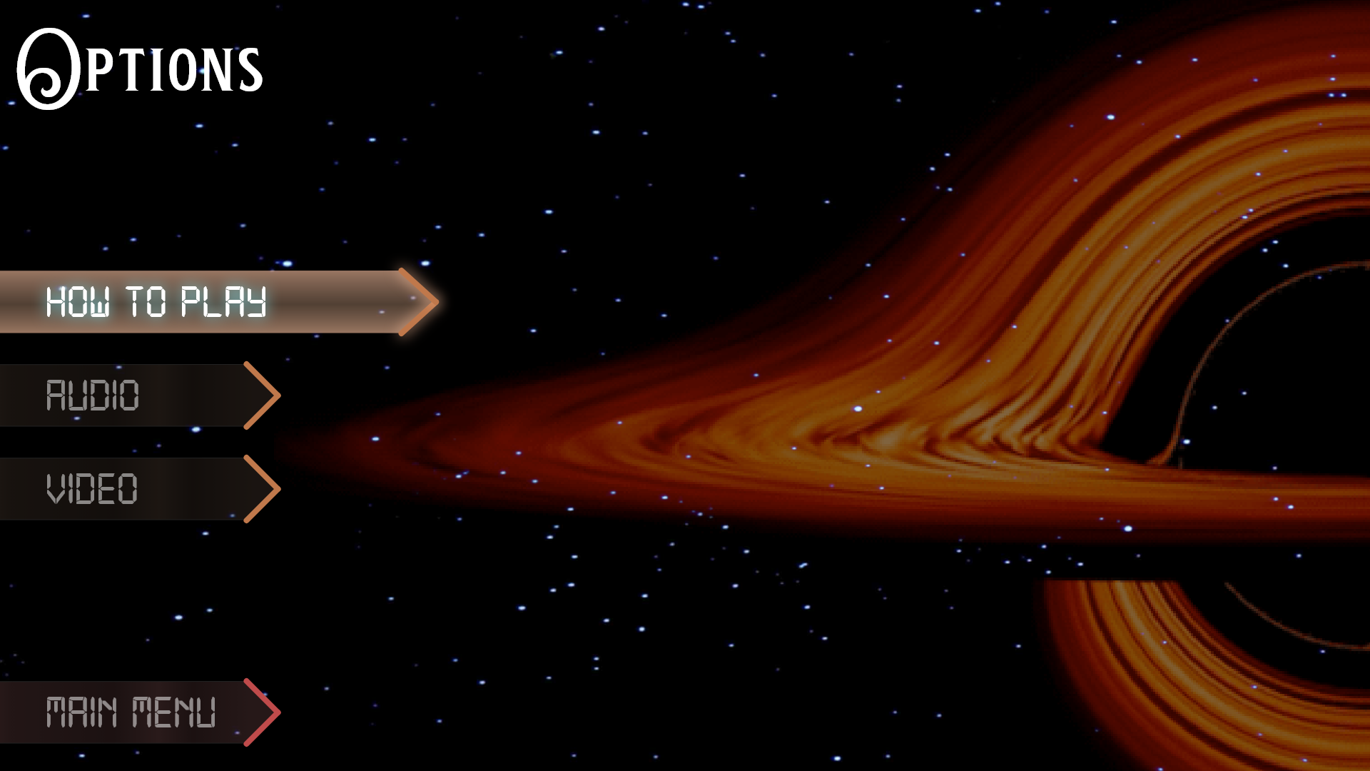
Bronze Era - Options
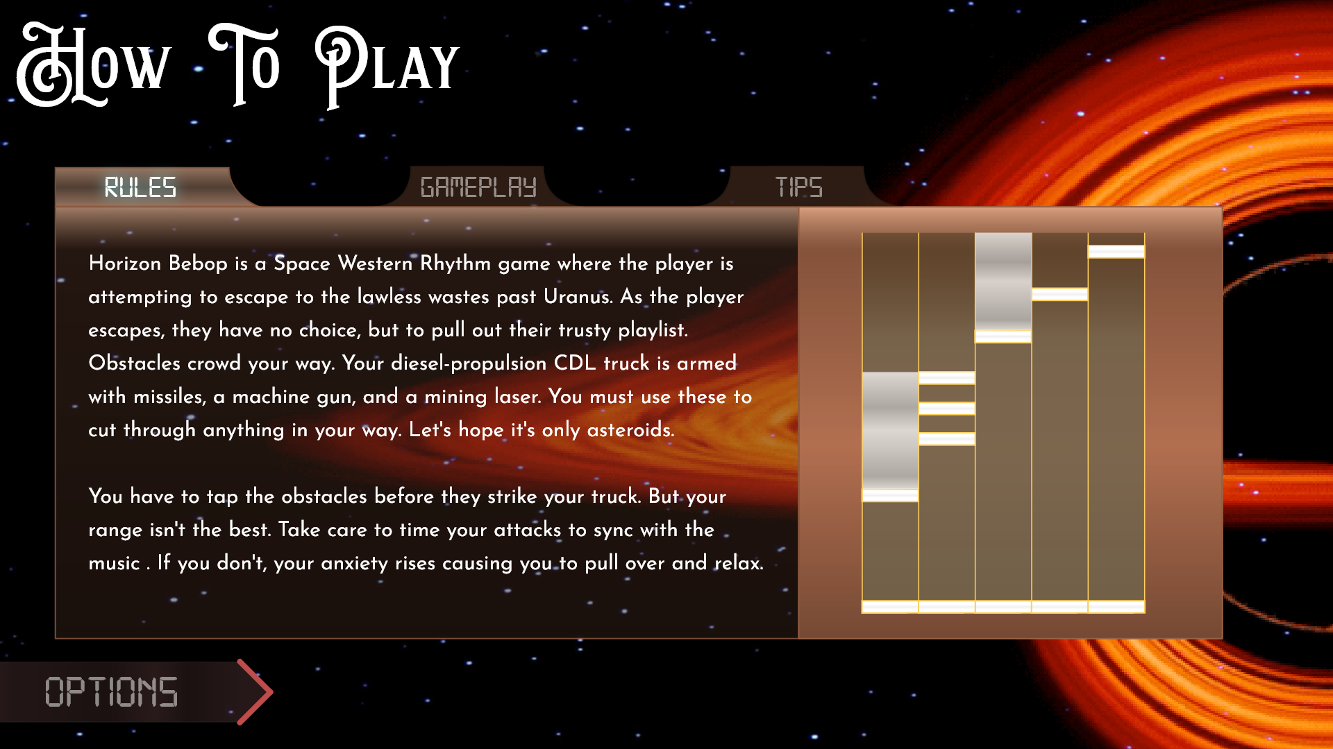
Bronze Era - How To Play
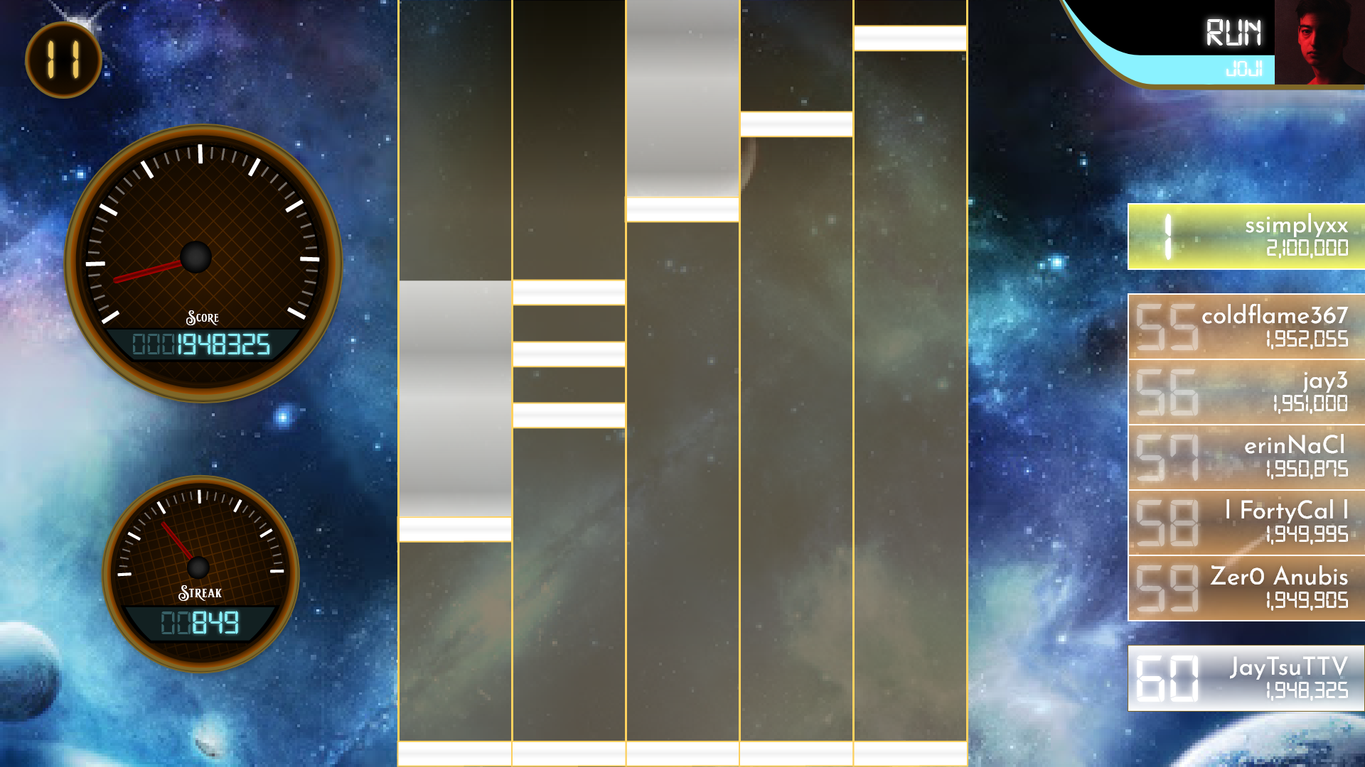
Bronze Era - In-Game Interface
2nd Iteration: The Electric Era
The Electric Era shows the shift from designs that drew from space to a focus on the main theme of the game. The different menus became distinct and easy to recognize, which was a step in the right direction. But with the logo still in development. Something was still missing.
The interface itself was coming together and starting to feel cohesive. But it was all still too clean and neat to showcase the entire theme. So it was pushed a bit more.
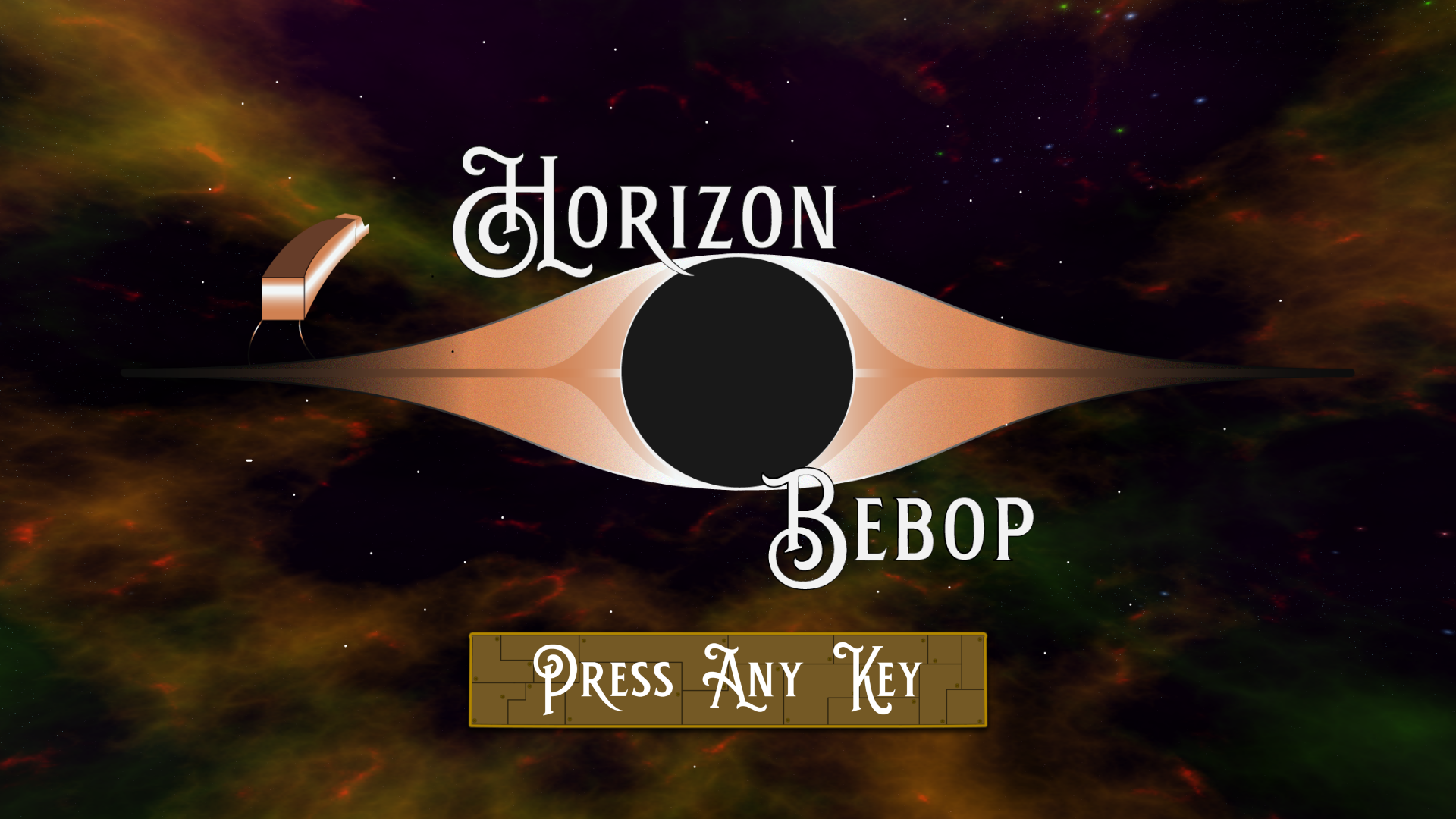
Electric Era - Horizon Bebop Logo

Electric Era - Main Menu

Electric Era - Free Play
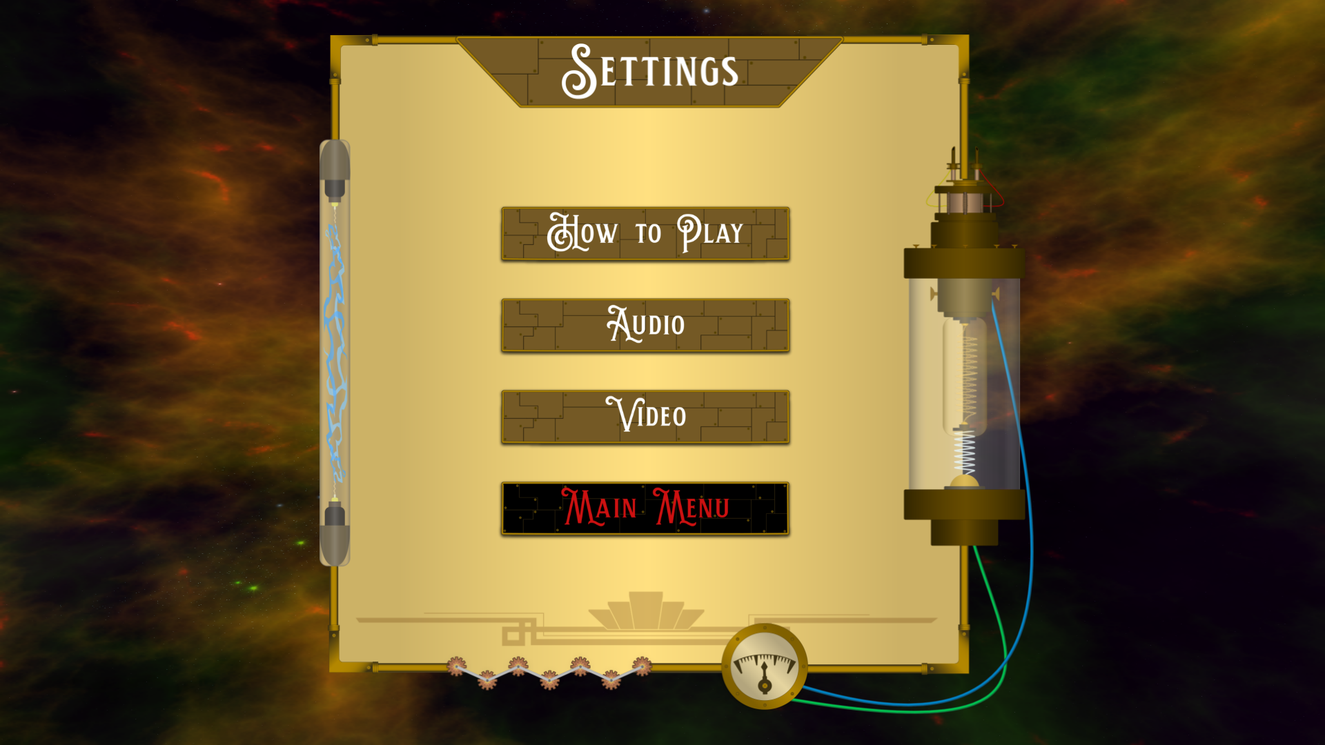
Electric Era - Settings
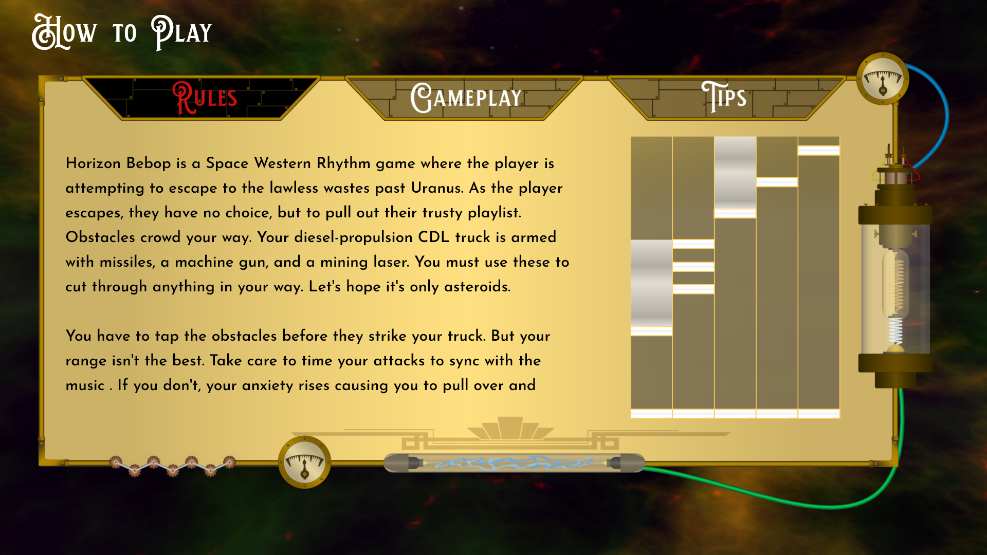
Electric Era - How To Play
Post-Mortem
Horizon Bebop was a project that allowed me to utilize not just my UI skills, but also game design skills. Though this part of the projector only shows the menus and interfaces, I also created a GDD, TDD, and story progression chart. Doing the additional documents and research allowed me to have a concrete world and direction for the interface design. This project is near and dear to my heart because of the space western themes. Many designers have a game they wish they could create but seldom get to flesh it out. And I'm happy I can always come back and start programming Horizon Bebop for the world to see.
3rd Iteration: The Golden Era
Now the culmination of all of the hard work of iterations and resets led to this final design. The Golden era design was the perfect balance of not just the sleek modern sci-fi that I wanted to portray but had the hints of rust, dirt, and decay of the space western.
The embellishments of the logo came together to show the Art Deco style that the game originally stemmed from. The main menu was covered in a bit of dirt and grime that made it feel worn and in a specific time and place in this world. With the breakdown of the story and little pieces added to the in-game interface, the player finally had a reason to avoid the obstacles and hit specific notes.
The songs weren't just placed on a conveyor belt for the player to choose. But the song list itself could be in the world. Everything was brought to life with just a little grime, shine, and cogs. Coming from a cookie-cutter design to a solid theme and design, Horizon Bebop jumped through many hoops in the iterative process. But it helped it to portray the theme it initially was supposed to.
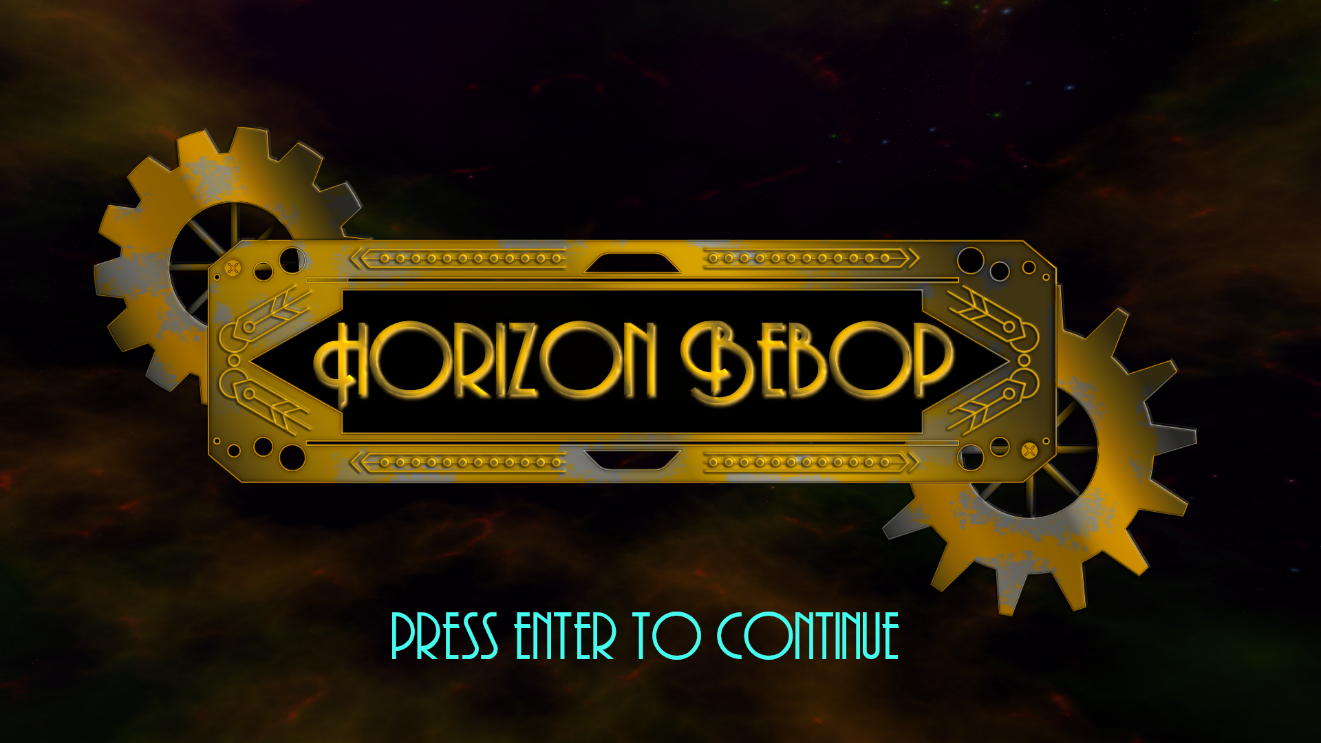
Golden Era - Title Screen
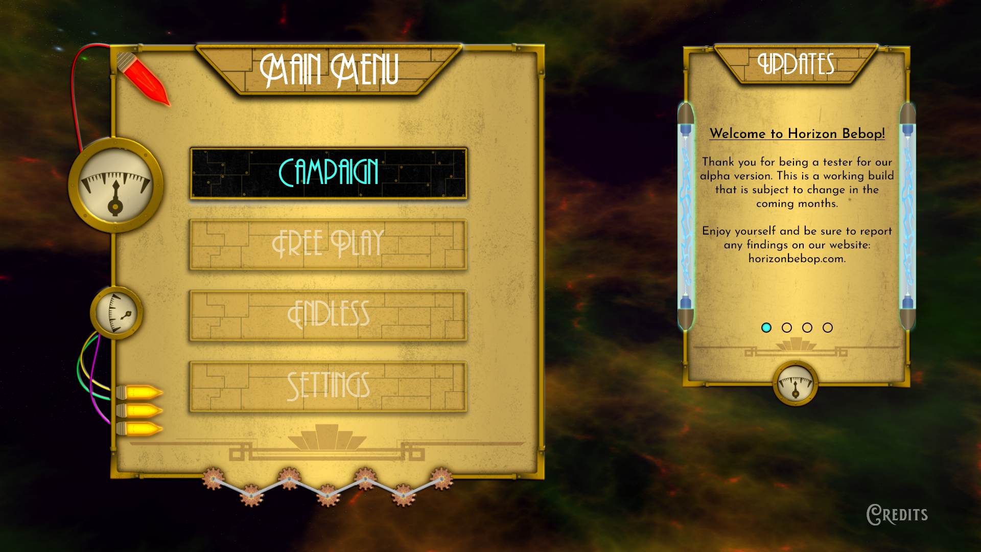
Golden Era - Main Menu
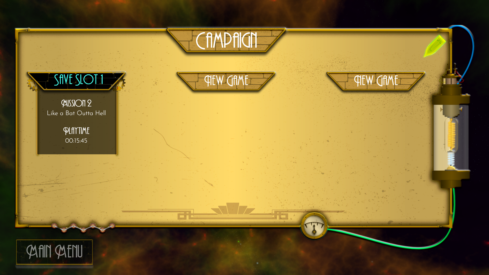
Golden Era - Campaign Menu
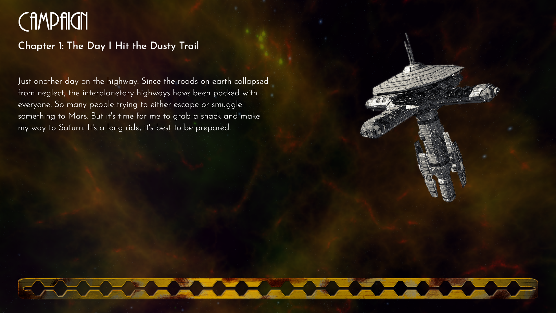
Golden Era - Campaign Loading Screen
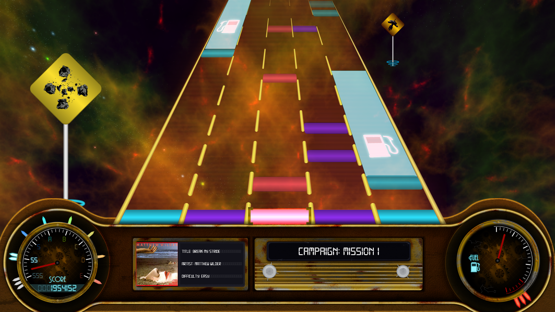
Golden Era - In-Game Interface
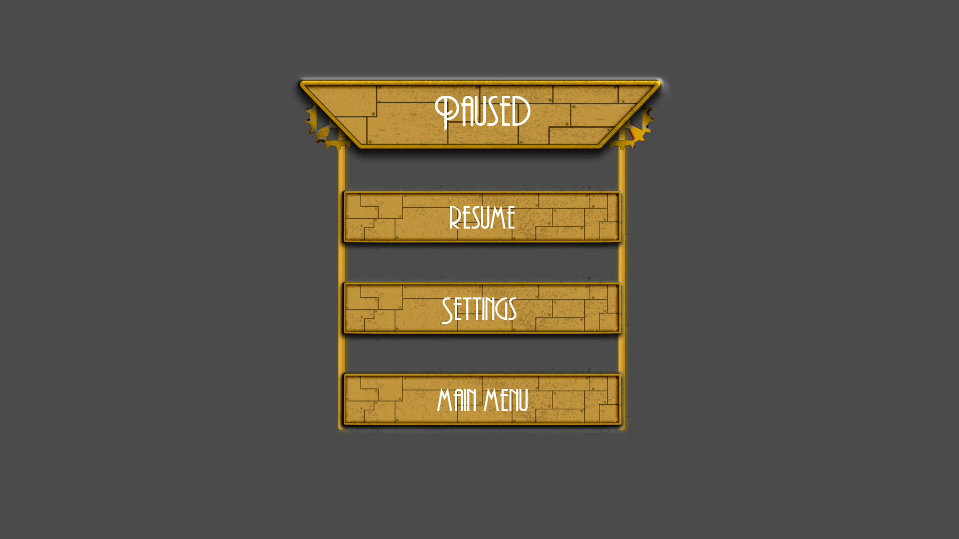
Golden Era - Pause Screen

Golden Era - Free Play Menu
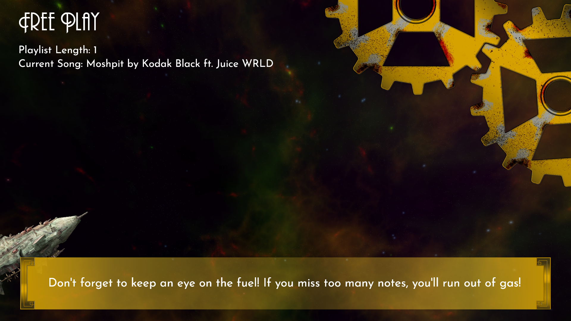
Golden Era - Free Play Loading Screen

Golden Era - Settings Menu
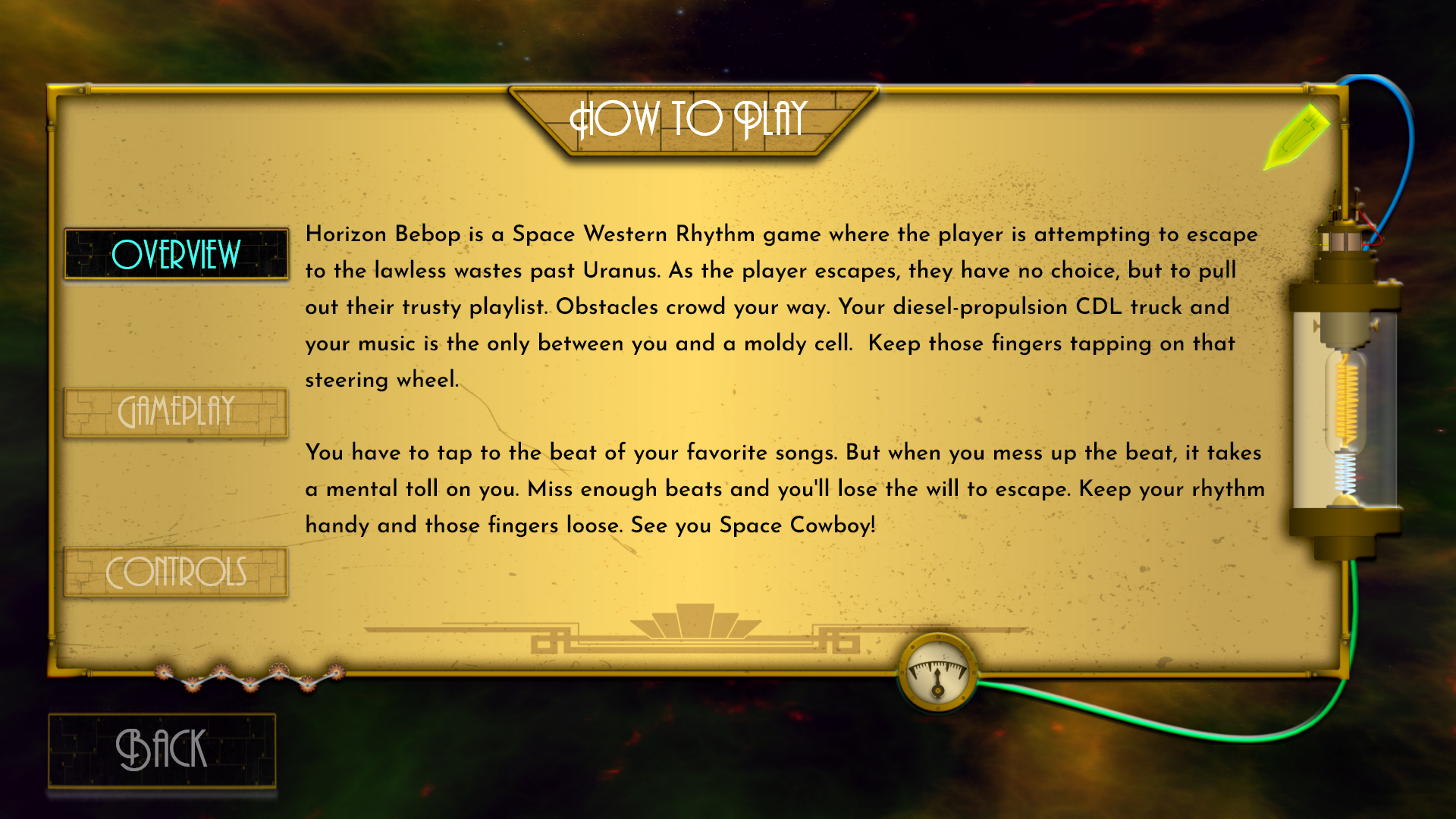
Golden Era - How To Play
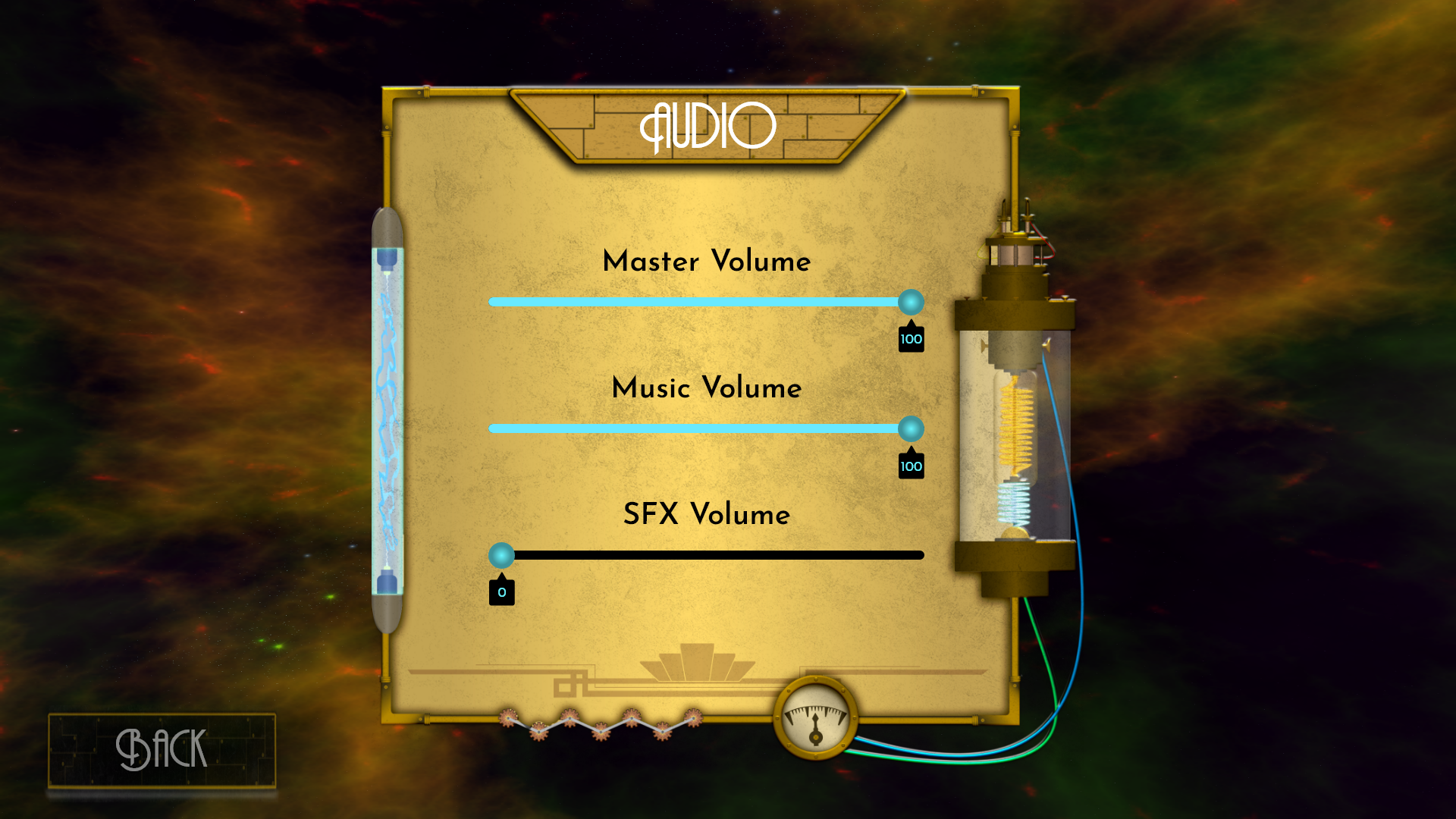
Golden Era - Audio Bars
