
Project Description
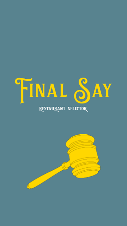
Final Say: Restaurant Selector is an application that allows users to answer that age-old question, "What are we going to eat?"
Many people have gone through the pain of selecting a restaurant when they don't feel any particular way. Well, that's where Final Say comes in! Final Say does all the hard work of taking important details from the user and using them to decide. No more worrying about where to eat with your family and friends at the end of the night! You don't have to when you have the Final Say!
The video shows how the application takes in information to provide a suitable place to eat. The app allows the user to enter a few pieces of information for restaurants. The app then filters out restaurants based on how they compare to the user's upper and lower limits. The information is then stored so the user can come back to previous searches.
Preliminary Process
Wireframes
Many food ordering and delivery apps influenced the wireframes. The large buttons made selecting important information easy to access. Sliders were also an aspect found in many restaurant ordering applications. I also wanted to keep the design simple. That way, everyone could utilize the app without getting confused.
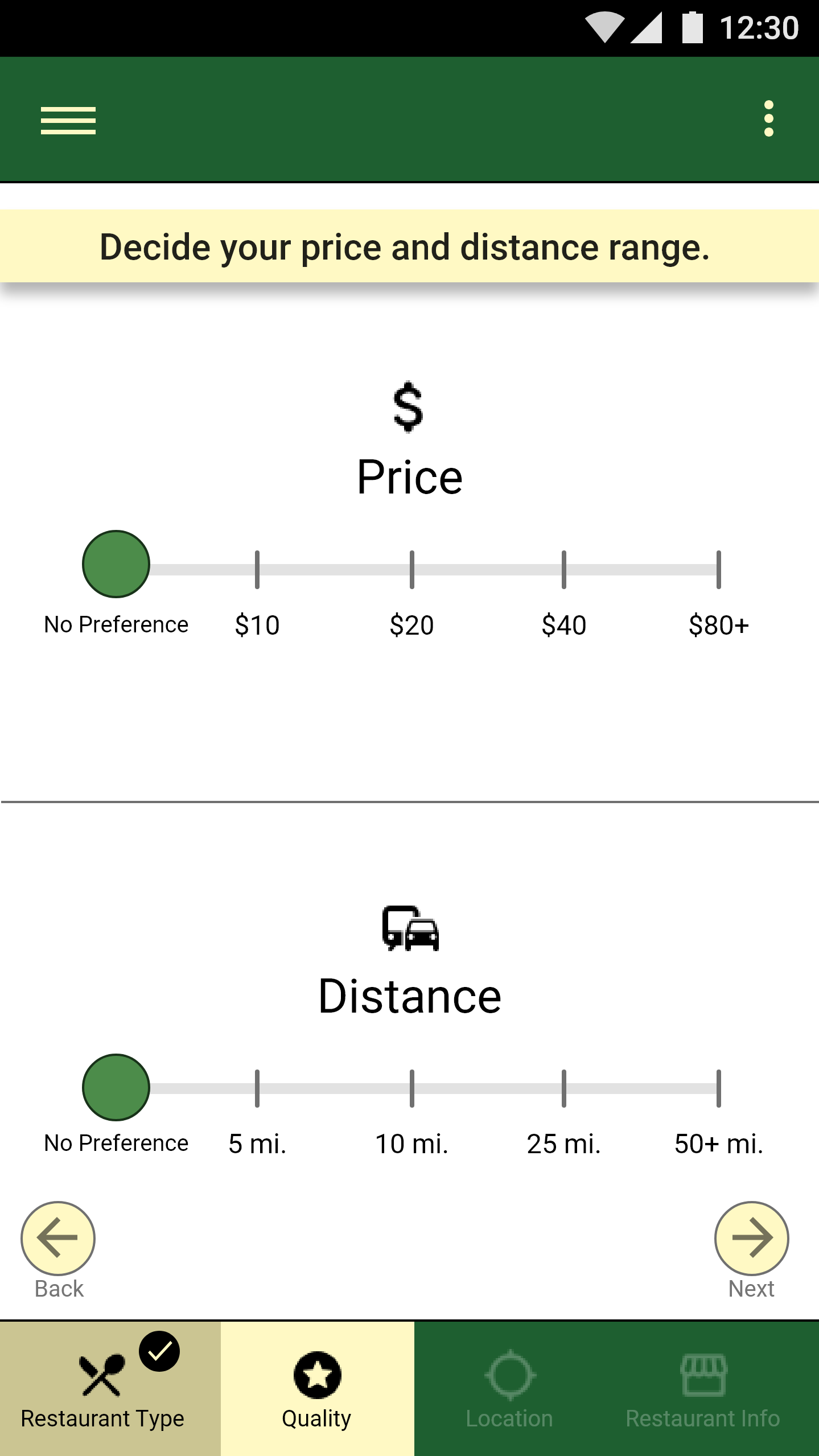
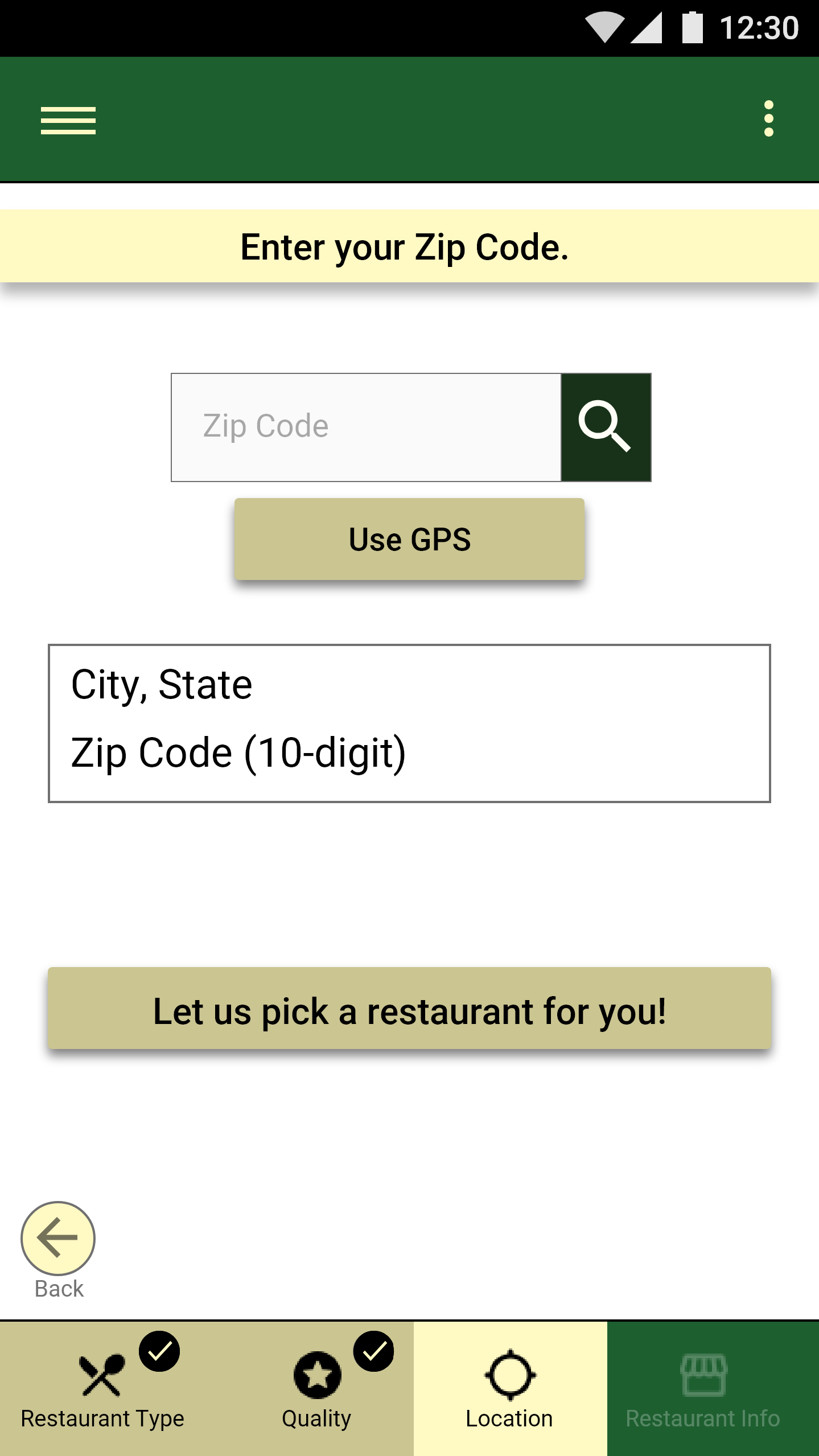
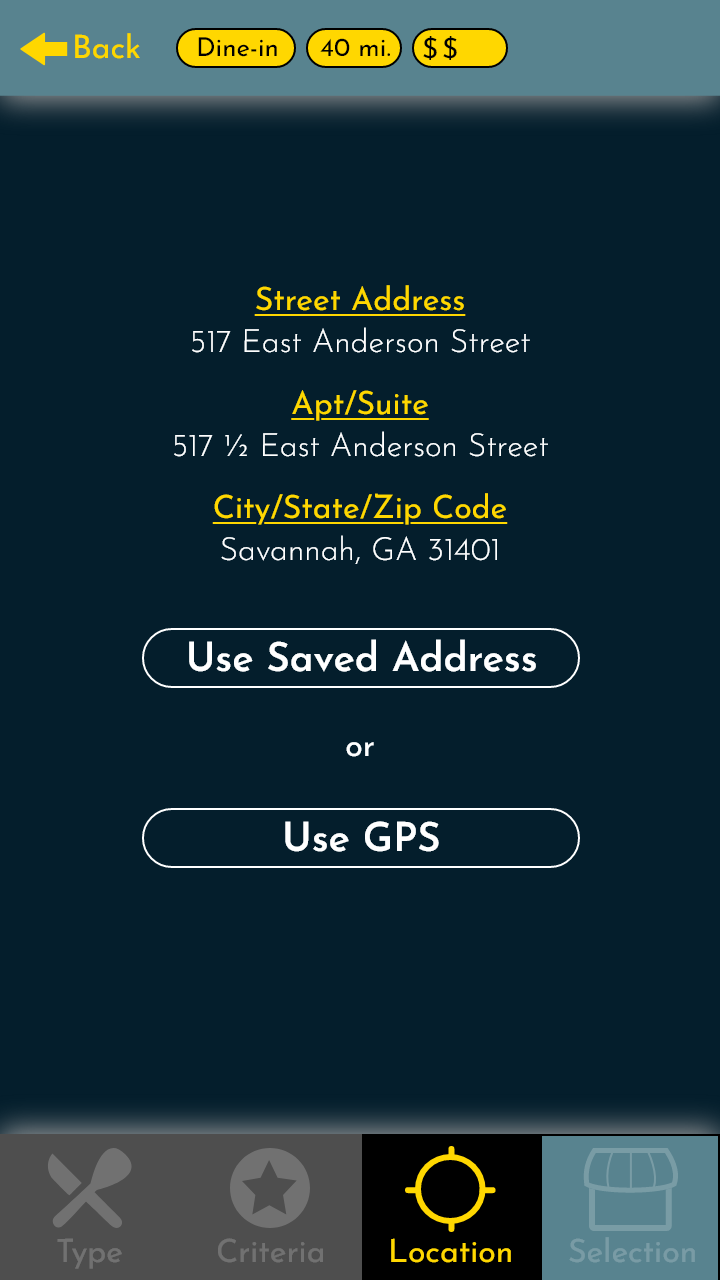
After I surveyed how people choose a restaurant to visit, I found that distance was one of the most important factors. This led to including a way for the user to insert their address or zip code. This prioritizes restaurants in the user's general area depending on the distance the user chooses.
Wireframe: User Restaurant Selection
Wireframe: User Distance/Price Selection
Wireframe: User Zip Code Input
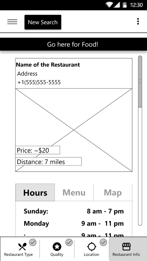
Wireframe: Final Say Selection
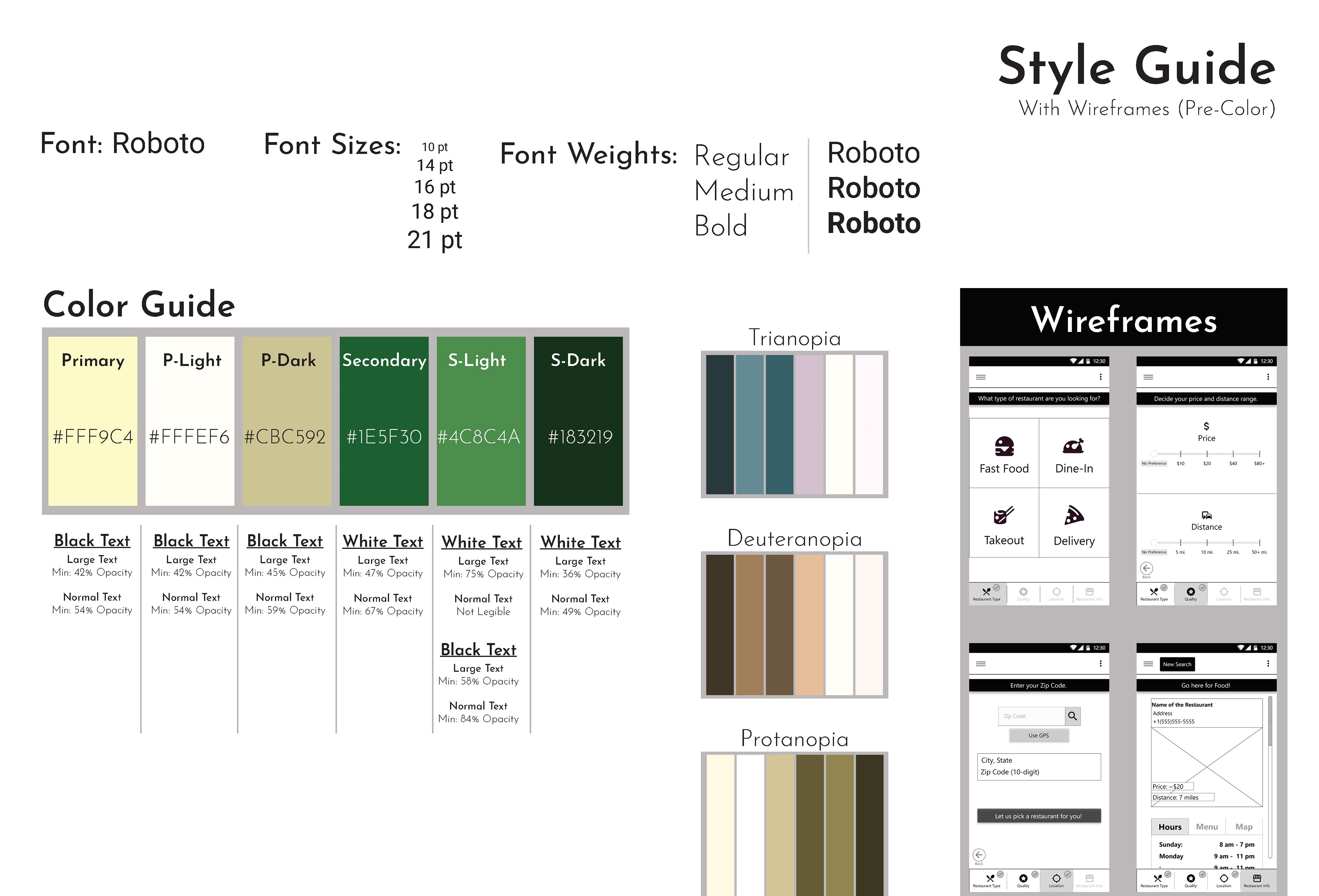
Preliminary Styleguide
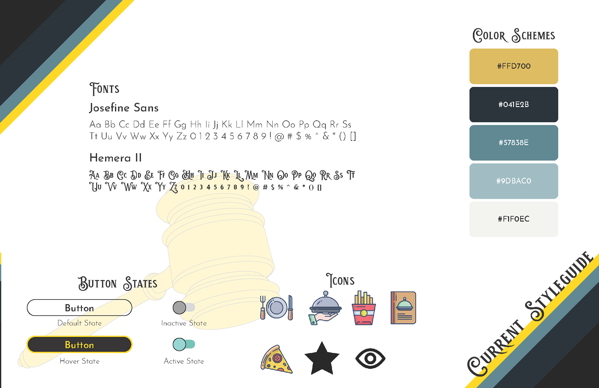
My color themes tend to lean more on the warm side. Once I noticed my preference for warm tones, I decided to take a cooler direction for Final Say. The greens went well with the idea that Final Say is supposed to be relaxing and stress-relieving. I chose neutrals that worked well even with different color blindnesses. The contrast made each color stand out even with green color blindness.
Roboto was an obvious choice because the app was designed for Android. The different fonts focused on text hierarchy to give more important information (User Selections/Inputs) more visual weight.
Redesign
Purpose
When Final Say was finished, it felt empty. The final design for Final Say felt unfinished. The application was set to be accessible for a majority of users. But what I felt would be accessible then ended up impersonal and cold. So after taking a few months away from the application, I found myself staring down at my past designs. As I revisited my designs, I agreed with my peers of the time. The designs were bare and uninspired. And with that realization, I pushed myself to move forward with the application. I needed to make it whole finally.
So I decided to take the green and tan base and shift it to a more complete design..
Proposal
I wanted to make sure Final Say feels like an application. I needed to take it from a mid-fidelity mockup to a polished final prototype. And for me to accomplish that, there needed to be some drastic changes in the design.
• Remove flat colors
• Add photos that help people choose
• Diversify choices
• Reorganize the restaurant information page
• Create a profile page
• Modernize the buttons
• Create a slide menu
• Create a settings page
• Polish the prototyping connections


Research
Color Schemes / Design Ideas
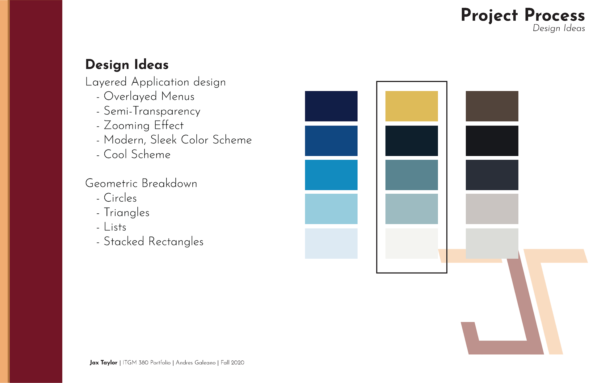
After figuring out what I wanted to accomplish. I scrapped the current color theme. The colors chosen before weren't bad, but they were not utilized effectively. So I decided to keep the idea for a cooler color scheme but utilize them more in a modern, sleek design.
For the application redesign, I moved away from the simple blocks for a more colorful alternative. I utilized transparencies, overlayed menus, and more of the screen real estate.
Competitive Research
Instead of researching how ordering apps worked, I went into competitive research focused on how to make the app feel more cohesive. I reviewed apps like UberEats, DoorDash, and InstaCart. This gave me a way to compare the designs, but also find out what made them feel whole. The biggest aspect I took away from the research was the use of actual photos. Not just photos of the restaurants, but also the food, deals, and specific dishes too. It gave the different screens more visual variety without tiring the user's eye.
Redesign Process
Redesign Styleguide
As stated above, I shifted away from the greens and neutrals. The previous color scheme could have worked, but I could only see the old application when those colors were utilized. So starting from scratch, I went to a blue and gold combination. There is a high contrast between the two, and the shades and tints for the blue are great for layering. I also changed the fonts. Instead of leaning on the ease of using Roboto, I wanted strong, contrasting fonts for logo text and general text.
I also revamped the button styles and icons to draw more on the use of photos.
App Additions
Just changing the colors, adding fonts, and photos is not enough to constitute a full redesign. Unburdened by time constraints, I added additional sections to Final Say. I wanted to up the complexity along with updating the design. So for that reason, I added...
• Profile Section
• Hover States
• Micro-animations
• Consistent Iconography
Redesign Wireframes
It is important to look back on failures and misses. You learn so much from your past designs. For that reason, I wanted to highlight the difference between the 1st iteration of Final Say and the last. It is plain to see which feels more complete. It is also clear that the time spent wasn't wasted on the updates to the design and content.
Restaurant Type
Selction Criteria
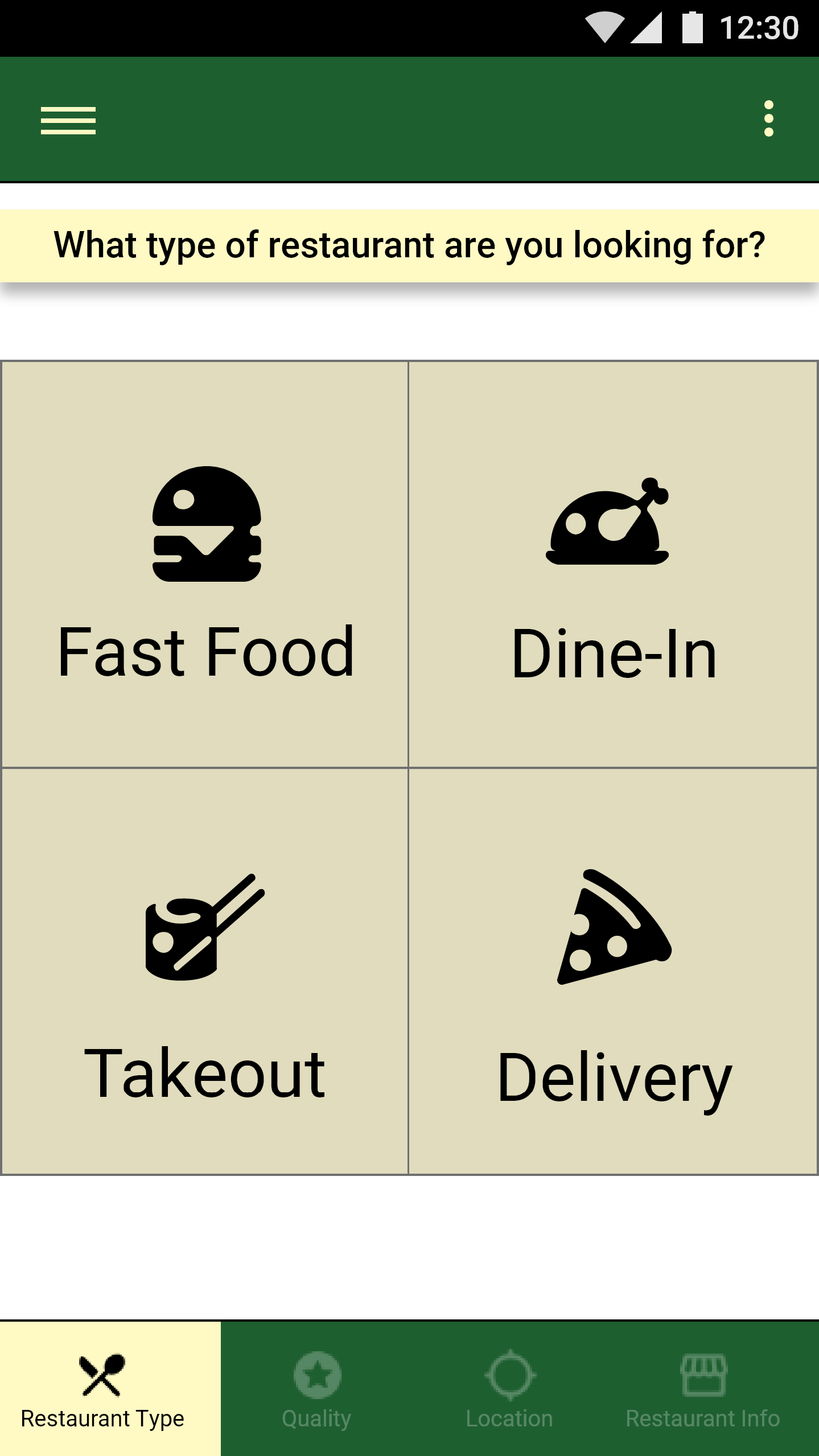
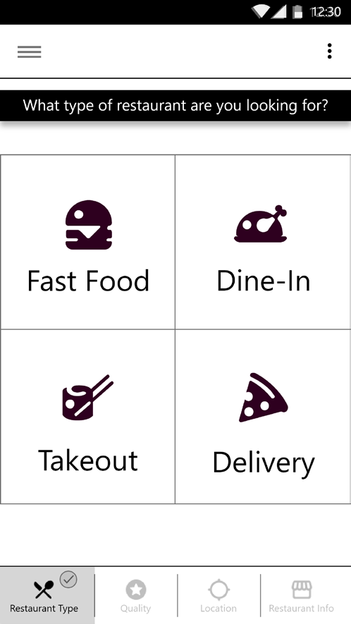
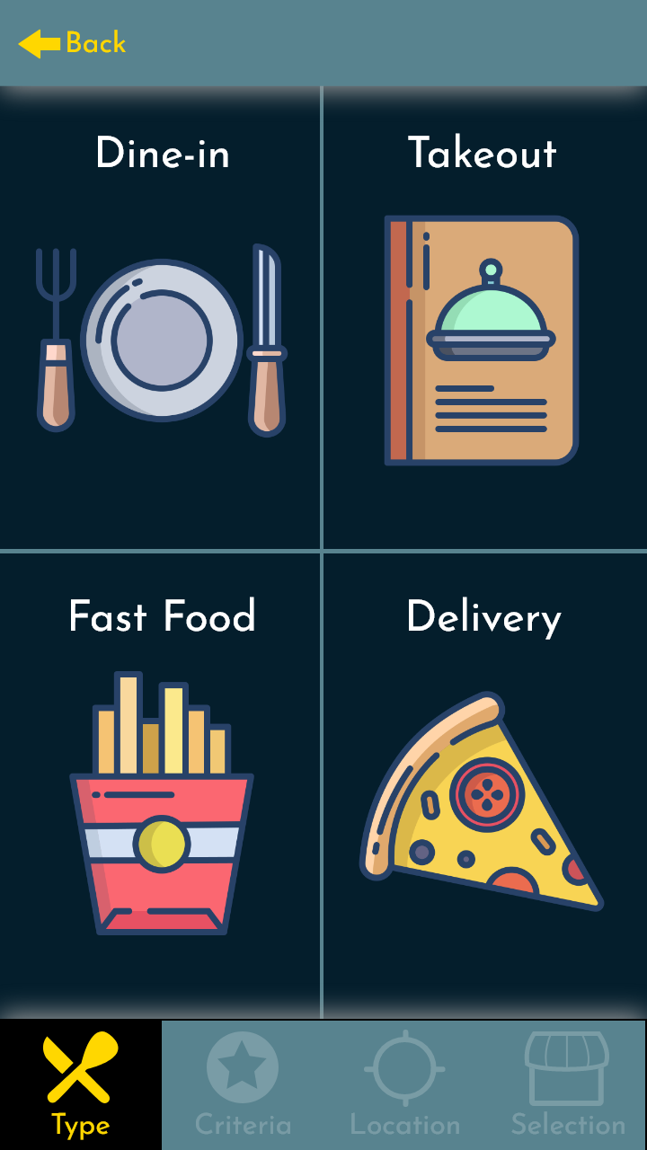
1st Iteration Final Say Restaurant Type Screen

2nd Iteration Final Say Restaurant Type Screen

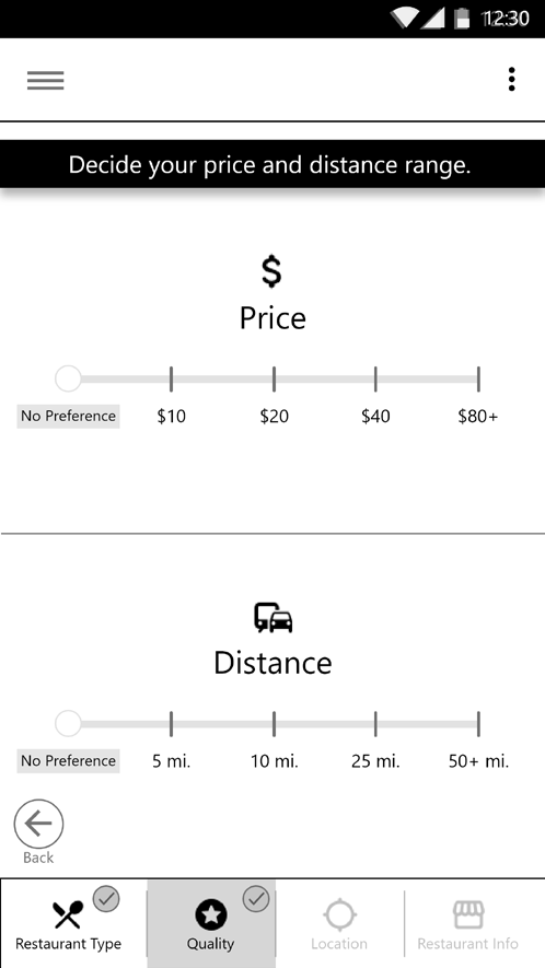
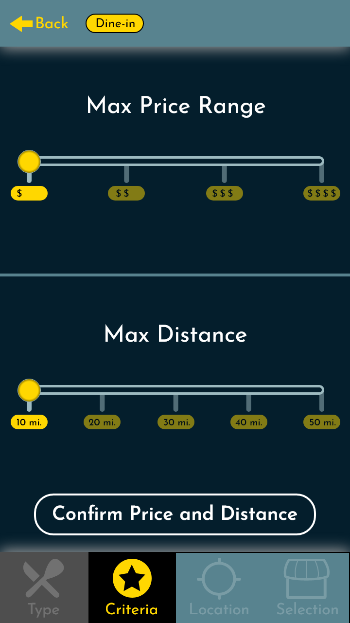
1st Iteration Final Say Distance/Price Screen

2nd Iteration Final Say Distance/Price Screen
Location
Final Say

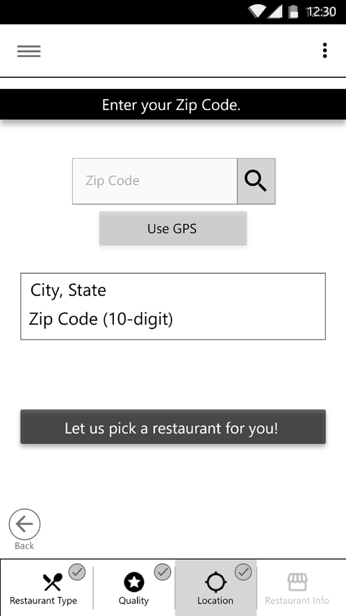
1st Iteration Final Say Location Screen
2nd Iteration Final Say Location Screen
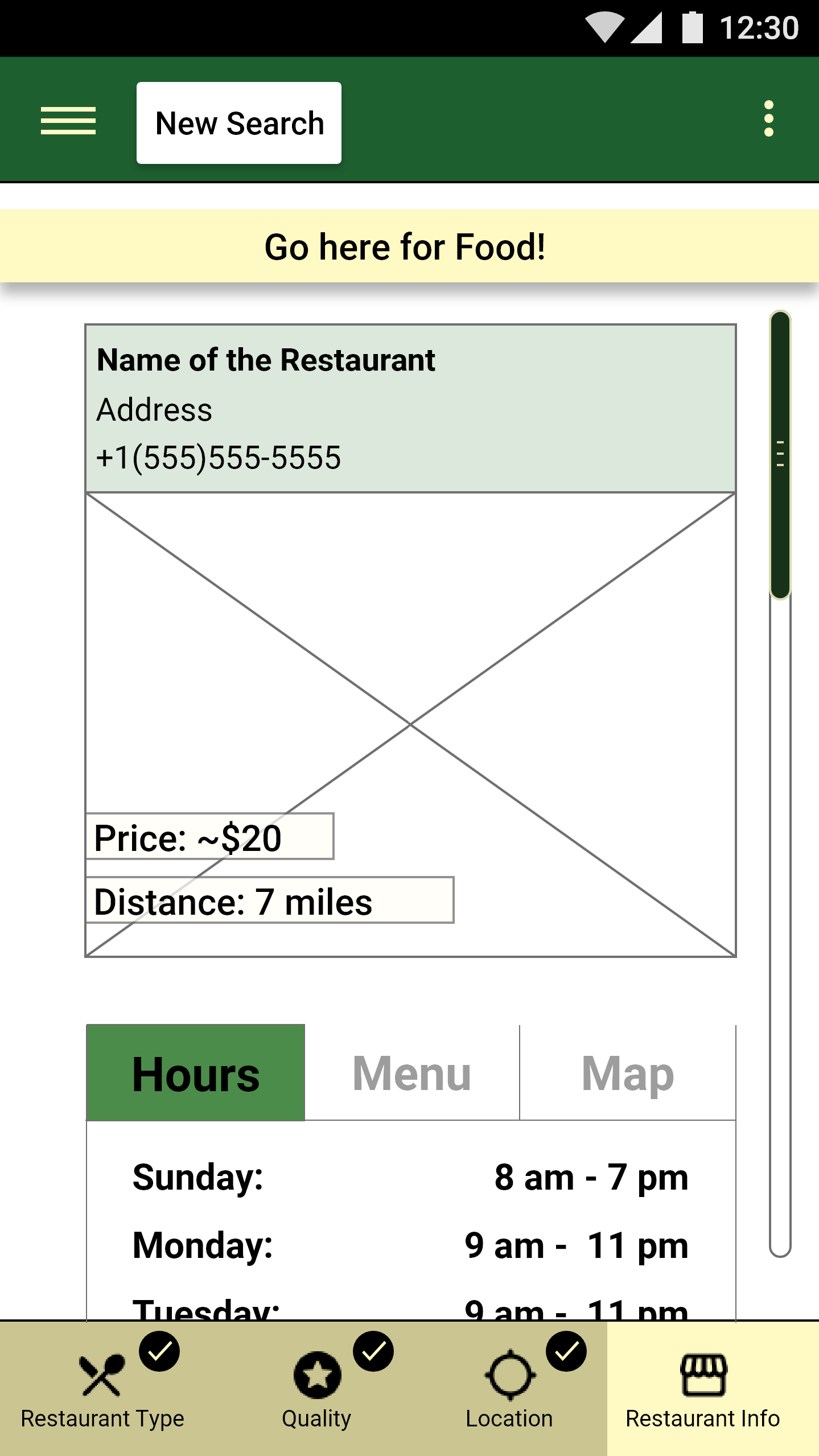
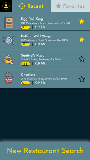
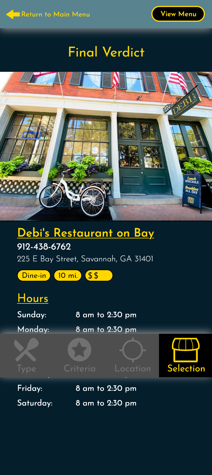
1st Iteration Final Say Final Say Screen

2nd Iteration Final Say Final Say Screen
Post-Mortem
At the end of the day, highlighting your mistakes and growing from them is a somber experience. It's a time of going back on should-haves and could-haves. It highlights a lot of inadequacies in skills and knowledge. Knowing the faults that you used to have allows you to absorb and learn from those mistakes to grow faster and go further. I feel that way with every single iteration of one of my previous designs. And after revisiting Final Say, I have a greater understanding of what constitutes a complete app.
Final Designs
Final Say Restaurant Type Screen
Final Say Search Criteria Screen

Final Say Location Screen
Final Say Final Say Screen